Tuesday, August 09, 2005
This Explains a Lot
Never stop learning. That's my motto: the more you know, the more you know you don't know. That's usually an accumulative process: the more you learn, the more you can learn, and the faster you can learn it.
But in the magical fairyland known as IT, some people seem to actively destroy knowledge, creating more confusion wherever they go. We've had a word for it for a while - FUD (fear, uncertainty, and doubt). Now we have an explanation, at least analogically - the uncertain world of vaporware and project requirements must be quantum, yeah that's the ticket, and we've just discovered that Quantum information can be negative:
Really I don't want to be a typical popularizer abusing quantum mechanics for my little analogies ... long before the concept of negative information appeared, the philosophical concept of defeasible reasoning captured the idea that in most real-world situations learning new facts can force you to give up previously held conclusions. Certainly this is true in any scientific revolution, where switching from the Ptolmaic to the Copernican world view or from Newtonian to Einsteinian physics required throwing out vast amounts of knowledge.
But the next time I encounter a confusing cloud of fuzzy figments surrounding the slippery, unfocused requirements of the latest vaporware, I want to believe I've encountered negative quantum information, dang it.
-the Centaur
But in the magical fairyland known as IT, some people seem to actively destroy knowledge, creating more confusion wherever they go. We've had a word for it for a while - FUD (fear, uncertainty, and doubt). Now we have an explanation, at least analogically - the uncertain world of vaporware and project requirements must be quantum, yeah that's the ticket, and we've just discovered that Quantum information can be negative:
Even the most ignorant cannot know less than nothing. After all, negative information makes no sense. But, although this may be true in the everyday world we are accustomed to, negative information does exist in the quantum world ... What could negative information possibly mean? In short, after I send you negative information, you will know less. Such strange situations can occur because what it means to know something is very different in the quantum world ... Negative information turns out to be precisely the right amount to cancel the fact that we know too much.
Really I don't want to be a typical popularizer abusing quantum mechanics for my little analogies ... long before the concept of negative information appeared, the philosophical concept of defeasible reasoning captured the idea that in most real-world situations learning new facts can force you to give up previously held conclusions. Certainly this is true in any scientific revolution, where switching from the Ptolmaic to the Copernican world view or from Newtonian to Einsteinian physics required throwing out vast amounts of knowledge.
But the next time I encounter a confusing cloud of fuzzy figments surrounding the slippery, unfocused requirements of the latest vaporware, I want to believe I've encountered negative quantum information, dang it.
-the Centaur
// posted by Anthony Francis @ 9:36 AM Permalink (0) comments
Wednesday, August 03, 2005
Hell Freezes Over
At last, Apple has released a multi-button mouse. After years of bravely thinking different(ly) and enduring consequent public ridicule and lemminglike adoration, Apple released a Mighty Mouse with not one, not two, not three, no, with FOUR, count them FOUR buttons:
The center ball is the new scroll wheel, PLUS left click, right click AND "innovative" squeezy buttons on the side, just like the squeezy buttons on the side of my Kensington Mouse-in-a-Box Optical Pro attached to the Blue Slab of Coolness, except the "less innovative" Kensington distinguishes squeezes from the left or the right. Ah, the price of "innovation". But I digress.

Or do I? The neat thing about the Kensington is that the side buttons look like highlight accents on the mouse: if you don't want to use them, you'll never know they're there. There is a tension between providing powerful features and clean design: the clutter of obvious interface features can be intimidating, confusing. I believe it's far better to have a clean design that doesn't clutter the user's view with features, and to make the power user features "just work" the way you want them to. While I haven't seen any user interface studies specifically examining this question, it does seem consistent with research I recall having read about about human attention (we can directly perceive or "subitize" only about four items at a time) and novice users (who can be confused and put off by cluttered interfaces).
Apple has done the same thing that Kensington did: the mouse appears to have only two buttons, the main surface and a tiny scroll ball for panning and scrolling inside documents. Beneath that shiny surface, however, are sensors that allow the Mighty Mouse to tell its left from its right (at least on its top surface). However, in its default mode, both the right and the left button respond as left buttons, so the default experience of novice users is the same. Out of the box (ha ha) the Mighty Mouse provides Mac users with the experience they have come to expect - but if you are a power user, and presumably you are if you dashed in to the Apple store to scoop up all the Mighty Mice they had before I could get one, you bastards, then you will know to go to System Preferences and set your right mouse button to respond to the right. This is where the excellent Ars Technica review both gets it and doesnt get it:
With all due respect to the reviewer, who really hit the nail on the head with his review, this particular dig at two-button mice misses the point. While I, too, have not tracked down any studies specifically testing one vs. two button mice, user interface studies generally show that more complicated input procedures that require people to actually, like, learn things generally kick the ass of input methods designed for novices. (This one reason why I regularly get schooled in Starcraft by people who know the hotkeys, or why my friends David Cater and Henry Crutcher can program rings around me because every possible configuration of input devices on their computers does something useful for them. But I digress.)

Or do I? I certainly FEEL far more efficient browsing the web on the Blue Slab of Coolness because I can right-context click and save files or view source of a page without performing a context click than I am on the Grey Slate of Smoothness, which only has a one-button trackpad and requires a key-and-mouse dance to get the same functions. Or, to compare Apples to Apples (ha ha), I definitely feel far more efficient using my iLamp with its third-party three-button mouse than I am on the Grey Slate, which feels like a step backward.
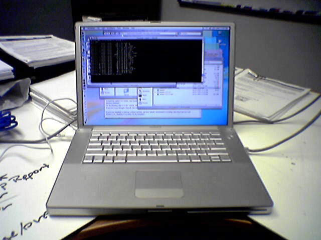
(In fact, compared to the Toshiba Satellite's slick programmable animated trackpad ...

...the Powerbook's simple grey slate seems like something out of the Stone Age:

... especially when you think how easy it would be for the animated trackpad and Apple's grey slate to be combined. But, again, I digress.)
Apple's genius of late has been to show that the true solution is NOT "either novices or experts" but is instead "BOTH novices AND experts". Apple's new mouse is not a one button mouse or a two button mouse ... it's both: a four-button mouse that looks like a one button mouse from the perspective of novices, but is fully programmable. Apple is one of the most GUI-focused operating systems that exists that "just does the right thing" for novices, but it's now layered on top of Unix so that the most hardened hacker can crack open bash, Emacs and Perl to get his job done. As the Ars Technica review notes:
SO maybe there AREN'T user interface studies that will definitively show that one button mice {kick the ass of | suck compared to} two button mice. But now Apple has shown you don't have to accept that Hobson's choice ... you can get both. And since Apple has now given users the means to choose (spiced up of course with Apple's marketing mojo and the distinctive Apple innovations like that micro scroll ball which enables you to pan and tilt anywhere in large documents in programs like, oh, PHOTOSHOP or something - talk about playing to your core audience. But I digre-WHAM-thud). Ahem.
Since Apple has given its users the means to choose, we no longer need to wait for studies - we can let the market decide.
And I decide a two-button mouse will make me feel better ... as soon as I can snatch one from all of your fast little hands.
-the Centaur
Here would go an image of my new Mighty Mouse. But by the time I got to the Apple store, you got them all. So there isn't one. Next time, if you want an image of my new mouse, leave one for me. Until then, please enjoy this ascii art of the new mouse I don't have:------------(o )
Thank you.
The center ball is the new scroll wheel, PLUS left click, right click AND "innovative" squeezy buttons on the side, just like the squeezy buttons on the side of my Kensington Mouse-in-a-Box Optical Pro attached to the Blue Slab of Coolness, except the "less innovative" Kensington distinguishes squeezes from the left or the right. Ah, the price of "innovation". But I digress.

Or do I? The neat thing about the Kensington is that the side buttons look like highlight accents on the mouse: if you don't want to use them, you'll never know they're there. There is a tension between providing powerful features and clean design: the clutter of obvious interface features can be intimidating, confusing. I believe it's far better to have a clean design that doesn't clutter the user's view with features, and to make the power user features "just work" the way you want them to. While I haven't seen any user interface studies specifically examining this question, it does seem consistent with research I recall having read about about human attention (we can directly perceive or "subitize" only about four items at a time) and novice users (who can be confused and put off by cluttered interfaces).
Apple has done the same thing that Kensington did: the mouse appears to have only two buttons, the main surface and a tiny scroll ball for panning and scrolling inside documents. Beneath that shiny surface, however, are sensors that allow the Mighty Mouse to tell its left from its right (at least on its top surface). However, in its default mode, both the right and the left button respond as left buttons, so the default experience of novice users is the same. Out of the box (ha ha) the Mighty Mouse provides Mac users with the experience they have come to expect - but if you are a power user, and presumably you are if you dashed in to the Apple store to scoop up all the Mighty Mice they had before I could get one, you bastards, then you will know to go to System Preferences and set your right mouse button to respond to the right. This is where the excellent Ars Technica review both gets it and doesnt get it:
The debate over one-button versus multibutton mice has become extremely heated at times and has roots going back for almost as long as mice have been around. Proponents for both sides claim that their mice are "easier to use" and promote productivity, although I am not personally aware of any extensive human-computer interface (HCI) studies done on multibutton mice that have come out in their favor.
However, regardless of the results of various usability studies, the tech world refuses to relent and geeks around the world demand the versatility of the multibutton mice that they've come to know and love, just not from Apple.
With all due respect to the reviewer, who really hit the nail on the head with his review, this particular dig at two-button mice misses the point. While I, too, have not tracked down any studies specifically testing one vs. two button mice, user interface studies generally show that more complicated input procedures that require people to actually, like, learn things generally kick the ass of input methods designed for novices. (This one reason why I regularly get schooled in Starcraft by people who know the hotkeys, or why my friends David Cater and Henry Crutcher can program rings around me because every possible configuration of input devices on their computers does something useful for them. But I digress.)

Or do I? I certainly FEEL far more efficient browsing the web on the Blue Slab of Coolness because I can right-context click and save files or view source of a page without performing a context click than I am on the Grey Slate of Smoothness, which only has a one-button trackpad and requires a key-and-mouse dance to get the same functions. Or, to compare Apples to Apples (ha ha), I definitely feel far more efficient using my iLamp with its third-party three-button mouse than I am on the Grey Slate, which feels like a step backward.

(In fact, compared to the Toshiba Satellite's slick programmable animated trackpad ...

...the Powerbook's simple grey slate seems like something out of the Stone Age:

... especially when you think how easy it would be for the animated trackpad and Apple's grey slate to be combined. But, again, I digress.)
Apple's genius of late has been to show that the true solution is NOT "either novices or experts" but is instead "BOTH novices AND experts". Apple's new mouse is not a one button mouse or a two button mouse ... it's both: a four-button mouse that looks like a one button mouse from the perspective of novices, but is fully programmable. Apple is one of the most GUI-focused operating systems that exists that "just does the right thing" for novices, but it's now layered on top of Unix so that the most hardened hacker can crack open bash, Emacs and Perl to get his job done. As the Ars Technica review notes:
When you press both buttons at the same time or simply depress the top half of the mouse, it left clicks. I consider this to be a very important point, as much of the recent debate about this mouse has revolved around whether it would be a good mouse solution to package with new Mac products in the future, therefore having to still "just work" for those who desire the one-button simplicity and not confusing those people when they start seeing unexpected contextual menus popping up. I think it would be very difficult to accidentally right-click this mouse, as most one-button users simply click on the left side with their index fingers or click in the center, which would still yield a left click.
SO maybe there AREN'T user interface studies that will definitively show that one button mice {kick the ass of | suck compared to} two button mice. But now Apple has shown you don't have to accept that Hobson's choice ... you can get both. And since Apple has now given users the means to choose (spiced up of course with Apple's marketing mojo and the distinctive Apple innovations like that micro scroll ball which enables you to pan and tilt anywhere in large documents in programs like, oh, PHOTOSHOP or something - talk about playing to your core audience. But I digre-WHAM-thud). Ahem.
Since Apple has given its users the means to choose, we no longer need to wait for studies - we can let the market decide.
And I decide a two-button mouse will make me feel better ... as soon as I can snatch one from all of your fast little hands.
-the Centaur
// posted by Anthony Francis @ 7:48 AM Permalink (0) comments

 By day, Anthony Francis makes computers smarter; by night he writes science fiction and draws comic books. He lives in San Jose with his wife and cats but his heart will always belong in Atlanta.
Comments: