Monday, February 01, 2010
Dakota Frost Reloaded

Dakota Frost in the ink, if not the flesh. Changes include a new face, facial tattoos fixed, left hand enlarged.
-the Centaur
P.S. And have I mentioned I really love my little "imagelink" program that automatically formats HTML inserts for images just the way I like them? Latest tweak is to copy it to ~/bin/ so I can run it anywhere I'm working at the command prompt.
Labels: Artworks, Dakota Frost, Development, Dragon Writers
Sunday, August 23, 2009
Now we know where your loyalties lie...

No, really, I'm interested.
-the Centaur
Labels: Artworks, Dragon Writers, Sith Park
Comments:
Not being very nice ...

But sometimes it is necessary.
-the Centaur
Labels: Artworks, Dragon Writers, Sith Park
Comments:
Monday, May 18, 2009
Dakota Frost
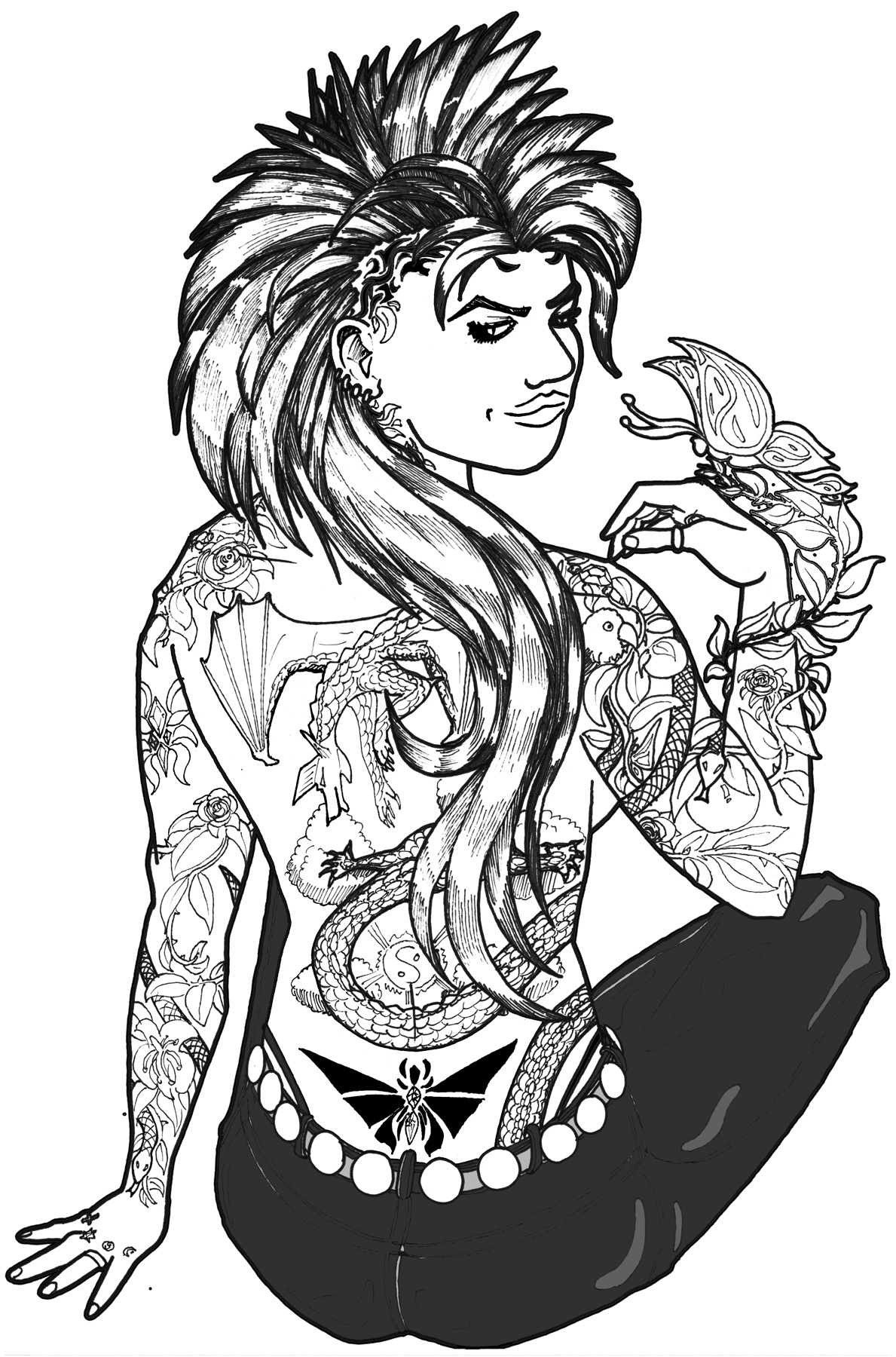
That's Dakota Frost, in the flesh, penciled and inked by me, based on my own sketches, internet references for the Mohawk and tattoos, and the body of my lovely wife, who was kind enough to model for me.
I had to do some promotional flyers for Frost Moon, have talked to the publisher about a frontispiece; this may be it.
-the Centaur
Labels: Artworks, Dakota Frost, Dragon Writers
Comments:
Wednesday, May 06, 2009
Recreating Artistic Accidents

The Library of Dresan logo is an example of this: as I recall, I played around with larger logos in varying degrees of transparency and shading but didn't like them. I then made a smaller, shrunken copy of the logo, intending to delete the original once I had the little one positioned. However, I found I liked the small logo superimposed on the larger one so much it became the basis of the logo design you see above. The left-to-right fade is another happy accident I capitalized on - I was trying for a flat fade and hit the wrong setting.
When I was satisfied with this logo and look I then made specialized logos for various areas of the site - most of which you never see because they're off in obscure corners like Research. To make the name of each area stand out, I swapped my name onto the top and the area description to the bottom, requiring the change in the font size you see below in the Research logo. In some respects I liked this logo even better than the original Library logo, but didn't use it on my main site because I thought it made my name too prominent.

But recently as I was redesigning the site I was playing around with a prototype that was in the Research space, and looking at the logo I decided to take the recommendations of all those people who have suggested putting your name prominently on your own site (I know, duh, I shouldn't have needed Jacob Nielsen and Ayn Rand to tell me that, but at least now I've come around). But I had a problem: I no longer had the original source file from which I generated these logos.
Actually, that's not quite true. At first all I thought I had were the finished image files, which had glows which made them hard to edit in Painter or Photoshop. But eventually I dug around and found the original Xara files. But that was a problem: Xara doesn't work on the Mac, unless you're willing to compile it yourself.
So I tried Xara on my Windows Vista partition, and then found I didn't have the fonts I needed - in particular, Caeldera and Papyrus. Oddly, these fonts which I use so much were not embedded in my huge font library I've built up over the years - apparently they were put on some earlier system as part of a program which I didn't install on my Boot Camp Vista partition.
I struggled with the Xara files on Windows Vista for a while, then eventually decided to recreate the logo on the Mac in Corel Painter XI, a program I love but which is no more a vector graphics program than Xara is a natural media program. My results were mixed, as you can see below:

The Mac version of Papyrus had different sized capital letters, making the logo come out the wrong size. Worse, Painter had fewer options for playing with transparencies and glows, making it harder to experiment with the glow around the letters to get it right - causing the background to be too saturated and the black text to come out too blocky. Even worse still, I did this logo on my laptop, only to find out later its color balance was off.
But at home, my wife's computer has Windows Vista with the right version of Papyrus, and I was able to find a free version of Caeldera to fill in for the one in the huge font library I've built up on my primary laptop. Corel Painter is wonderful, I love Photoshop, and Adobe Illustrator is great, but for speed there's nothing like Xara. In less than thirty minutes I had essentially recreated the Research logo and saved it in a happy vector form that I can easily modify in the future. It isn't perfectly what I want, but it is easily modifiable; and so in mere minutes I modified it to serve as a new logo for the site, which you can see below:

The moral of the story? Taking advantage of happy accidents is great ... but make sure you write down the steps that got you there and capture all your dependencies, or recreating your accident later may make you rather sad.
-the Centaur
Comments:
Sunday, February 01, 2009
A Fail Full of Win
Our results: FAIL. But it was a good failure. As far as final product went, we didn't have much to show: each of us produced around two finished pages. I was just shy of finishing my second page when I quit at 9:30am, Jon finished 2 when he quit at 5, and Nathan had finished two pages and two half pages when he quit around 8:30. But the byproducts were far more impressive.
I produced a complete story, 26 complete pages of storyboards, and two pages of script for the trickiest dialogue sequences. Jon also produced a complete story, 24 pages of storyboards, and about 5 pages of script. Nathan had a complete story, but during the completion of the pages he became increasingly ruthless about his story and became convinced that he could restructure it better to tell a better story - so he perhaps learned more about his process than any of us.
What I learned about my process is that I'm getting better about taking story ideas, extracting a theme, structuring the plot around the theme, and condensing them to the right size; but I'm still inspired to tell stories much larger than my target lengths. And beyond that, I need to practice drawing: practice faces, practice bodies, practice hands, practice animals, practice everything. I was constantly looking online and in my extensive library for reference models to help me draw things that I should have learned and internalized by now. Admittedly, for the past two years I've been focused on writing, not drawing, but art is made by those who make it, not those who make excuses.
Since we're not done, we've agreed to finish the comics over the next 24 days and then have a party to share the finished comics with our friends. Technically these won't then be 24 hour comics; they're more "Comics inspired by the 24 hour comic day experience." But they will be OUR comics, they'll be finished, and we'll all have one more creative work under our belts.
Ad tractus!
-the Centaur
Labels: Artworks
Comments:
Saturday, January 24, 2009
Fanu Fiku is Back Up
Labels: Artworks
Comments:
Wednesday, December 03, 2008
Fanu Fiku and Dresan.Net...
-the Centaur
Comments:
Friday, November 07, 2008
Yes I know Fanu Fiku is down...
... I'm working on it. It also affects dresan.net and all the other people I know using the same hosting provider. Stay tuned.
-the Centaur
Comments:
Studio Sandi Updated
My wife's site, Studio Sandi, has just been updated with a lot of her new art and many more samples of her faux finishing work. If you live in Atlanta, New York or California and don't like the look of your walls, give her a call.
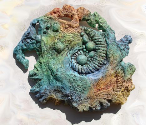
Above is one of her latest pieces in the Gigeresque series, Petrified Coral. After seeing it hanging in its first showing, I decided to buy it ... but Sandi gave it to me for our second anniversary. How sweet! Now I own two pieces in this series; the first I bought, Gigeresque itself, was also the first piece in its series, and an offhand comment by me gave it its name:
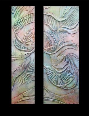
Both of these Gigeresques are hanging near my desk at the Search Engine that Starts with a G: Petrified Coral over my desk, and Gigeresque in the hall outside my office. Nice.
-the Centaur
P.S. Studio Sandi is generated by a Python script I wrote based on the code for Fanu Fiku, and allows Sandi to update her site with no programming - all she needs to do is organize her pictures into folders with a text file listing their names and descriptions, and the software does the rest. Hopefully I will release this software soon.
Labels: Artworks
Comments:
Wednesday, October 03, 2007
My ACTUAL Simspons Avataur
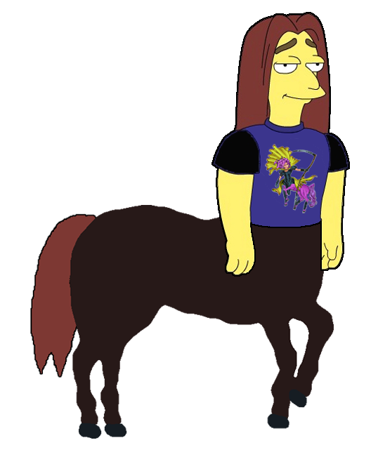
What was I thinking? That was too good a pun to pass up...
-the Centaur
Comments:
Tuesday, October 02, 2007
My Simpsons Avataur
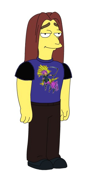
(The t-shirt of Porsche the Centaur is not available in the standard avatar shirt selection; you'll have to roll your own with your own copy of Photoshop or the Gimp).
-the Centaur
Comments:
Wednesday, June 13, 2007
Almost Certainly Magdalene Veen
After a few months of scribbling, one of those practice drawings finally turned out quite well in my narcissistic little eyes: a woman with goggles in an image I found off Warren Ellis' web site.
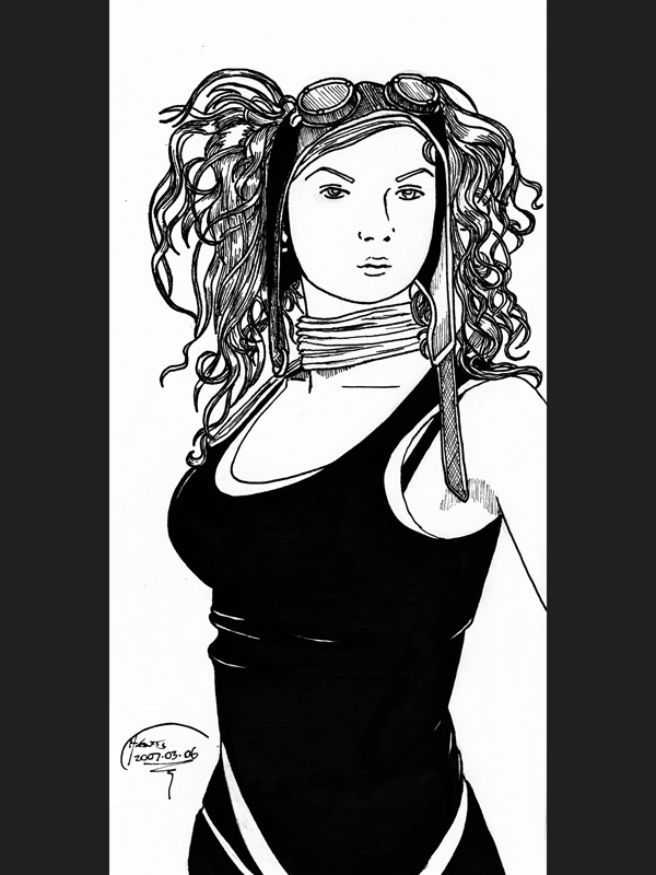
Since the original picture was off someone's personal site filled with other similar pictures, in a fit of hubris I decided to send it to the woman and/or photographer who'd put it up in case they wanted it. Unfortunately, the link was gone off Warren's site when I returned, or I no longer had the savvy or the recollection necessary to find it.
After much hunting, I have determined that this picture is almost certainly Magdalene Veen of the band Abney Park, which, as I have apparently produced fan art for them, I guess I am now obligated to go check out.
As should you all.
-the Centaur
Labels: Artworks
Comments:
The Warren Ellis is everywhere... Post a Comment
Thursday, October 21, 2004
Where oh where have my fanu gone?
But so are my hosting provider and my domain name provider for that site and at least one other site I control. So it's not just some bandwidth limit thing ....
Hmmm... more news as it happens.
Labels: Artworks
Comments:
Monday, October 04, 2004
Dreams too big for the sky
Right now most of the material on the site is preliminary
(and yes, I know there are broken links; they'll be fixed
after I finish giving a talk this week) but the storyline
for the first arc, Premonitions, begins on Monday.
(... and in case you're wondering why the story
story doesn't begin until next week... it's because I
wanted to get in the habit of forcing myself to finish
at least one page each week so I won't fall behind.
Currently I'm five weeks ahead. Let's see how long
that lasts.)
Enjoy.
Labels: Artworks
Comments:
Thursday, September 30, 2004
Fanu Fiku ... aaalmost there ...
And the young girl who can take them...
...anywhere she can imagine.
Fanu Fiku
Weekly. Starting October 4.
Labels: Artworks
Comments:
Tuesday, September 28, 2004
The Gallery is OPEN!
Kudos to Gordon for pointing out IrfanView, which made building the gallery a breeze.
And in other news, Fanu Fiku: Premonitions starts online October 4th and will run weekly. As I get ahead/behind on Fanu Fiku, I may or may not try to get Death Wish finished in online comic form as well.
Hope yall enjoy!
Labels: Artworks
Comments:
Monday, September 27, 2004
Okay, OKAY, I *get* the *point*!
Then the panel ends ... and a young lady sitting next to me asks me to do a sketch, because she liked what I was drawing so much. Then someone else commented on my t-shirt. And finally, out of the blue, while I was talking to a distributor of the fanfilm "Batman vs. Joker vs. Aliens vs. Predator vs. more Aliens vs. more Predators", he asked, "So, do you have a web site, and is any of your stuff on it?"
So, OKAY, I get the point! I'll put f@nu fiku and my other art online already. The gallery is half done, hopefully to be finished by Wednesday, and the front cover of Fanu Fiku will go up on Monday.
Stay tuned...
Labels: Artworks
Comments:
Sunday, March 14, 2004
Little Soho Midtown Street Fair
A quick note --- the community of merchants at Georgia Tech's new Technology Square at 5th and Spring Street are sponsoring a street festival. Sandi and I just returned from two days showing her art. Even though Georgia Tech is on spring break and the advertising for the fair was pulled at the last moment, we got a lot of foot traffic and Sandi sold one of her newest paintings.
The organizers of the street fair are determined to make it a success --- they want to turn 5th Street into a popular Midtown walking location on the weekends and plan to hold a street fair like this every weekend. They are actively seeking artists, musicians, vendors, and passersby to help turn this festival into a really big thing. Email rgarrison135 at aol dot com if you want to set up a table.
It runs from noonish to fiveish on Saturdays and Sundays. So check it out!
Labels: Artworks, Pointers, We Call It Living


 By day, Anthony Francis makes computers smarter; by night he writes science fiction and draws comic books. He lives in San Jose with his wife and cats but his heart will always belong in Atlanta.
Comments: