tl;dr: if the flaw is in the bones of the art, you must change its skeleton, not its clothing
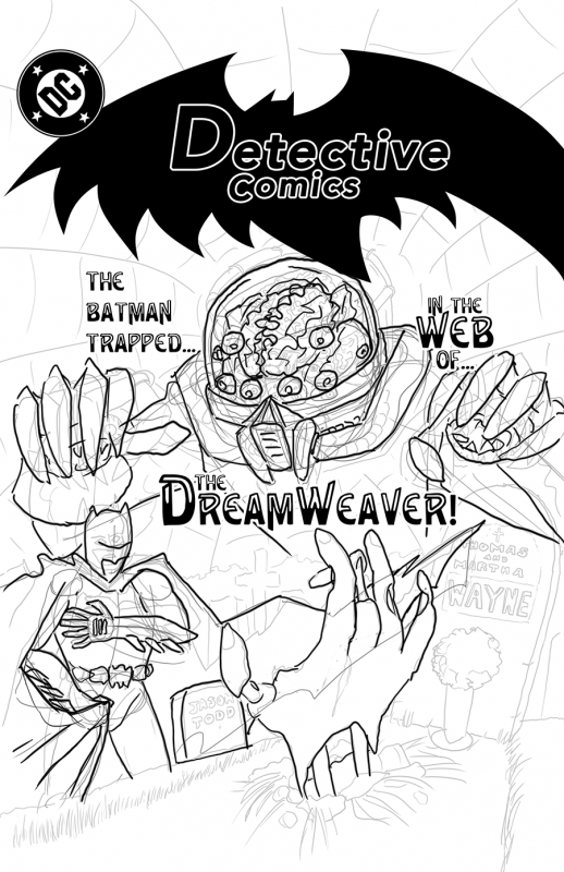
Today’s drawing is a revised layout for the “Batman 80’s style cover” page. While the previous page had more refined inks, Batman’s body posture was a bit off, and the Dreamweaver’s hands were floating about like he was Rayman. While I could have finished those inks, when I got to coloring the disembodied Dreamweaver would have posed a problem, and the misproportioned Batman would have just looked bad, no matter how much effort I put into the inks or coloring.
I’ve seen a lot of people spend a lot of effort trying to fix things with finesse or technique when the problems actually lie in the layout. If the flaw is in the bones of the art, you need to change its skeleton, not its clothing. And one of the freedoms that working in Photoshop on the Wacom Cintiq is that you can take a problematic layer, reduce its opacity to 25%, slap a new layer over it with its compositing set to darken, and — BAM — you have an instant lightbox to help you sketch a new one.
When Jim Lee got started, reputedly he spent a lot of time drawing from photo reference to help build up his skills. I’m no Batman, but nevertheless, I spent some time tonight taking reference photos of myself clutching my chest and a throw-blanket, trying to perfect Batman’s cape-grab, and other references of me villainously spidering my fingers, trying to imitate this “Dreamweaver” chap.
The result is a layout which, at first glance, looks a lot like the old one. Everything is where it was, more or less. But Dreamweaver’s hands are now attached to his body, his helmet makes sense, and Batman’s arms and cape now interact in a more realistic way. And his fingers aren’t rigid as boards, so it actually looks a bit like he’s clutching his heart.
No amount of refining the original drawing in place would have fixed these issues: Batman’s arm was too long and bent, his fingers were in the wrong place, and the Dreamweaver’s thumbs were actually out of their sockets – never mind the missing arms and shoulders. Finesse and technique only take you so far: at some point you may have to stop and rethink your layout to make real progress.
One step backward, two steps forward. Drawing every day.
-the Centaur