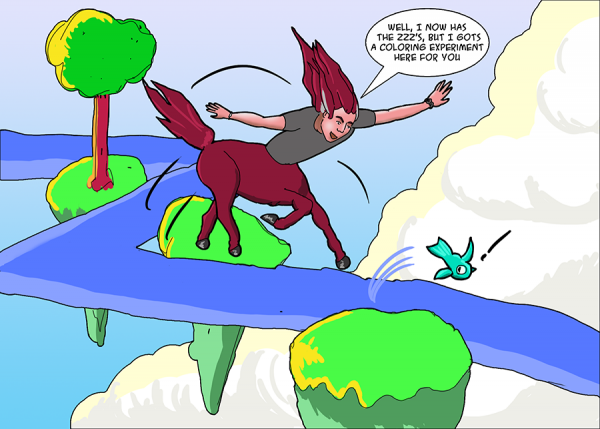
As it says on the tin. I noticed that Travis Hanson uses negative space and shading with layers of flat colors (in at least a couple drawings I happened to have on hand, not saying that’s all the time) and tried the same experiment in this little visit to the Roger Deaniverse and all its floating rocks. Though I didn’t end up using negative space because clouds were in my composition, but hey.
Ehh, not the best drawing, but it’s an interesting experiment in coloring without the normal Photoshop filters I use, but instead just using two or three colors per layer (excepting the skin tones, which had a few more and blending). I did use the “stroke” effect on some of the layers to fake inks, but the centaur and fish inks are drawn in a full inks layer, from which I took flats and then did coloring, using the select function to help me keep highlights / shadows to the right layers.
Drawing every day.
-the Centaur