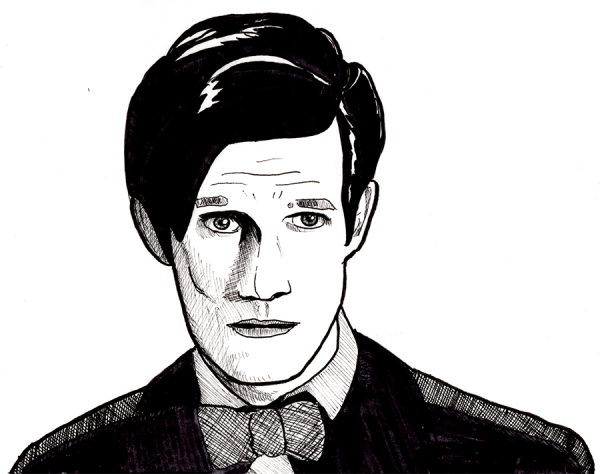
To see what was wrong with the previous day’s drawing, I traced – literally traced – the outlines of the image and then rendered it as before. To facilitate this process, I spent a good part of the day yelling at my drawing table, Photoshop, and Google Chrome. Oh wait, that came before and after what I did to facilitate the process – I took the Matt Smith image and Photoshop filtered it to bring up the outlines:
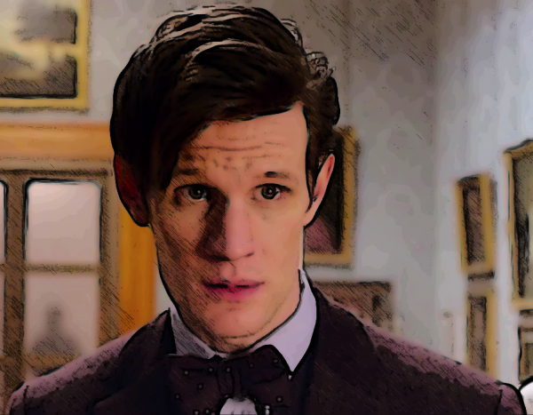
This process of mine, which you’ve probably seen on other art such as the current banner to the Library, involves duplicating the background layer, smart blurring it to create a softer look (and to make the outlining features work better), then duplicating it 3 more times and applying the following filters:
- Top layer, set to Darken, Opacity ~75%: Filter Gallery > Stylize > Glowing Edges, then Inverse
This creates a heightened set of outlines. - Middle layer, set to Darken, Opacity ~50%: Filter Gallery > Graphic Pen, often Inverted
This creates a shading layer. You may need to play with levels, contrast, or lightness, possibly with other filters, to create the necessary dark and light areas for this filter to give good results. - Back layer, set to Normal, Opacity ~90%: Filter Gallery > Poster Edges
This creates a cartoony layer; a 75% to 90% opacity lets part of the original image through to fill in tiny details to create a slightly more realistic look.
This combination creates the impression of a colored drawing. I like how it turns out, though your mileage may vary. Regardless, in this case, it punched up much of the outlines and dark/light areas of the drawing, which facilitated doing the tracing layer.
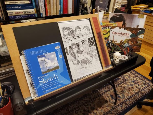
The screaming and yelling came in when I tried to compare today’s work to yesterday’s. Well, actually, it started when I tried to make a minor upgrade to my drawing setup above, a lip to prevent things from falling off; this was a pain in the ass because my nice but cheap drawing “table” had a lip so short that not only would notebooks and such fall off it, it was hard even to attach something to extend it. Yelling ensued. But eventually I did extend it, using a thin lip of oak held on by carefully angled screws:
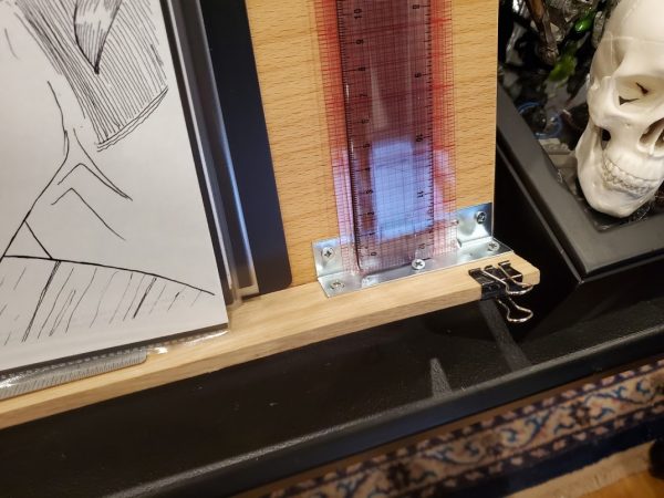
It’s a little too deep now, but that can be compensated for with a mat, whereas not having a decent lip can’t really be compensated for at all. Regardless, I drew on that tonight, and when I was done, I scanned the image and compared it.
Or tried to, as I hit a wall in my Photoshop knowledge, right when my disk filled up so I could neither undo changes, nor save files, nor really look anything up online. More screaming ensued, followed by an exhaustive closing of apps and Chrome windows. (Note to self: clean off the hard drive of your main computer, there must be some free space somewheres).
I hit the place I call “stuck in molasses” where every attempt to fix a problem creates a new obstacle (down to Chrome not even wanting to close web pages when I’m trying to free space, or web pages popping up “Would you like to sign up for my newsletter” right over the instructions as I’m reading them). This is often related to “the novice penalty” where you have all the general knowledge needed to tackle a problem but none of the specifics, so nothing you try getting started works; it can also happen to experts working in an area where they’ve grown rusty or the equipment, real or virtual, has bitrotted through disuse. The solution, I’ve found, is staying with it, focusing on an area of work, constantly seeking ways to either improve your skills, streamline your process, or eliminate blockers. As you build up this library of solutions, you reach a point where making progress is quick and easy, despite blockers.
In the end, ears ringing from yelling, I did manage to find the solution I wanted – to lighten “black” ink layers to a midscale grey prior to trying to colorize them – and that enabled me to produce this:
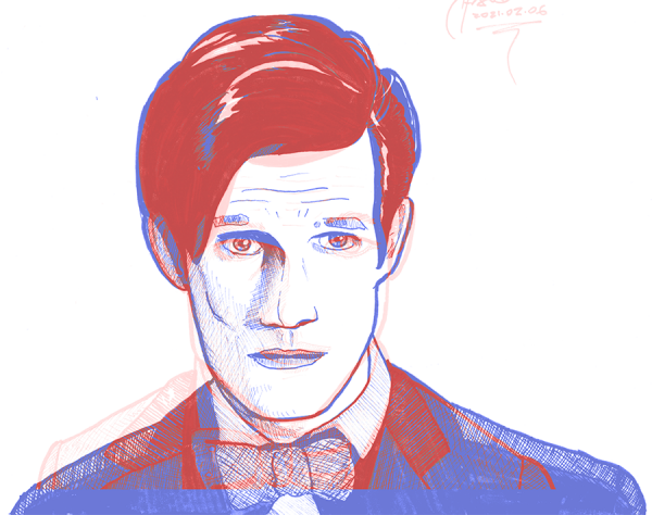
Red is yesterday’s drawing; blue is today’s rendered trace. Trying to line this up by matching nose to chin, I discovered various things:
- I got the top of the head pretty OK: Matt’s hair is roughly in the right place. That doesn’t surprise me: I like drawing hair, as all my favorite character creations are well-coiffed.
- I was correct in thinking I’d gotten the eyes too wide.
- I tend to exaggerate chin shapes, or at least I did here (and even in the trace before I caught it), leading to the too-wide original face. Human heads are narrower than I tend to draw them.
- I underestimate shoulder shapes, or at least I did here, or, more accurately, only Matt Smith could make someone as totally ripped as he is look like a goobery old professor.
Well, now I have some more things to work on. Onward!
Drawing every day.
-the Centaur
P.S. You may be wondering, “Yelling until your ears are ringing … are you OK?” No, no I’m not. Welcome to the pandemic, which is actually the least of my problems. Thanks for asking!