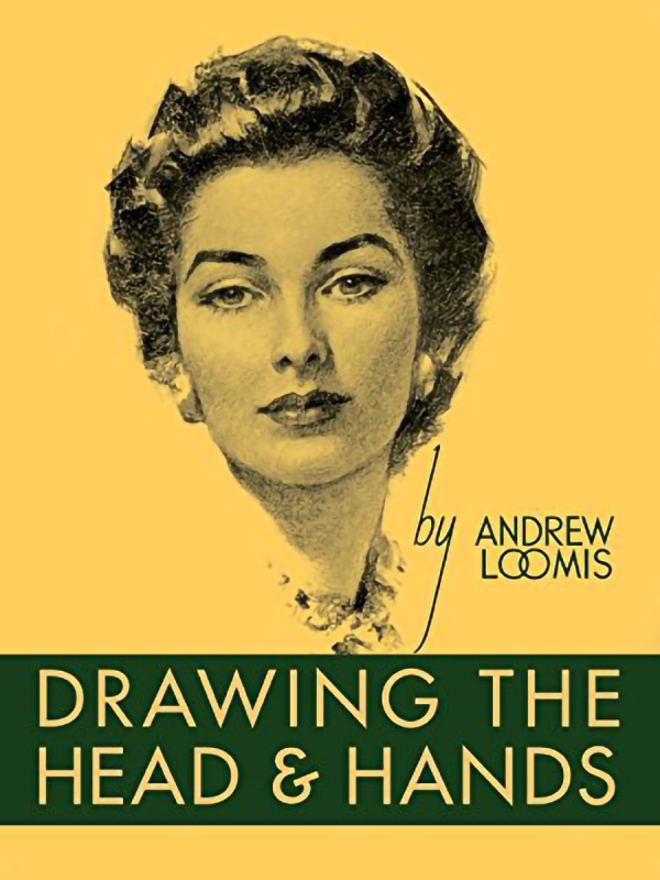
Quick Sharpie sketch of the cover of Drawing the Head and Hands by Andrew Loomis. Whenever I’m having trouble grokking something, I usually do best if I go back to the beginning and review my fundamentals, so I searched through my collection of drawing books and started with this one. I like Loomis’s work: while it is old school, he draws well and communicates well about how to draw. In this case, I’m going to try to methodically go through the book, as I started to a while back with his Figure Drawing For All It’s Worth, which is perhaps my second favorite art book after Wizard’s How to Draw: Getting Started.

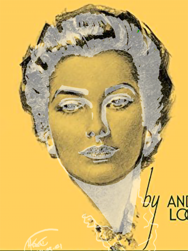
In this case, I haven’t even cracked open the book, or even tried roughs: to free up some time to chill on my Saturday night, I just started with a quick Sharpie sketch to warm up based on the cover. It’s tricky, as you need to make bolder choices on what is shade or not when using a Sharpie, and Loomis is using several levels of value here. Nevertheless, the result is … not terrible, though Sharpie resolution limits the drawing, and I missed some delicateness of the face’s features. But on a closer, side-by-side inspection, you can see some of the flaws more clearly:

Lining up the nose and mouth (which matched best, shown in light grey above) revealed three or four things right off. First, I had missed a tilt to the head (corrected in the side-by-side above). Second, I had made the mouth too small and high compared to the jaw (in the correction, this shows up as the jaw being too low, but the real problem was the reverse, as I started with the jaw; the eyes being too high is another part of this overall misestimation of facial features). Third, the hair is too small, showing I’m decent locally, but not great at getting the overall page distances – what I call the “landscape” – correct. This means a feature may be OK, but their relationships may be bad.
Fourth, I’m still having control problems on drawing lines. You can see this most easily with the left eyebrow. Three out of four of my lines land where I want them to, and the fourth seems to pop to a wholly different place. Perhaps this is just a need for practice, practice, practice, but given that I have a history of RSI issues, I plan to keep an eye on this.
Nevertheless, I enjoy the Sharpie sketches, because they’re quick, you have to commit, and you get near-immediate feedback about whether the ideas you’re trying are working, as opposed to various forms of full render, where I can get lost in the trees without realizing I’ve set the forest on fire.
Drawing every day.
-the Centaur