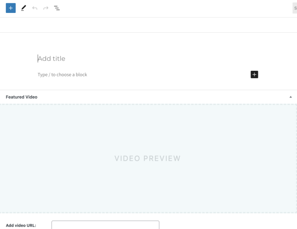
Above you can see the latest nonsense: today this is what the “new” Gutenberg editor on WordPress started showing me when I start trying to write a post. There are no text controls, the place to write is tiny, and most of the page is taken up by a “Featured Video” section that I have never seen before and never use.
I haven’t updated WordPress recently. I’ve never, that I can recall, used the Featured Videos feature, and certainly haven’t done so in the past ten or so posts. Yet the editor appears in this mode, even if I refresh the page to get a clean view. I just want to edit a document! Why is this interface doing everything but that?!
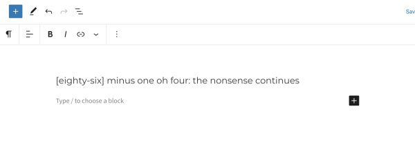
For clarity, below you can see the normal view I get when creating a post: a place to type text, along with text controls, with the video editor present only as collapsed bar (not visible in the normal view, but it’s still there, way down on the bottom of the page).

Back in the old days, the industry promoted standards for keyboard shortcuts in menus so they would be easy and consistent to use – but early in the history of the Macintosh, Apple failed to deliver these in a point update, and started pushing the idea that we didn’t need keyboard shortcuts, just the mouse. It’s now even hard to find information on these standards, much less the articles that documented how they disintegrated – it’s like these articles got scrubbed from the web, but it’s more likely the original sites are gone, and any few that remain are now lost in a deluge of helpdesk articles on keyboard shortcuts.
Back in the old days, the industry promoted borders for windows to resize them, visible scrollbars to do things, and buttons with tooltips – but then a flood of print design people flooded software development after the introduction of the web, and the so-called “clean” look of print began to be applied to our tools. Nowadays, to resize a window you have to aim for its literally zero-pixel-wide edge, you need to dig in the settings to make toolbars appear, and finding the controls in an interface is a game of Where’s Waldo, except Waldo is invisible most of the time, and sometimes moves around the screen to avoid your mouse.
These things aren’t happening because software creators are trying to make their software usable: they’re happening because they want to feel good about how it looks. Let’s stop trying to make “user experience” happen: it’s the wrong direction for software tools that people use, which requires a focus on usability.
The first test of your software is whether people can use it.
Usability is king, and only usability is usability.
-the Centaur
Pictured: The Gutenberg editor, which decided to start today in a mode I’ve never seen before. :-/