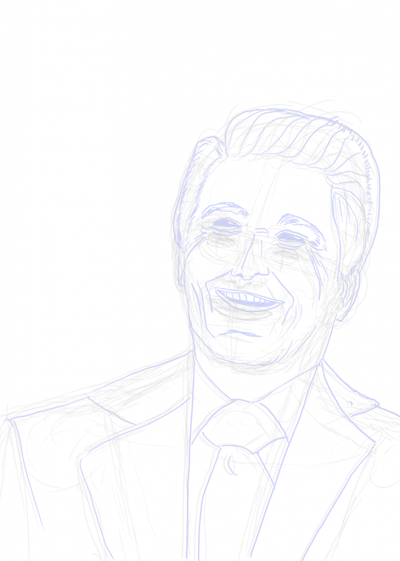
Who’s that? Another exercise in trying to make a face look like a face. This is a new set of techniques based on Erica Henderson of Guilded Age and The Unbeatable Squirrel Girl. According to Wikipedia (original article here) she sketches on a Cintiq using Paint Tool Sai, liberally exploiting the Undo feature to get the sketch right; then she prints this out in blue-line and inks over it, exploiting the ability of Photoshop to remove the blue-lines once scanned.
I tried the same thing here, using Photoshop rather than Paint Tool Sai, and using both Undo and Puppet Warp on various layers to move things around until I had a good sketch, which I printed in blue (greyscale lines below were removed prior to printing, this just shows the evolution):

Actually, I inked this in black, then (roughly) followed the guidance in this YouTube video to first turn one layer to grey, then from grey to light blue. Printing just the blue-lines on 11×17 paper and inking over that gave me a lot of control, and thanks to Graphic Design Stack Exchange I found an easy way to make the blue go away by converting to CYMK, using Curves to push down the Cyan and Yellow layers, then Channels to suppress Magenta and just get the Black channel without the blue lines, which can be copied and pasted into a new grayscale or RGB document for further processing or inking. Levels brought the inks up to the desired level of darkness, approximating the original physical inks.
As for whether it looks like a face …

… I’m still rating this a “meh”. I’m still having trouble landing the overall map of the face – not say the curves at point A or B or even the overall outline, but the relationship of the various parts so they’re correctly sized with respect to each other and properly angled with respect to the original.
Still … drawing every day.
-the Centaur
P. S. Gosh it is drawing a super wrinkly face and making it turn out right. I hadn’t realized how much of Reagan’s distinctive look was not just the shape of his face, but all those genial wrinkles.