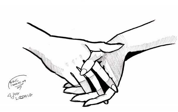
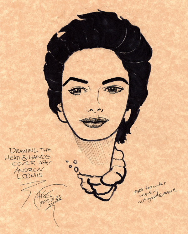
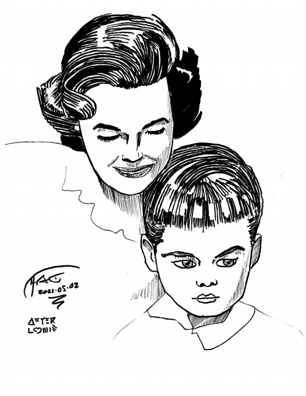
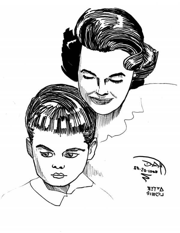
Clasped hands from the title page of Drawing the Head and Hands by Andrew Loomis. While this was from a full drawing after pencil roughs, I did simplify the rendering to use just five primary levels of value (white, black, two levels of crosshatching, plus the ink outlines of course) to make it easier on me.
The outcome: not ... terrible, but not great. I'm not going to include a scan of the original as it is inside the book, but for comparison, here's my attempt at this drawing from two and a quarter years ago:
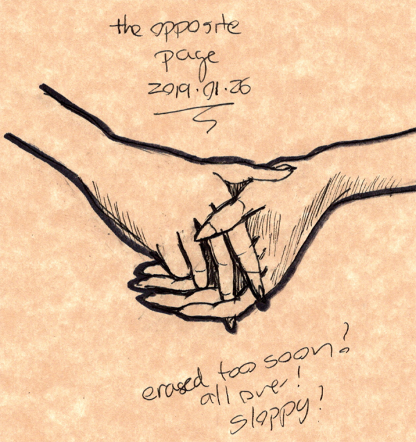
Admittedly, this drawing was much smaller than the new one, but the old one is still pretty sloppy. It does have a nice energy to it, and the dark outlines I use as a crutch make the old drawing pop.
Still, both of these fail to catch something about the barely visible palm of the left hand (in this picture, the left hand is on the right side of the drawing, and the palm is just barely visible at the edge of the index finger) which shows up perfectly fine in Loomis's drawing with just a few lines. This is definitely one of those times where flipping the drawing 180 makes it easier to see the true shape.
Maybe that's a sign of a really good drawing: it can look better when rotated or mirror reflected than the original. I sure have a long way to get there.
Drawing every day.
-the Centaur.
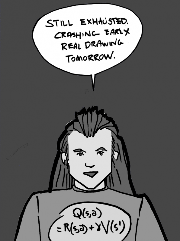 Mostly vaccine recovered, but didn't sleep well. Pretty tired, crashing out early.
Drawing every day.
-the Centaur
Mostly vaccine recovered, but didn't sleep well. Pretty tired, crashing out early.
Drawing every day.
-the Centaur 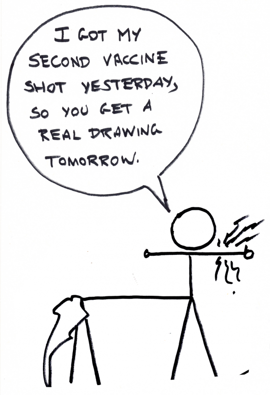


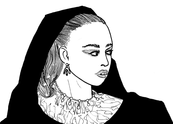 Quick sketch of FKA Twigs. Despite my best efforts redrawing the face 2-3 times in non-repro blue, her features swam towards the bottom right of her face, and her jaw isn't angular enough. Features being good relative to each other but poor with respect to the face seem to be one of my problems. This one might be a good candidate for a trace of the picture in vellum to see the difference between the lines I drew and the lines that are actually there (insofar as lines exist in pictures, which they sorta don't).
 Drawing every day.
-the Centaur
P.S. 300+ words so far, will try to push a little bit more before crashing. Only ~2700 words to go for the month.
Drawing every day.
-the Centaur
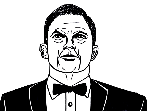
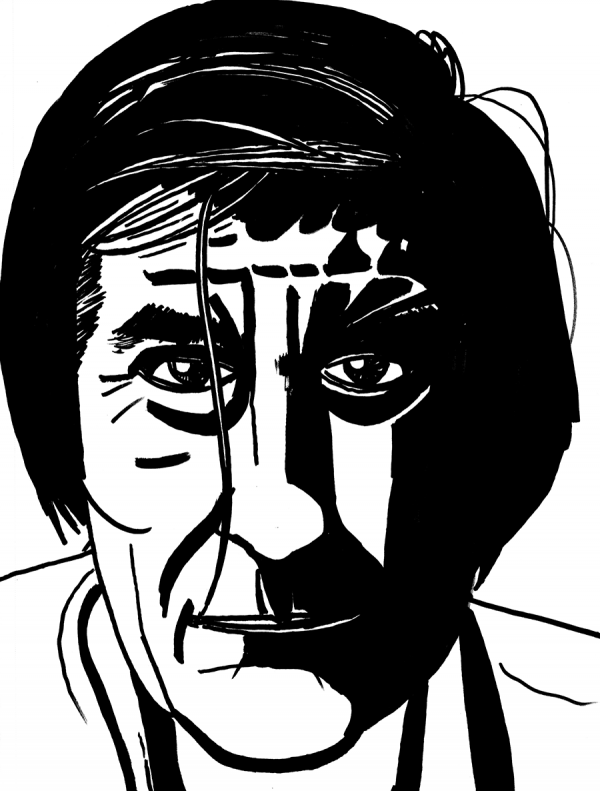
P.S. 300+ words so far, will try to push a little bit more before crashing. Only ~2700 words to go for the month. 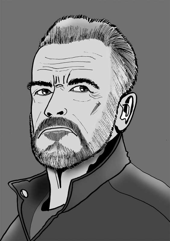 Another quick sketch of Arnold Schwarzenegger, again roughed with non-repro blue, but this time more properly rendered with Sakura Graphic 1 and Micron 03 and 08. I was wondering if the sketch would turn out better if I properly rendered it, even quickly, using finer instruments than a Sharpie.
 Head tilt is not quite far back enough, but ... it looks better rendered in something less blunt than a Sharpie.
Drawing every day.
-the Centaur
P.S. And 2000+ words, only ~3000 left for the month. Go nano!
Head tilt is not quite far back enough, but ... it looks better rendered in something less blunt than a Sharpie.
Drawing every day.
-the Centaur
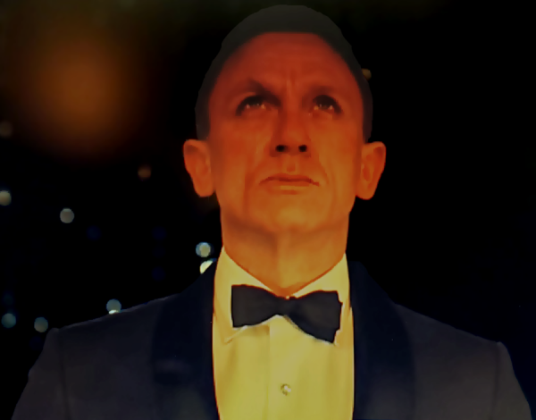
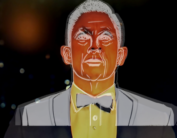
P.S. And 2000+ words, only ~3000 left for the month. Go nano! 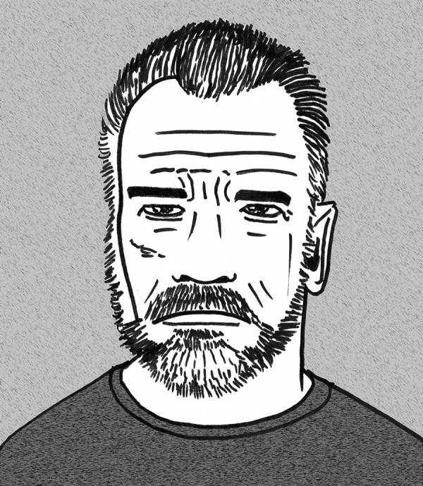 Quick Sharpie sketch of Arnold Schwarzenegger, roughed first in non-repro blue as I really wanted to work on the eyes and landscape first, then cleaned up and very lightly shaded in Photoshop as it's late and I want to turn in. Eh, the eyes are still a notch too big, and lopsided, despite my efforts, but, it's not as completely terrible as some of the other sketches.
 Drawing every day.
-the Centaur
P.S. and 2400+ words too.
Drawing every day.
-the Centaur
P.S. and 2400+ words too. 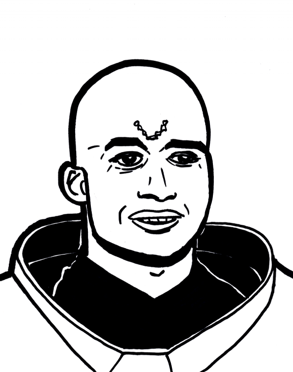 Suuuper quick Sharpie sketch of a character from Stargate. Not terrible, but I think I need to focus on getting that egg shape of the human head a little bit more consistent (and one of the eyes got squished, but then, it's a suuuper quick Sharpie sketch without any roughs).
 Drawing every day.
-the Centaur
P.S. Wrote 3600+ words today (and 8100+ words yesterday, when all was said and done).
Drawing every day.
-the Centaur
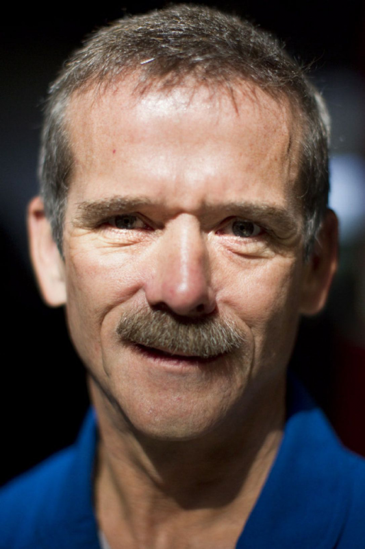
P.S. Wrote 3600+ words today (and 8100+ words yesterday, when all was said and done). 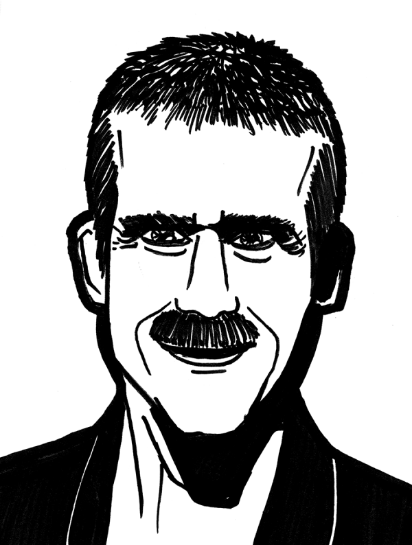 Astronaut Chris Hadfield, roughed in non-repro blue and then quick-sketched with a Sharpie. The face is ... way off to me. At first I couldn't see what was wrong, other than it was wrong; then later, I think the real Chris's head is more egg-shaped, even though it is pretty angular, and his eyes are farther apart. Once again, I think I got caught up in the micro-details instead of the overall architecture.
 But then I did write 5900+ words so far today, so I feel good about that.
Drawing every day.
-the Centaur
But then I did write 5900+ words so far today, so I feel good about that.
Drawing every day.
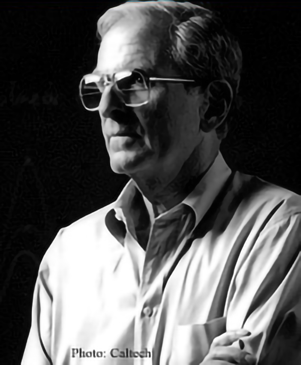
-the Centaur 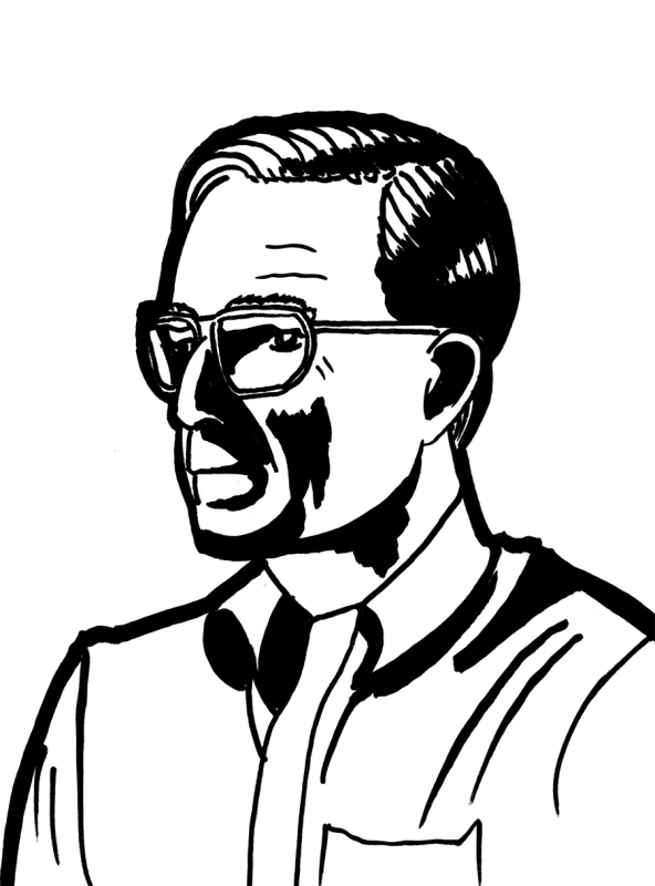 Quick sharpie sketch of David Goodstein, from The Mechanical Universe science TV show (and many popular books). I loved The Mechanical Universe; it's what I watched prior to reading The Feynman Lectures on Physics. Again used the non-repro blue to rough it, focusing very, very hard just on the shape of the face and not the rendering. I actually like how the shape came out.
 Drawing every day.
-the Centaur
P.S. And wrote 2300 words too.
Drawing every day.
-the Centaur
P.S. And wrote 2300 words too.
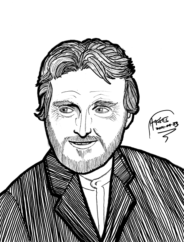 Vincent van Gogh from "Vincent and the Doctor". Roughed in non-repro blue on Strathmore 9x12, outlined in Sakura Pigma Graphic 1 and rendered in that and Sakura Micron 08, 03, and 005, plus Sakura Pigma Brush. I erased part of the non-repro blue to try to clean it up, which ended up being a mistake as it destroyed some lines, leaving white marks through the drawing; however, using Photoshop's Black and White feature with cyans almost taken to black and blue taken to white, it dropped out the blue while adding a nice warm shading to it.
Overall, not bad, though I am still squashing heads even when I am explicitly trying not to squash heads, and ending up with slight asymmetries, particularly in the left side of the beard, when I am explicitly trying to avoid that. But at least the eyes are not totally oversized this time.
Vincent van Gogh from "Vincent and the Doctor". Roughed in non-repro blue on Strathmore 9x12, outlined in Sakura Pigma Graphic 1 and rendered in that and Sakura Micron 08, 03, and 005, plus Sakura Pigma Brush. I erased part of the non-repro blue to try to clean it up, which ended up being a mistake as it destroyed some lines, leaving white marks through the drawing; however, using Photoshop's Black and White feature with cyans almost taken to black and blue taken to white, it dropped out the blue while adding a nice warm shading to it.
Overall, not bad, though I am still squashing heads even when I am explicitly trying not to squash heads, and ending up with slight asymmetries, particularly in the left side of the beard, when I am explicitly trying to avoid that. But at least the eyes are not totally oversized this time.
 Drawing every day.
-the Centaur
And just ~600 words too, though much of today was cats, taxes and work. Taxes are submitted to the accountant, the cat is home from the vet after a nasty gastrointestinal scare, work is progressing (RL is hard!), and Dakota Frost is having a great time doing SPOILERS with SPOILER, so, no excerpt for you.
Drawing every day.
-the Centaur
And just ~600 words too, though much of today was cats, taxes and work. Taxes are submitted to the accountant, the cat is home from the vet after a nasty gastrointestinal scare, work is progressing (RL is hard!), and Dakota Frost is having a great time doing SPOILERS with SPOILER, so, no excerpt for you. 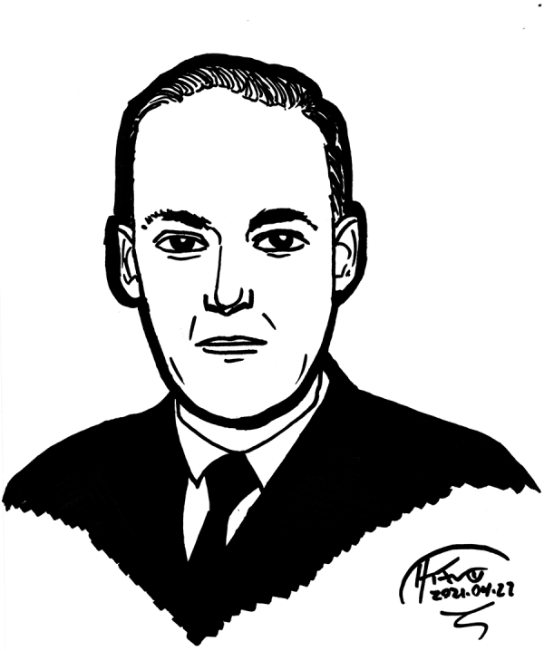 Quick sketch of H.P. Lovecraft. Not ... terrible ... per se, but I squashed his head, and there's something about the face that's wrong that also bothers me about the faces drawn by Steve Dillon in Preacher. Don't get me wrong - I love Preacher and Steve Dillon's art, but something has always struck me as slightly off about the faces in Preacher, and the same thing is going on here. If I knew what it was, I could probably fix it. But I don't, so I guess I just have to keep practicing.
 Drawing every day.
-the Centaur
P.S. 1800 words. Getting back on track on Nano.
Drawing every day.
-the Centaur
P.S. 1800 words. Getting back on track on Nano. 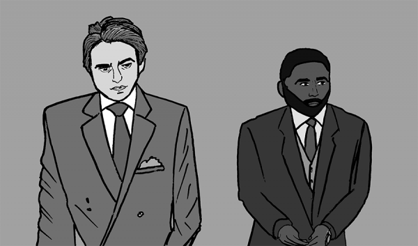 Super quick sketch of Neil and the Protagonist in one of the most iconic shots from Tenet. Roughed with blue pen, sketched with Pigma Graphic 1 and Pigma Micron 08 and 03, scanned, de-blue-lined, and rendered in flat grayscales in Photoshop. Robert Pattinson is OK, maybe a little of the angularness of his head lost and a slight bloom in the jacket, but I appear to have squashed John David Washington's head.
 Eh, it's a quick sketch. Gotta get back to taxes and writing.
Drawing every day.
-the Centaur
Eh, it's a quick sketch. Gotta get back to taxes and writing.
Drawing every day.
-the Centaur 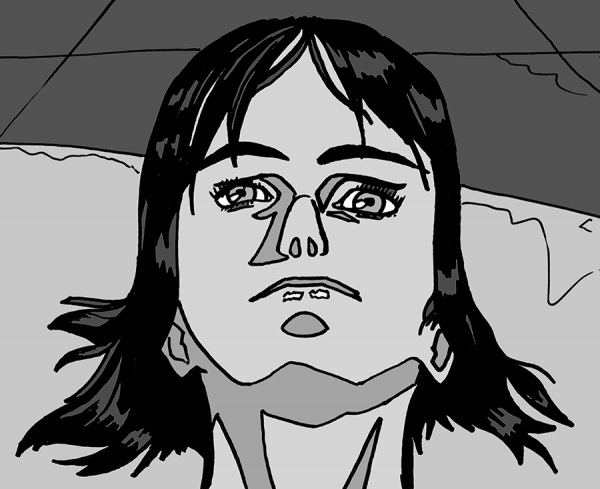 Quick Sharpie sketch of Motoko Kusanagi from Ghost in the Shell, post-processed in Photoshop to get the cell shading. The left eye ended up warped, the overall face is stretched down compared to what it should be for someone viewed from this low angle (she's lying down on a tank, head leaned back).
 I think what's going on with the distortions and so on is that I am not consistent in comparing my lines as I'm drawing them to their parallel features. My line control requires a lot of focus and therefore is very local, which draws my attention away from the corresponding features I should be matching.
Drawing every day.
-the Centaur
I think what's going on with the distortions and so on is that I am not consistent in comparing my lines as I'm drawing them to their parallel features. My line control requires a lot of focus and therefore is very local, which draws my attention away from the corresponding features I should be matching.
Drawing every day.
-the Centaur