 tl;dr: if the flaw is in the bones of the art, you must change its skeleton, not its clothing
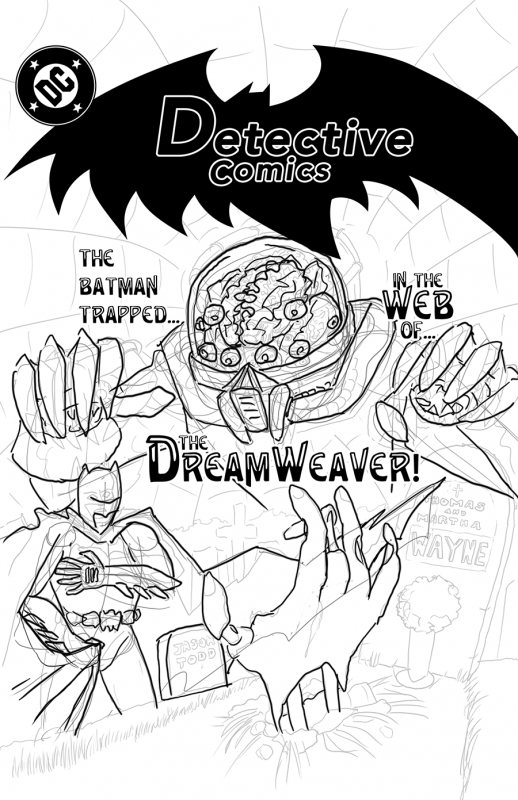
Today's drawing is a revised layout for the "Batman 80's style cover" page. While the previous page had more refined inks, Batman's body posture was a bit off, and the Dreamweaver's hands were floating about like he was Rayman. While I could have finished those inks, when I got to coloring the disembodied Dreamweaver would have posed a problem, and the misproportioned Batman would have just looked bad, no matter how much effort I put into the inks or coloring.
I've seen a lot of people spend a lot of effort trying to fix things with finesse or technique when the problems actually lie in the layout. If the flaw is in the bones of the art, you need to change its skeleton, not its clothing. And one of the freedoms that working in Photoshop on the Wacom Cintiq is that you can take a problematic layer, reduce its opacity to 25%, slap a new layer over it with its compositing set to darken, and --- BAM --- you have an instant lightbox to help you sketch a new one.
When Jim Lee got started, reputedly he spent a lot of time drawing from photo reference to help build up his skills. I'm no Batman, but nevertheless, I spent some time tonight taking reference photos of myself clutching my chest and a throw-blanket, trying to perfect Batman's cape-grab, and other references of me villainously spidering my fingers, trying to imitate this "Dreamweaver" chap.
The result is a layout which, at first glance, looks a lot like the old one. Everything is where it was, more or less. But Dreamweaver's hands are now attached to his body, his helmet makes sense, and Batman's arms and cape now interact in a more realistic way. And his fingers aren't rigid as boards, so it actually looks a bit like he's clutching his heart.
No amount of refining the original drawing in place would have fixed these issues: Batman's arm was too long and bent, his fingers were in the wrong place, and the Dreamweaver's thumbs were actually out of their sockets - never mind the missing arms and shoulders. Finesse and technique only take you so far: at some point you may have to stop and rethink your layout to make real progress.
One step backward, two steps forward. Drawing every day.
-the Centaur
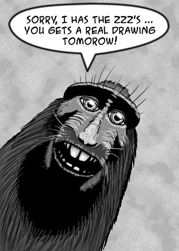 As it says on the tin: it's late and I'm tired. Based on the Monkey Selfie Copyright Dispute. Seven layers in Photoshop (not counting blank background), five of them still active, including oh I'm too tired to type, here they are:
 I go zzz now.
-the Centaur
I go zzz now.
-the Centaur 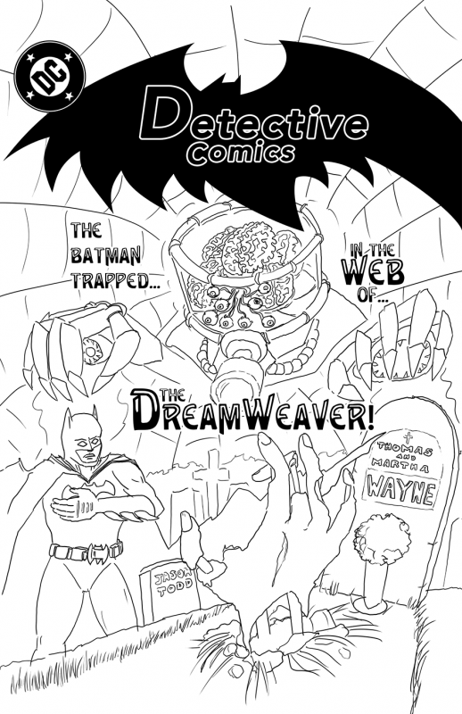 Roughs in Photoshop. Some of the limits of the original composition are becoming clearer here - like, what are the hands of our villain attached to? Has he no shoulders? Is he secretly Rayman?
Enough for now. Still, drawing every day.
-the Centaur
Roughs in Photoshop. Some of the limits of the original composition are becoming clearer here - like, what are the hands of our villain attached to? Has he no shoulders? Is he secretly Rayman?
Enough for now. Still, drawing every day.
-the Centaur 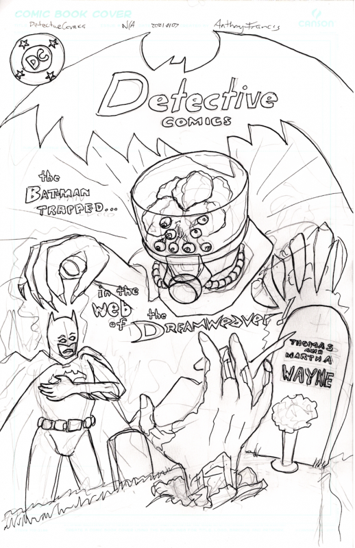 Rough sketch for a cover design a la Batman covers of the late 80's.
Drawing every day.
-the Centaur
Rough sketch for a cover design a la Batman covers of the late 80's.
Drawing every day.
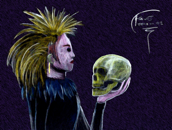
-the Centaur 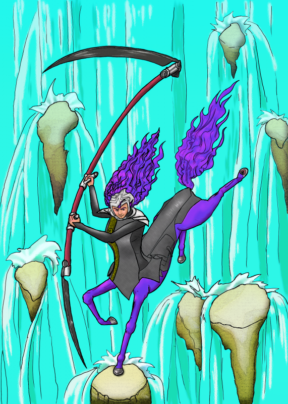 Day 11's drawing, colorized. Lots I would fix in the underlying drawing; many techniques of digital coloring I wished I had learned. But enough of that. Tired, going to bed now.
Still ... Drawing. Every. Day.
-the Centaur
Day 11's drawing, colorized. Lots I would fix in the underlying drawing; many techniques of digital coloring I wished I had learned. But enough of that. Tired, going to bed now.
Still ... Drawing. Every. Day.
-the Centaur 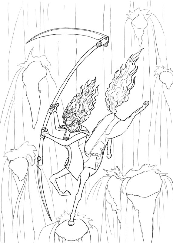 Hello, Porsche, my old friend; time to draw you again.
Getting more comfortable with the Cintiq + Photoshop + Humanscale combo. But only had time for the inks today. Colors maybe tomorrow, or perhaps another drawing.
Drawing every day.
-the Centaur
Hello, Porsche, my old friend; time to draw you again.
Getting more comfortable with the Cintiq + Photoshop + Humanscale combo. But only had time for the inks today. Colors maybe tomorrow, or perhaps another drawing.
Drawing every day.
-the Centaur 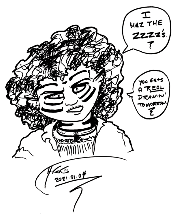 Cinnamon is tired and so am I. No-regrets quick cartooning with a heavy ink pen - a Faber-Castell "
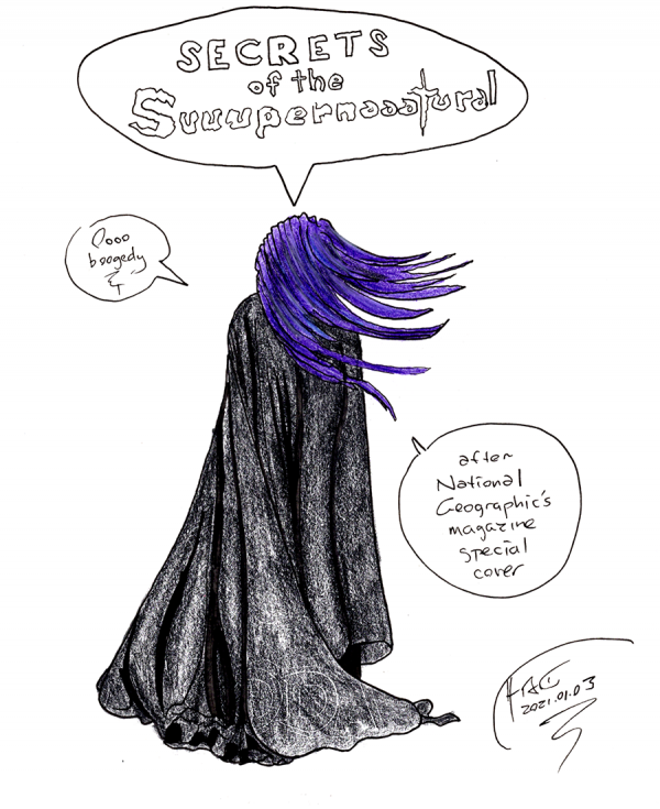 A sketch of a National Geographic magazine cover that reminded me of the vampire Lady Nyissa from Dakota Frost, Skindancer.
Yeah, I'm not liking the broad lines of these colored pencils or the roughness of the texture I can get out of this charcoal pen, especially compared to my preferred comfort zone of pencils-then-ink for line art then Photoshop for color. And you can even see a bit of the previous page, where I'd been sketching the logo to the old space furry comic Dalgoda. Ugh!
But, as my wife and I were talking ... you have to put pen to paper in order to improve. So ... sigh ... lots more work to be done improving will require lots more work that, um, sucks.
Still ... Drawing. Every. Day.
-the Centaur
A sketch of a National Geographic magazine cover that reminded me of the vampire Lady Nyissa from Dakota Frost, Skindancer.
Yeah, I'm not liking the broad lines of these colored pencils or the roughness of the texture I can get out of this charcoal pen, especially compared to my preferred comfort zone of pencils-then-ink for line art then Photoshop for color. And you can even see a bit of the previous page, where I'd been sketching the logo to the old space furry comic Dalgoda. Ugh!
But, as my wife and I were talking ... you have to put pen to paper in order to improve. So ... sigh ... lots more work to be done improving will require lots more work that, um, sucks.
Still ... Drawing. Every. Day.
-the Centaur 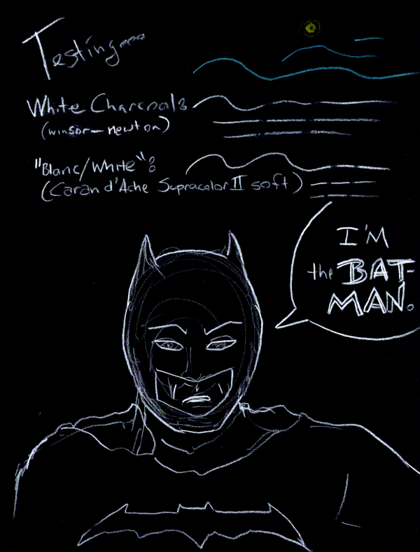 Not so successful experiments with light pencils on black paper. A consultation with my wife suggests Conté crayons or oil pastels as an alternative, but really, I think I prefer the brown paper of my other experiments as providing the best midtones. Even Photoshop couldn't salvage this one:
 The original came out pretty grainy ... these pencils just won't cut it on black paper.
 Still, drawing every day.
-the Centaur
Still, drawing every day.
-the Centaur  Bit of a rush job, as I want to turn in early tonight (and still leave a little time for Editing Every Day). Forehead a bit too high, could have used another rough sketch.
Still, drawing every day.
-the Centaur
Bit of a rush job, as I want to turn in early tonight (and still leave a little time for Editing Every Day). Forehead a bit too high, could have used another rough sketch.
Still, drawing every day.
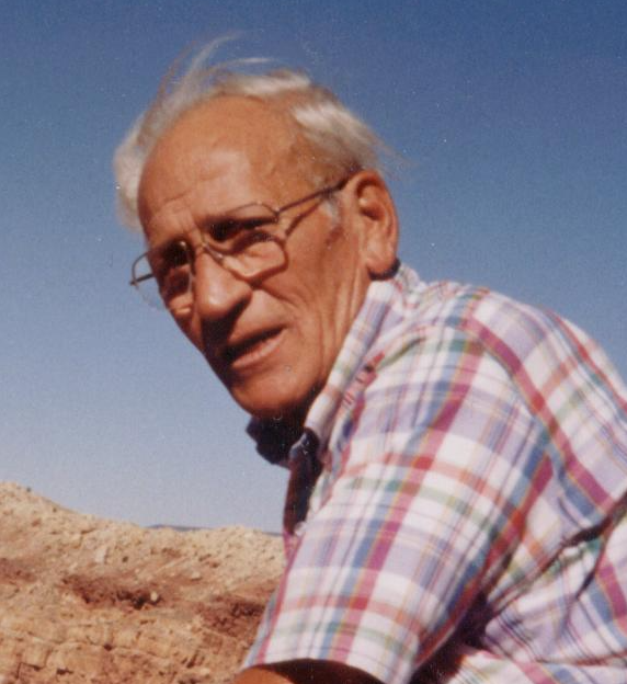
-the Centaur  Tony Francis at Meteor Crater. Sure was windy that day. Oddly, this is one of the best pictures I have taken of my dad.
Guess I enjoyed spending time with him more than taking photos!
Drawing every day.
-the Centaur
Tony Francis at Meteor Crater. Sure was windy that day. Oddly, this is one of the best pictures I have taken of my dad.
Guess I enjoyed spending time with him more than taking photos!
Drawing every day.
-the Centaur 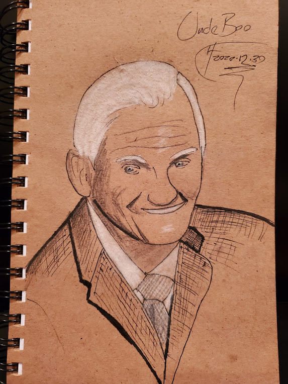 Ran out of time unpacking and organizing my library, so no digital sketch today. All I had time to do was a hand sketch of Uncle Boo, which I took on in hopes that I'd do better than the digital one (or at least figure out where I went wrong). Other than imagining connections instead of seeing and drawing them, the number one thing I walked away with was, man, I need to find and unpack my art supplies.
Though the resemblance to my dad is more striking in a drawing ...
Ran out of time unpacking and organizing my library, so no digital sketch today. All I had time to do was a hand sketch of Uncle Boo, which I took on in hopes that I'd do better than the digital one (or at least figure out where I went wrong). Other than imagining connections instead of seeing and drawing them, the number one thing I walked away with was, man, I need to find and unpack my art supplies.
Though the resemblance to my dad is more striking in a drawing ...
 Perhaps I've found my next drawing subject ...
Still, drawing every day.
-the Centaur
Perhaps I've found my next drawing subject ...
Still, drawing every day.
-the Centaur
 Uncle Boo, after his
  Bit off more than I could chew this time, attempting to do full coloring layers. Had to give up about a third of the way through because it is way past bedtime, even for me. Not happy with the sketch or the result, didn't really get to flesh this one out the way I wanted to.
Still, drawing every day.
-the Centaur
Bit off more than I could chew this time, attempting to do full coloring layers. Had to give up about a third of the way through because it is way past bedtime, even for me. Not happy with the sketch or the result, didn't really get to flesh this one out the way I wanted to.
Still, drawing every day.
-the Centaur  Little sketchier this time. But drawing every day.
-the Centaur
Little sketchier this time. But drawing every day.
-the Centaur  -the Centaur
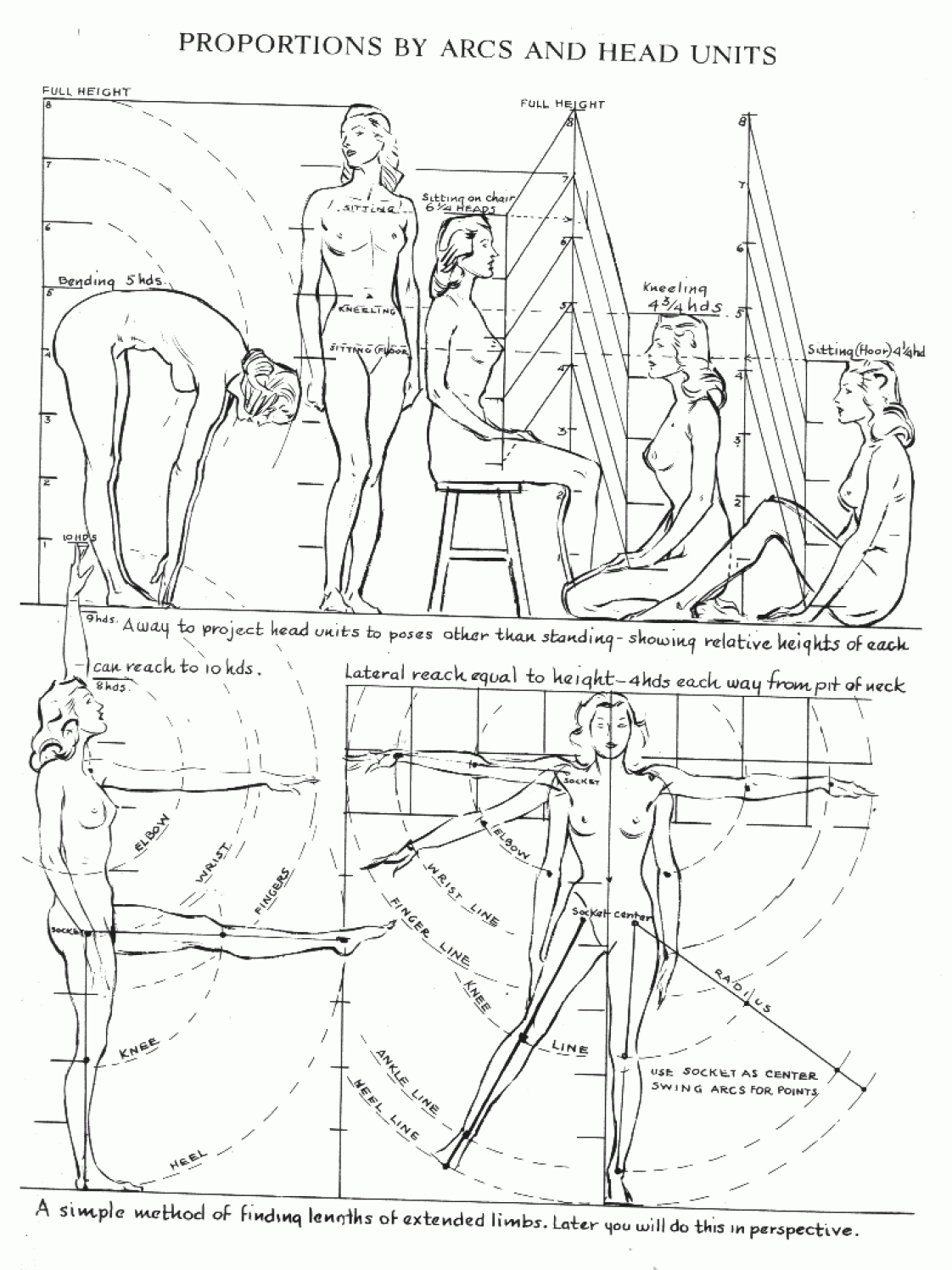
 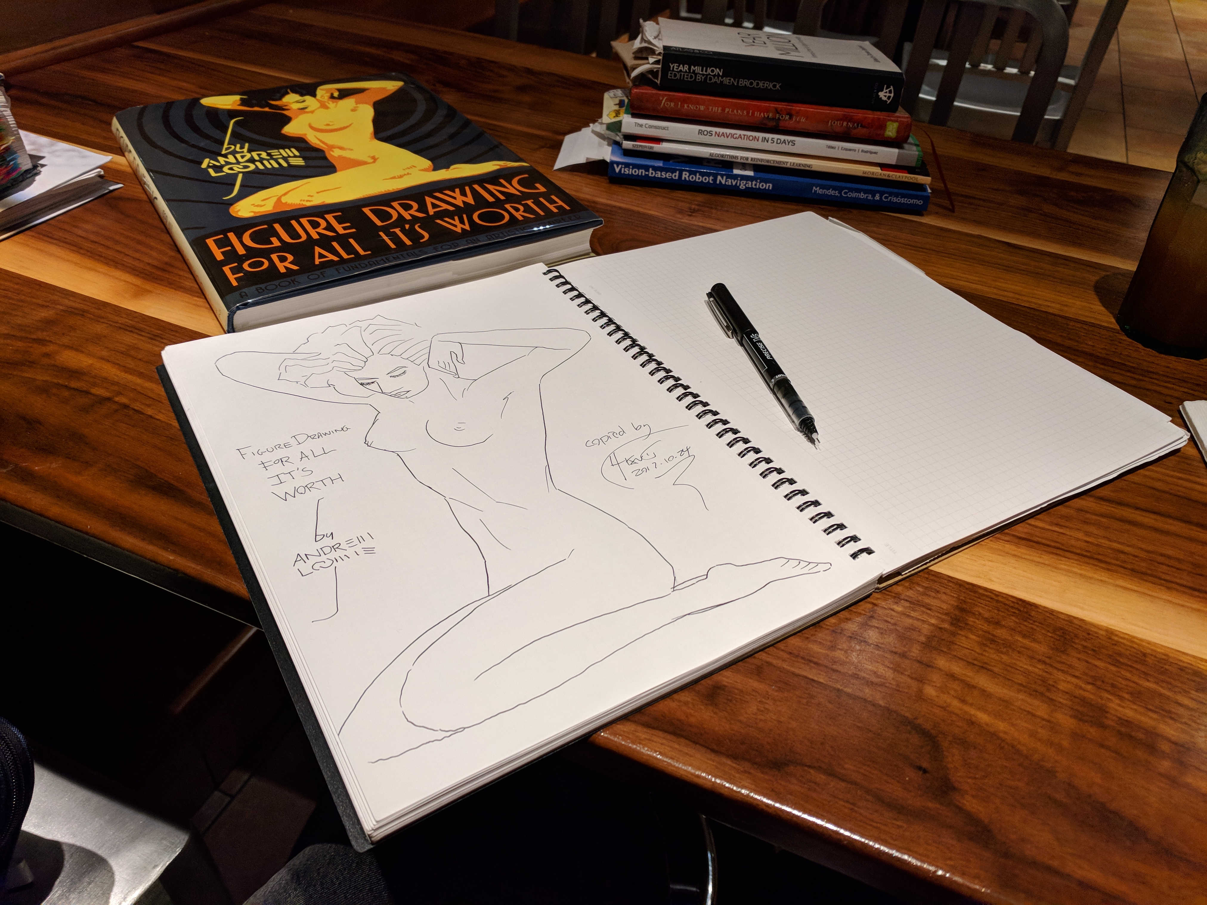 Daily Sketchworks: trying to reproduce the cover of Andrew Loomis's
 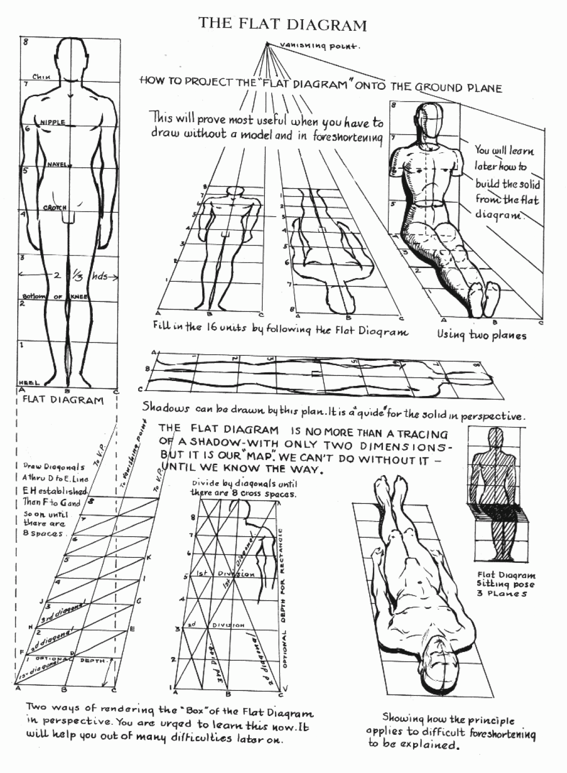 To be wholly frank, I'll use whatever tools I have to to make me do more drawing.
 -the Centaur
 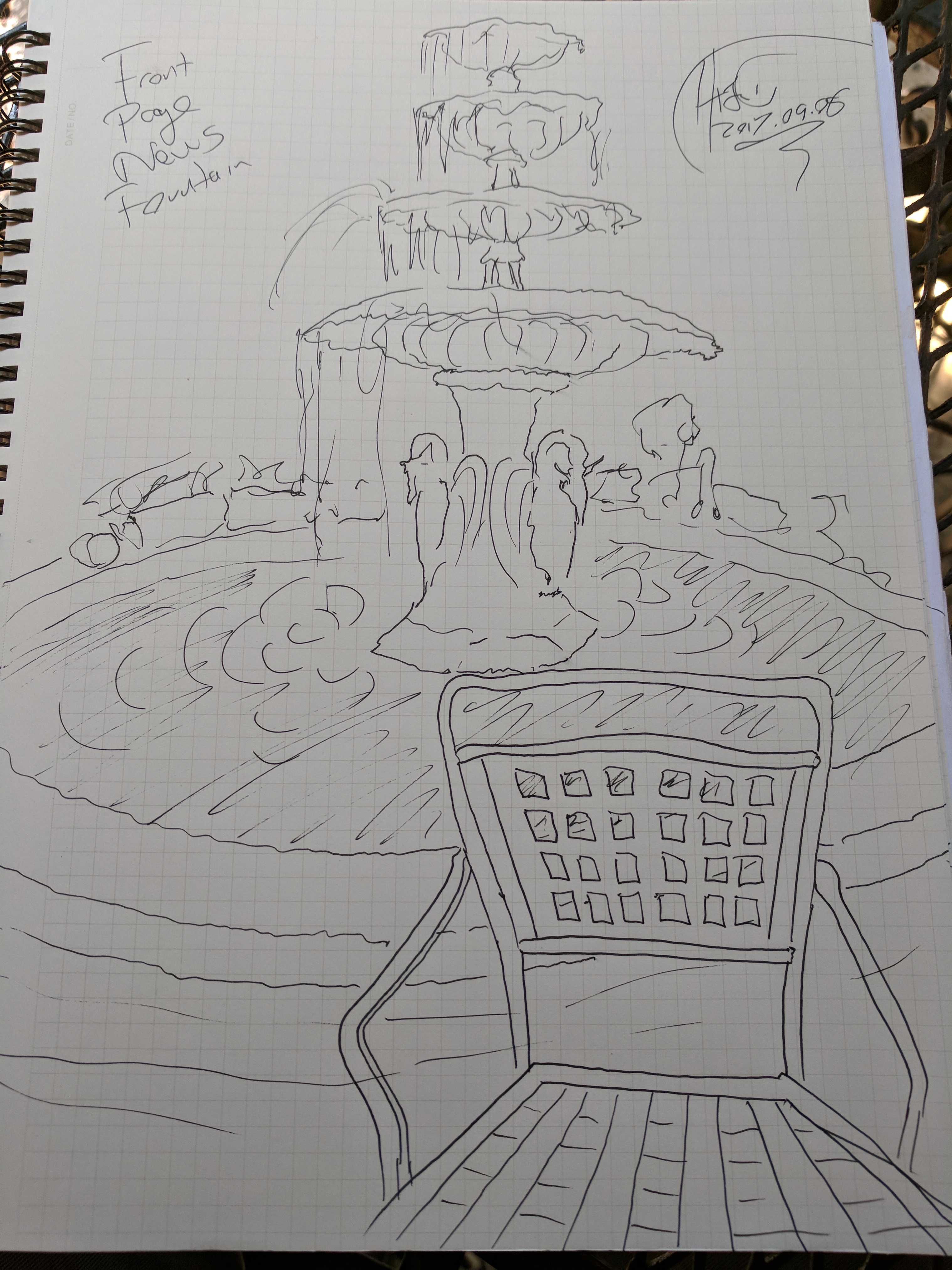 How much can you draw before they bring your food? Fountain at Front Page News L5P, again with no pencils.
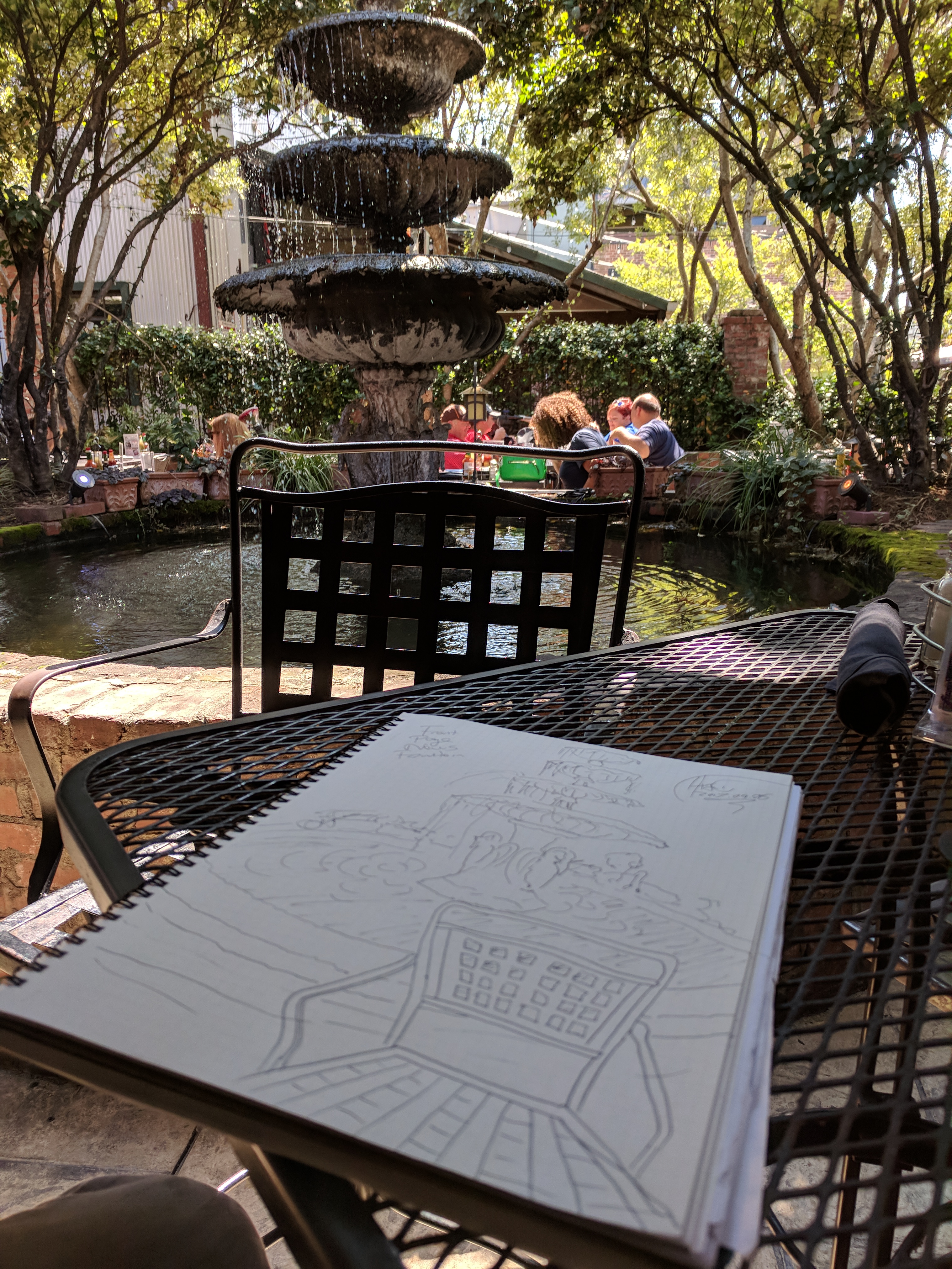 -the Centaur
 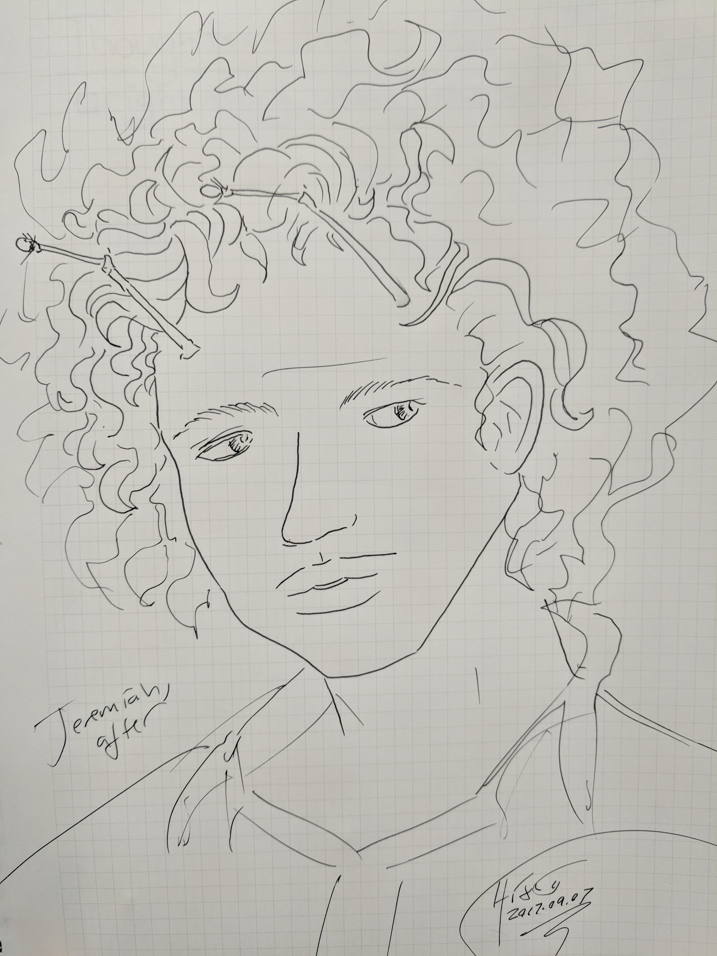 The challenge on this one: no pencils, no references, just straight freeform inking.