Press "Enter" to skip to content

Posts published in “Uncategorized”

Aptera, Not Yet In the Wild

centaur 1
Aptera is the manufacturer of an innovative new aerodynamic electric car which has appeared in the press recently. Now I've had a chance to see one in real life when on Earth Day they brought a couple of their test models to the parking lot of the Search Engine That Starts With a G:


These cars will go on sale in November, starting at $25,000ish for the base electric model, something higher for a gas model, and up to $40,000 for a series gas-electric hybrid that runs entirely on its electric motors until the battery runs out, at which point a generator kicks in.


I wasn't one of the lucky few who got test drives, and the $1M prototype wasn't set up for people to sit in it, but from what I saw of the cockpit it looked comfortable. There wasn't a lot of space in the back, however:


Aptera's car is interesting in that it is a three wheeler. Part of the reason for this is aerodynamics: Aptera started with the most aerodynamic car it could and then has been adjusting it to make it more livable, rather than start with an old style car and bubblifying it.


What's fun is watching these cars drive. I saw one slicing past me on the road as I was driving up to the demonstration in my beloved but gas-guzzling Nissan Pathfinder, and it was going so fast it looked like a bat out of hell. But they're almost completely silent:

[youtube=http://www.youtube.com/watch?v=rElKY6nBn_s]

I'm not sure it's my next car - I plan to test drive a Tesla shortly. But I'm definitely thinking about it, even though it is definitely 1.0 technology that will have a few kinks to it.

The series hybrid is most intriguing to me: if you drive to and from work everyday and charge up at work or at night, the gas motor will never have to kick in. If you want to take a road trip, however, you don't have to worry about running out of power and looking for a place to charge: the generator kicks in and you can drive it like a normal car - that is, just like a super efficient normal car that gets an equivalent of a kajillion miles per gallon.

-Anthony

Not enough hours in the day, redux…

centaur 0
I easily could spend 8 hours a day blogging. There's just too much to write about; I don't know how people like Andrew Sullivan and Warren Ellis write so much. No, wait, I do: they're paid to write, dang it, where I am paid to make search engines smell better and must squeeze my writing in around the margins.

Recently I started work on redesigning the templates for the Library, and in my giant Mongo death Todo list I have an entry "blog updates to library". But I never got around to writing the article, because I kept on getting confused about what to write first.

Then I realized that's part of my problem. The point of blogging the redesign of the Library was to expose the thought process that normally goes into the redesign of any web site, rather than hiding all of the hard work behind the covers, springing it fully formed onto the world, and proclaiming: "See! Doesn't it smell better?"

So here's the thought process that was blocking me from writing articles on the Library:
  • Anthony looks at Todo list, sees entry "Blog Update" and tries to figure out what to do with this horribly underspecified action item with no clear next action. Somewhere out in cyberspace, David Allen kills himself, then spins in his grave.
  • Anthony decides "I've got a prototype for the new design of Library now! I just need to post the darn thing and get on with it!"
  • Anthony starts work on cleaning up his Blogger template. During this process he finds he needs to figure out precisely what his Blogger template is doing, as he no longer remembers and the code is poorly documented.
  • Anthony comes up with a clever way of visualizing how his Blogger template works which itself is probably worth blogging about.
  • Then Anthony realizes that he doesn't know whether the design works well with Internet Explorer on Windows, or Chrome, or on small screens (notwithstanding my desire to support only large screens), or on super large desktop screens with different sized fonts.
  • This leads to more questions: What browsers should this work well on? How should I test this? What if there are fundamental incompatibilities between IE and Firefox?
  • Well, shazbot. I decide, screw it, let's just fix a small page somewhere and update that. So I update the Research page, which already needed an overhaul of its research statement.
  • Anthony finds a system to help him test and prototype his content which is worthy of blogging about in its own right.
  • The textual update goes swimmingly, but updating the CSS and HTML proves more of a bear, especially comparing Internet Explorer and Firefox.
  • Anthony's system for updating the content starts to show failures which are worthy of blogging about in their own right.
  • Well, shoot, now what do I do?
At this point, I have about half a dozen things to blog here: updating the Library, updating the Library's blogger template, issues with Internet Explorer and Firefox, issues with HTML and CSS, how to update your software, how to test your software, how to rapidly prototype, and how you can visualize changes to a template. So in the process of deciding to update my blog template, I accumulated far more things to blog, which at the start of this process I'd wanted to wait until after updating my blog template. I become totally confused.

But the point of this blogging exercise is NOT to go off and hide and try to figure these things out, then come back smiling with a solution. Instead, when I get stumped, that is a serious decision point in the development process and I'm SUPPOSED to write an article which says, here's what's on my plate, and boy did I get stumped.

So this is that article. And just articulating the things going through my mind gave me a sequence of things to do: now I can blog each of the elements on that list and show how I encountered the problem, how I tackled it, and how I got to a solution.

-Anthony

I can’t read what I want right now

centaur 0
Right now I'm working on Blood Rock, the sequel to Frost Moon, my novel about Dakota Frost, a magical tattoo artist who can create tattoos that come to life. It's an urban fantasy novel set in Atlanta, where werewolves and vampires are real, magic was hidden by its own practitioners, and the counterculture of the 1950's, 60's and 70's dragged it all into the light. Each book in this series focuses on one new monster and one new alternative culture practice made magical: Frost Moon focused on werewolves and magical tattooing, Blood Rock focuses on vampires and magical graffiti, and the upcoming Liquid Fire focuses on dragons and magical firespinning.

I recently completed the revision of Frost Moon, and am trying to get back into my groove on Blood Rock. I heard an author (I think it was Steven Barnes) recommend that you should read about ten times as much as you write, and while I don't strictly follow that I do believe you need to expose yourself to a lot of writing to prevent yourself from falling into your own linguistic ruts. (You should do a lot of living too, and observing that living, but how to do that is something you must discover for yourself).

SO I went to pick up a new novel to read. When I started Blood Rock, I had recently picked up Fool Moon by Jim Butcher. A few pages into it I saw the beginnings of a plot thread similar to one I'm exploring in Blood Rock and immediately put it down. I don't like to read things similar to what I'm working on "because stuff can sneak in even when you don't know it's happening" - a sentiment by Oliver Platt that's as true about writing as it is about acting. I wrote a story once about a man fighting a crazy computer, and later found entirely unintended similarities to an episode of the Bionic Woman that I hadn't seen in more than a decade.

So, no Fool Moon for you, not right now. I read Ayn Rand, H.P. Lovecraft, Steve Martin and many others, but finally wanted to roll around again to urban fantasy. So I picked up T.A. Pratt's Blood Engines. I didn't start it right away, and in the interim I attended a fire ballet at the Crucible out here in the Bay Area, and decided to set a scene in Liquid Fire out here in the Bay Area. So I open Blood Engines ... and finds out it opens behind City Lights Books in San Francisco.

So I put that one down. I then said, hey, let me get out my copy of Our Lady of Darkness by Fritz Lieber, which people have recommended to me as a classic precursor of the urban fantasy genre. Flip it open: a reference to Telegraph Hill in San Francisco. Dangit! What about this other book in my pile, the Iron Hunt by Marjorie Liu? Also features a magic tattoos. Dangit! Dangit! Dangit!

So I've given up on reading urban fantasy right now.

Instead I'm reading Severance, by Robert Butler, a series of flash fiction stories each 240 words long - the estimated number of words that someone could pass through someone's head after they've been decapitated.

After that, hopefully I'll be done with Blood Rock, and I can pick back up with the always dependable Anita Blake series by Laurell Hamilton. I love Anita Blake and think she's a great character, but Dakota Frost is my reaction against heroines that start off as uber-tough chicks before the first vampire shows up. I'm more interested in telling the story of how the uber-tough chick got that way, of showing how meeting vampires and werewolves and magical misuse would force someone to toughen up. Anita, of course, has been through that, and is more like a Dakota Frost t-plus ten years in the trenches. So it should be pretty safe to read Cerulean Sins.

Just no magical tattoos, graffiti or firespinning. Please. At least till I finish these three books.

-the Centaur

Podmena Traffica Test?

centaur 0
Recently I've been getting a lot of pointless "spam" with a reasonable sounding subject line but a body that only says "podmena traffica test". Mysterious, and pointless, from a spam perspective; so I assumed it was some automatic program testing a variety of addresses to see which ones bounced.

Finally I decided to track it down, and while I don't know for sure I've now heard a good hypothesis:

There seem to be some strange spam emails doing the rounds, with a body text of "podmena traffica test".. what gives? It makes a bit more sense if you transliterate it into Cyrillic, which leaves you with a Russlish phrase "подмена трафика тест" and that simply translates as "spoofing traffic test".

Trying to verify his logic: Romanizing "podmena traffica test" gets me "подмена траффица тест", as predicted, and translating that back to English gets "substitution traffitsa test" which is close enough.

The specifics of the message I'm seeing don't match the description in that blog post, but it's enough to make me think that the author has nailed it: it's a Russian spammer testing out addresses and more importantly web servers.

Mystery solved! Now quit it, spammer guys.
-the Centaur
Update: I keep getting this spam. I have now received this spam almost 60 times in the last month, according to Gmail.

Twitter? What’s that?

centaur 0
While I'm on the bleeding edge in some areas of technology, I'm not in others. Latest example: Twitter. I've been on twitter for a while, but rarely used it; but now everyone from my thesis advisor to Google Newsbot are on Twitter. Twitter, through its short posts, follow/following metaphor, and realtime nature, does seem to be a good way to communicate what people are up to in short sound bites. So I guess it is time for me to actually start using the darn thing.

I use Google Reader to follow a variety of blogs, including Lifehacker, so I knew that there was a Twitter Gadget for Gmail Labs's Gadget feature (specifically the Add Gadget by Url feature). If you haven't used Gmail Labs or the Gadget feature, don't worry; the Twitter Gadget site has detailed installation instructions.

Once I close the Twitter window, I don't open it again for weeks or months. I'd hoped that widget would help me twitter more, but, alas, the real important and functional features of Gmail - labels, chat, etc - push the Twitter client way, way down to the bottom of the page, so I rarely see it. TwitterGadget also has an iGoogle widget, but I rarely use iGoogle. So I'm still not plugged in to this thing in any meaningful sense.

But, well, occasionally I do twitter, but how can I surface this information to the rest of you who don't twitter? The Library of Dresan is supposed to be the primary repository of all my information - you shouldn't have to go to twitter.com to find out what I'm up to. Fortunately, Twitter has a variety of widgets, including one for Blogger. I've experimentally added this to my blog - making the need for a redesign even more pressing.

But, for now, I'm ready to, uh, tweet.
-the Centaur

-o-\_== @ warp factor 100

centaur 0
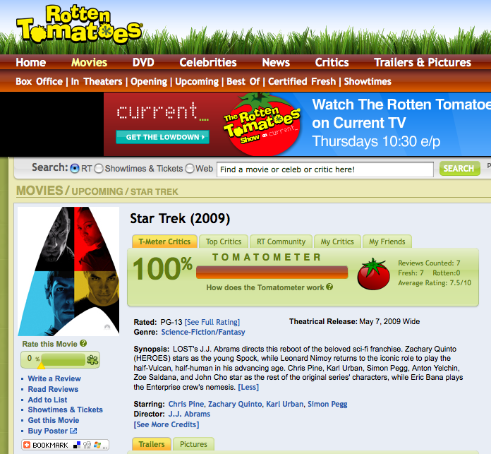
While it lasts ... Star Trek 11 has a 100% rating at Rotten Tomatoes:

(Picture used under fair use thingy, all rights reserved Paramount and Rotten Tomatoes, yada yada.) I'm sure this will drop once a broader selection of reviewers tackles it, but here's hoping.

-the Centaur
P.S. I'm officially in my blackout period for Star Trek, so don't tell me anything else, I already know too damn much, unless they move the opening to May 7 at 7pm or something.

Why I Use Transparent Terminal Windows

centaur 0
I use transparent windows for my terminals, so you can see beneath the text to other windows or desktop backgrounds beneath. I've done it for a long time on Linux as just a neat trick to show the desktop beneath whatever I'm typing, but it works better if you can see the actual window beneath the terminal. On Windows you can do this with various add-ons (don't remember which one worked best, so sorry no link), but it works well natively on the Mac and recently with Compiz I've gotten it to work the way I want on on Linux.

Combined with the microscopic fonts I like, this makes my screen hard to read for others; one of my collaborators used to insist I make the windows opaque and increase the font size so he could see them. So why do I do this? Even the Mac OS X tips page that tells you how says it "has no serious purpose" except to make your windows look pretty.

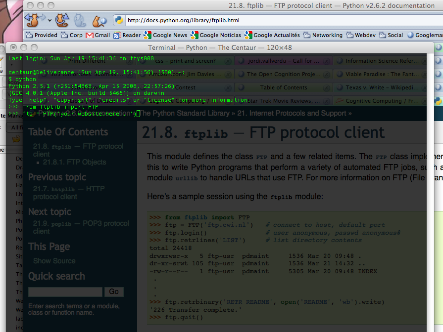
Well, I beg to differ. This screenshot shows why:


Here, I'm working on some Python code to automatically generate a list of labels for my web site. I've never used the Python ftp library before ... so I just Google'd the Python ftp protocol, found the Python doc page, and began prototyping my code straight at the Python prompt, looking through the terminal window to see the sample code beneath it.

Mmmm. Composity goodness, captured via Mac's Command-Shift-3 screenshot keystroke and edited with Preview. If you program at the command line you should try it - your eyes train up pretty quickly to ignore whatever's behind the terminal unless you need it.

-the Centaur

Blog Labels at the Library: The Not-So-Dewey Decimal System

centaur 0

Blogger lets you categorize your blog entries with tags - like Development, Pound Cake or what have you. However, they don't provide an easy way to put these labels into your web page if your site is not hosted on a Blogger server, which the Library of Dresan is not. I've played around with this a bit, but have not yet figured out how to do it.

But the directory structure of the labeled blogs is simple - just the subdirectory "labels" and a bunch of eponymous files like "Mission to Mars.html" or "Sith Park.html". So I'm going to put these labels up myself right now, and write a 10-line or so Python program that will do it for me later.

To make things easy, I've added an index.html to the labels directory, so you can just navigate to it to see the current list of labels. For historical interest, here's what I've got right now:

More to come...
-the Centaur
Update: removed the image for this post after investigating the license and finding it was a GNU-style "poison" license that required GNUification of the entire post. Sorry, Richard, I appreciate your efforts to make things available to the world but you don't get my blog entries in exchange. I can take my own dang photos.

Pound Cake Reloaded

centaur 1
So I tried making pound cake again, this time with success! I even brought it in to the Search Engine that Starts With a G to get comments from my coworkers, and none of them died (that I know of) and some of them even liked it (as reported on an anonymous form)! Even more of a success!

Here's what I did differently.

pound cake 2.0

First, I changed the recipe. This time, I adapted one from "I'm Just Here for More Food" by Alton Brown, a chef well known for his excellent, scientifically-based cooking. After cross-referencing against the Joy of Cooking, I felt safe leaving out the vanilla on the suspicion that last time's funny flavor wasn't just the Splenda but my fairly old vanilla flavoring (which I found was labeled "bourbon vanilla" which made me even more suspicious.) This left the recipe:
  • Three cups of allpurpose flour
  • Three large eggs
  • Two cups of sugar
  • One cup of buttermilk
  • One half pound of butter
  • One half teaspoon of salt
  • One half teaspoon of baking powder
Preparation was much easier this time with a $25 handheld motorized mixer from Fry's
Electronics
. I used a few tricks this time:
  • Allow butter to warm to room temperature by itself - no heating in the microwave
  • Mix the butter and sugar and blend until fluffy with no sugar grains visible in the mix
  • Beat egg yolks and whites together and mix with butter and sugar blend in 3 batches
  • Sift all the dry goods (salt, baking powder, flour) together 3 times
  • Alternate adding the dry goods and buttermilk to the mix
Also, I was more careful flouring the pan to prevent sticking. As before, the oven was preheated to 325, baking was 1 hour, and the cake was allowed to sit a bit before being taken out of the pan.

pound cake 2.0

Results: Yum. The texture was light and flaky, on the edge of being too flaky. The flavor was good, though slightly bland - it could have used more vanilla. The crust had a good texture, but it could have been a bit darker.

pound cake 2.0

This was a good cake, but I got even better feedback from my coworkers and from myself. The cake needed vanilla, a slightly better mixing, and a slightly better cooling procedure. Nevertheless, the pound cake served its desired function:

pound cake 2.0

I will follow up soon with the details on how I tweaked the recipe until it was "perfect".

-the Centaur

How Wide Should Your Website Be?

centaur 0
For the longest time I've tried to design the websites I'm responsible for to be pretty narrow - the Library of Dresan is supposed to be just over 800 pixels, fanu fiku is supposed to be just over 700 pixels, and Studio Sandi is just about 800 pixels. The rationale behind this was that in the olden days of the Internet, user's screens were as small as 1024 by 768 or even 800 by 600, and even users who had wider monitors displayed their browser in a window that didn't take up the full screen.

I remember reading an article (I don't remember where) that pointed out with browser sidebars and chrome, the width of the page could be far less than monitor width. I measured it on my circa-2000 screen and I found that I had about 800 pixels of width for the web page. So that led to the design of the Library: 800 pixels of width, 600 for the main content and 200 for the sidebar. The banner itself was a little over 1000 pixels so that it didn't end abruptly if the user made their screen wider.

But that was almost ten years ago. Does that logic still hold?

Many people view the web on laptops and phones. Dealing with phone resolution will require more than just dealing with screen widths, so I'll return to it in a later article when I tackle the CSSification of the Library. But a quick search suggests that typical laptop screen widths range from the 1024x768 XGA standard to the 1440x900 WXGA+ widescreen standard. There are some people who have smaller laptop screens, of course, but they are in the minority. Conversely, screens do get larger: for example, for many years I owned a glorious Toshiba Satellite laptop with a 1600x1200 screen. But on those larger screens users often use smaller windows for their browsers: for example, on this MacBook Pro, with a 1440x900 screen, I'm only using a little more than 1200 pixels for the browser window - and typically I use narrower windows.

So something more than 800 and less than 1400 appears to be a good guess. Discussion on the web seems to indicate people are starting to give up on the 800 width and moving to 900 or more, but rarely more than 1024.

Digging around, I found more articles with the same idea - Mario Sanchez argues the goal of web site width is to avoid horizontal scrolling, and recommends you design your web site for 800 pixels, with a layout that works well at 1024. Jacob Nielsen recommends straight out to optimize your site for 1024, but not to design for a specific size and let your layout be "liquid", changing width for your users's monitor sizes. Personally I think this breaks down if you have images to display, though I reserve the right to be convinced otherwise by CSS wizardry at a later time.

All of the above are opinions, of course; what about the evidence that they're based on? The Steam Hardware Survey put out by Valve Corporation suggests that 95% of users use screens of 1024 pixels or wider, with fully 50% at 1024x768, 1280x1024, or 1440x1900. Similarly, the Browser Display Statistics analysis by W3 Schools indicate 36% of users have a display resolution of 1024x768 ... and 57% have higher. Update: I checked the Library's own stats, and found that Google Analytics does indeed track screen resolutions. Less than 5% of all users had a resolution less than 1024x768, and only 1.5% had a resolution less than 800x600. Of that, 0.5% were listed as no resolution, leaving 1% at 640x480. Those numbers will come back later...

Take all that with a grain of salt given that some significant percentage use browser screens larger than their monitor resolution - Nielsen points out in the same article I mentioned above that as resolutions get staggeringly large (he predicts 5000x3000 in the future) users begin to display multiple side by side windows. True enough, at the Search Engine That Starts With a G, all of my officemates have dual monitors with aggregate resolution of 2400x1920, but none of us typically displays a browser window larger than half the screen - 1200 pixels, minus chrome or subtracted width to see other windows underneath.

So that leaves me with the feeling that Nielsen and Sanchez are essentially right. My personal take on it for the Library is:

  • Your website should display well in no more than 1024 pixels of width. You may use a "liquid" layout that can expand to use more space, but it should not require more than 1024 pixels to display.

  • The essential content of your web site should fit into the leftmost 800 pixels of width. If you are displaying graphics or images or have a lot of site widgets, some of these features may scroll off to the right on an 800x600 screen. Don't put anything essential on the right. Your mileage may vary if you are creating a web site for right-to-left languages, of course.

  • Make sure your "liquid" layouts don't break down on very wide or narrow screens. A user who displays a very wide window on a 2400 pixel wide screen should not see all your paragraphs turn into long marching lines of text - these can become hard to read. Similar problems can happen when a screen is squeezed very small - for example, Wikipedia used to display terribly on certain mobile phones, creating vast blank spaces for the user to navigate through.


The new design for the Library uses around 1000 pixels, with the leftmost 600 for text (to satisfy the 1% of people who are still stuck at 640x480), the next 200 for site navigation (for the less than 5% stuck at 800x600), and the remaining 200 for everything (and everyone) else: search boxes, author pictures, and Flickr badges; in short, anything less important than the articles and navigation features. Technically this is not a "liquid" layout, but hopefully this will be something the vast number of users can enjoy with little scrolling, and something that other users can appreciate without feeling left out.

-the Centaur

The Great Litany at Maundy Thursday Vigil

centaur 0
From two to three this morning I served on the Maundy Thursday Vigil today at Saint Stephens in the Field, the local Episcopal church I attend.

Maundy Thursday is the day Jesus instituted the Eucharist and was arrested, according to the Bible and tradition. Rather than a Maundy Thursday service, Saint Stephen's holds a vigil from evening to the time of the Crucifixion. Someone is in the church all hours of the night.

There's no way to know exactly when Jesus was arrested, but I've always thought the hour of darkness was pretty close to two to three AM, so that's a special time for me. Being arrested, humiliated and crucified for essentially telling the truth and trying to do the right thing would be terrible.

The first thing I read during my part of the vigil was from the Great Litany from the Book of Common Prayer; I thought it was apropos in our current time of trial:
We humbly beseech thee, O Father, mercifully to look upon
our infirmities; and, for the glory of your Name, turn from us
all those evils that we most justly have deserved; and grant
that in all our troubles we may put our whole trust and
confidence in thy mercy, and evermore serve thee in holiness
and pureness of living, to thy honor and glory; through our
only Mediator and Advocate, Jesus Christ our Lord. Amen.

Then I read from the Bible, first another apropos passage from Sirach 21:8:
8: He that buildeth his house with other men's money is like one that gathereth himself stones for the tomb of his burial.


After that, I started reading the Passion from the Gospel of John, and then went on to read the remaining readings for Maundy Thursday: first from the Gospel of John, then from Exodus, then from the Psalms, then from 1 Corinthians.

I leave you with the close of the Maundy Thursday service:
Peace is my last gift to you, my own peace I now leave with
you; peace which the world cannot give, I give to you.

I give you a new commandment: Love one another as I have
loved you.

Peace is my last gift to you, my own peace I now leave with
you; peace which the world cannot give, I give to you.

By this shall the world know that you are my disciples: That
you have love for one another.

Gravity Wave Lasers and Faster Than Light

centaur 0
If only the theory mentioned in this article were true...
Chiao and co ask how big is this effect of a gravitational wave on a thin superconducting sheet compared to the effect on an ordinary conducting sheet. The answer? 42 orders of magnitude bigger.
...then just by putting two superconducting sheets together we would have gravity wave lasers. They'd probably be practical within twenty years, and Lord knows what we'd have within a hundred. Unfortunately this probably violates the equivalence principle and is likely nonsense:
First, Chaio assumes that coopers pairs fall differently than normal matter in a gravitational field...which basically means violation of Equivalence Principle....and there is no physical evidence for that assumption....neither does he give a rigorous treatment to prove that ASSUMPTION.
In other news, scientists studying the Alcubierre warp drive have found yet another way it would not work: in addition to being unstable, non-steerable, non-startable, and requiring planet-sized masses of unobtainable negative energy, it would also cook the occupants as soon as you exceeded the speed of light.

Sigh.
-the Centaur

Renewing the Library

centaur 1

Recently I started to notice that the design of the Library is getting long in the tooth.  One friend who was a web designer commented that it looked very "old Internet".  I've watched another friend innovate on his blog design while mine was staying still.  Work on my wife's web site made me revisit some of my choices, adding a description and picture but making few other changes.  I know the site needs a redesign because I have a lot more material coming out soon, but the final trigger was when I couldn't attend a talk and looked up one of the authors to learn more about their work - I think it was Oren Etzioni - and I was struck by his straightforward site design which enabled me to quickly find out what he was working on.

SO, I'm redesigning the Library.

I'm an artist in addition to an author and researcher, so simply gutting the site and making it simpler wasn't my goal: I have specific ideas about what I want the site to look like, and I started designing a new one.  Partway through that redesign, I noticed that I was doing a fair amount of research work - examining other blogs that I admired, investigating blog widgets, investigating CSS and HTML advances, researching color theory and design principles - but not blogging any of it.  In fact, come to think of it, typically when people redesign their sites they put all their work under a bushel, trying to hide their planned change until the last possible moment, possibly exposing it to a few trusted users in beta or with an alternate link prior to springing it on the world as if freshly formed and fully new.

Well, phooey on that.  The thought process that a web designer goes through producing a web site is interesting (well, to other web site designers, anyway) and provides a valuable resource to other designers doing their work.  I wished that other people had blogged the process that they went through and the alternatives they explored, as it would help me make my own choices - but you know what?  I don't control other people.  I only control me.  And if someone else hasn't filled the gap, then it's my own responsibility to come up with something to meet my needs. 

SO, I'm going to blog the redesign of my blog.  How "meta".

There's far too much to put into a single blog entry, so I'll start off going over the thought process that led to the design in more detail, then explain my strategy.  The first thing that I did was look at other web sites that I admire.  Earlier when working on my wife's web site I found a number of beautiful looking blogs, but when I started the redesign, I started my search over, focusing on sites of artificial intelligence researchers, bloggers, writers, and artists, trying to find ones I instinctively admired with interesting ideas, features or appearances that I could steal.  Some of these included:

  • Oren Etzioni's Home Page: Quickly Present What You Are Doing
    An "old school" (not that there's anything wrong with that) web site from an academic researcher, it has an "old style nav bar" up top that quickly tells you how to find his publications.  Below that is text which points you to his research projects and most cited publications.   From this I gleaned:
    • Organize your work into logical areas
    • Make navigation between areas easy
    • Put things people want up up front
  • Rough Type by Nicholas Carr: Put Your Content Front and Center
    Featuring a straightforward design that gets you straight to his content, Rough Type also has an author blurb and a pointer to his most famous article, "Is Google Making Us Stupid?" and his book "The Big Switch" The key points I gleaned from the site:
    • Get your content out front and center
    • Tell people who you are
    • Point them to your best work
  • Vast and Infinite by Gordon Shippey: Show the Author, Try Fun Features
    Written by an old buddy from Georgia Tech, Vast and Infinite isn't that different from Rough Type.  However, he's constantly innovating, adding a site bio and author picture, tweaking his banner, adding shared items and flickr gadgets and more, whereas my blog tends to stand still.  The lessons from this:
    • Show people your picture
    • Keep your content front and center (sound familiar?)
    • Trying out new technologies generates interest in the site
  • Home Page of Jim Davies: Show the Author, Organize Your Site Logically
    Jim Davies is another academic researcher, with a much more modern site.  Like Oren Etzioni, he has a navbar, but also a large picture, a more detailed description, and links to his art, store and blog.  Unlike Oren, each area of the site seems a little more organized, without the duplicated links to publications and the odd inclusion of news articles in his personal page.  Jim takes this further by having extra blogs just for rants and links.  My takehomes were:
    • An academic site can have a modern design
    • Showing people your picture creates interest
    • Don't be afraid to segregate content into areas
  • Marvin Minsky and John McCarthy: Tell People About Your Work, and Share It
    Two of the greats in artificial intelligence have interesting sites filled with lots of content.  Both start with a description of them and their work and then continue with many, many links to their most prominent work.  Minsky puts up chapters of his most recent book; McCarthy includes a lot of narrative that gives context.  What I like:
    • Tell people what your site is about using narrative
    • Put work you are interested in front and center
    • Fill your site with lots of content
  • Greg Egan's Home Page: Fill Your Site With Lots of Content, and Share Your Research
    Greg Egan is an author I admire primarily for his novel Permutation City and his short story Dark Integers, though I have more of his books in the queue.  His site's layout is a little harder to read than some of the others, but it is filled with pointers to all of his work, to the research that he did to create the work, and applets and essays related to his work.  The takehome from this firehose is:
    • Fill your site with lots of content
    • Share the research you did on how you p roduced your work
    • Don't be afraid to promote your work by showing it to people

There was one more site that kicked this all off, which I will hold in my pocket for a minute while I talk about opinions.

Unlike Jacob Nielsen, I don't have research backing up these conclusions: they're really just guesses about what makes these site work, or, worse, just my opinions about what it is that that I like about these sites.  What's dangerous about opinions is that recent scientific work seems to indicate that they're often post-hoc explanations of our instinctive reactions, and they're often wrong.  So, to combat this tendency, I looked at other resources that specialize in information about good design of web sites to try to get information about what I "should" do.  I don't pretend I've absorbed all the information in these sites, but am simply including them to show you the kinds of things that I looked at:

  • Jacob Nielsen's UseIt.com: Make your site fast, simple and standards based
    Jacob Nielsen's site on web site usability is so simple it hurts my eyes.  I don't like to actually look at it, but I do like the ideas.  He's got a breakdown of recent news on the right and fixed web site content on the left; the idea of the breakdown is good but seems opposed to my goal to work with Western left-to-right reading.  Jacob points out that he uses no graphics because he's not a graphic designer, and that's fair; but since his site is unpleasant for me to read I only loosely follow his recommendations.  But one cool thing about his site: if I resize the browser his content stays divided more or less the way he's put it because the structure is so simple and well designed.
  • But What Are Standards?  W3C and Webmonkey
    The W3C is the official source of standards for the web like HTML and CSS, but I've always found their standards hard to read (and I've read many, many of them over the years).  The new site redesign they're testing seems to make it easier to navigate to find things like the CSS Standard, but it is still hard to read and lacking the practical, let's get started advice that I want.  Back in the early days of the web, I used Webmonkey as a source of good tutorials, but the site seems crufty and broken - trying to narrow in on the CSS tutorials got me nothing.  I have a number of offline books, however, and am a whiz at reverse-engineering web pages, so when I get to the CSS articles I will detail what I learn and what sources I use.
  • CSS in Practice: FaceFirst.us and CSS Zen Garden
    I know the designer of FaceFirst.us, a social networking site, and in exchange for me beta testing his site he turned around and gave me a tutorial on how he uses CSS in his process to ease his site design.  In short, like Nielsen, he recommends separating the "bones" of the site from the content using CSS id's and classes.  One example he showed me was the CSS Zen Garden, which has fixed content that is modified radically just by stylesheets.
  • But What Did Your Thesis Advisors Do? Ashwin Ram and Janet Kolodner
    I also dug into what Ashwin Ram, my thesis advisor, and Janet Kolodner, a member of my thesis committee and my original advisor, did with their web pages.  Both Ashwin and Janet have profile pages back at the College of Computing, but they also have richer pages elsewhere with more detailed content.  I have no intention of slavishly copying what my thesis advisors are doing, but as far as the research part of my web is concerned they're similar people solving similar problems whose solutions are worth looking at and adapting for my own use - why, yes, my Ph.D. was in the case-based reasoning tradition, why do you ask?  On that note, it occurs to me to look at other colleagues' web sites, like Michael Cox's site.

Standards, shmandards, cool sites and web lights - all well and good.  My brain exploded, however, when I saw Warren Ellis's web site (billed as a blog for mature adults, so it's occasionally NSFW - be warned).  In my mind, Warren's site had a number of great features:

  • Show the Author's Name:
    The author's name is hugely printed across the top - so you immediately know who this is, as opposed to say my dumb blog where my name is printed in 2 point type.  And Warren's domain name is also his own name plus dot com, so that he can actually show his name and site name in the same logo.
  • Keep the Text to the Left:
    The text of all the articles is corraled to the left margin so they can be PRINTED, aligned to the top of the page so it dives into the header and is immediately visible.  Almost as if Warren's site was designed knowing that the majority of the people who read the English language read it from left to right, therefore the text should appear where their eyes go.  This pattern, plus the pattern of the rest of his design, is consistent with putting the good stuff in the F-shaped heat map that typical users eyes take when scanning your page.
  • Use the Middle of the Page:
    There is a bar of links in the MIDDLE of his page, immediately to the right of the articles, which puts it close to the golden ratio of the horizontal space of his site design (as viewed on my monitor).  This "linkbar", held in place by CSS wizardry and a black magic compact with the Old Ones,  contains permanent site features that most need to be linked - message board, mailing list, comics, his novel, his agents, and his bio inline.  Think of it as sexier version of Jacob Nielsen's "Permanent Content" box.
  • Put Sparkly Things to the Far Right:
    Beyond the linkbar are all the cool fun site features like a search bar, podcasts, images and other nonsense, which are fun to look at but less important.  On my site, some of these are on the right, or even at the very bottom of the page; on other people's sites they appear on the left, distracting Western readers from the article and possibly shoving the right ends of the articles over the printable width of the page.  Ellis' contract with Cthulhu and the hellish powers of the W3C enable him to safely corral these fun elements to the right where they belong.

The linkbar was the most mindblowing thing.  It eats into the banner.  It's readily visible.  It leaves the text on the left, but it's close enough to be visible on most monitors.  The whole site is 997 pixels wide, so it will fit on a typical 2009 web screen, but if your screen is smaller, first you lose the fun sidebar, then the important linkbar, and only then do you lose the text.  Even better, since the li nkbar CSSes its way into the banner, the size of the site is controlled by the header image so it won't get wider.  So your Nielsen-style variable content is always visible on the left, and your important fixed content is always on the right, and God willing it will never get hosed by someone resizing their window.  Once I saw that, I decided I'd done enough work researching, and it was time to start redesigning.

SO my first step is to unashamedly steal Warren Ellis's linkbar.

Immediately I sent out my secret agents out to download his HTML and CSS and transport it to my secret lab so I can take it apart piece by piece until it has no secrets left.  Of course, some of Warren Ellis' choices won't work for me, so I will have to do a lot to adapt the ideas he and his team used in his site design.  And simply imitating the form of Warren's site won't be successful, any more than just making a movie just like Star Wars called Sky Battles would be immediately successful.  (Battlestar Galactica fans, take note: while I loved the show, I think it's fair to say that it took the reinvention of the show to really produce a success, which was based on making the show interesting in its own right and not copying Star Wars).

The outer form of his site is the product of his inner success - he is a popular, prolific author with a message board, mailing list and weekly online comic he uses to promote his other writing and books, which makes the prominent placement of the message board agents and books highly important in the linkbar.  Starting a message board and getting an agent won't help me.  I, in contrast, am a jack of all trades - developer, researcher, writer, artist - using this blog as a tool to force me to stop being a perfectionist, complete my work, and put it out in front of people.  So my goal is to make sure this website displays my content, prominently surfaces the areas of interest I work in, and has a few flashy features to attract attention to individual items of more permanent interest.

In upcoming articles I will detail my original constraints for the blog version of Library of Dresan and why those constraints failed as the site evolved over time, my goals for the new site design, what I think I understand about how wide to make your web pages and where to put your content (and where I got those crazy ideas) my move to the use of CSS and my attempts to make the site work well on screen, on printers and phones, my attempts to better exploit Blogger, Flickr and other web gadgets, and the work that I'm doing investigating color theory and generating the new art assets that will make up the site.

Hopefully you'll enjoy the process, and when it's done, that you'll enjoy the site more.

-the Centaur

Shooting from the hip versus shooting straight

centaur 0
One of the reasons I blog is that it forces you to shoot from the hip and not polish things. For example, in the "Why I Write" article I used the word "quite" 3 times in a few sentences and I forced myself to hit "Publish" rather than going back to wordsmith it ... because "shipping is a feature". An article published is better than one in a sockdrawer, even if it is only published to a blog.

But even I have my limits. When I was reading over the article again and realized that I consistently spelled Allen Ginsberg as Alan Ginsburg, even though I copyedited it and checked it against the Wikipedia article, I found I had to go back and fix the article.

And I also fixed the "quites".

Oh well. I suppose that no matter how much you try to make yourself commit to publishing over polishing, there's some amount of polish that must be done ... sooner or later, published or not. If there are real mistakes, you gotta fix 'em.

Han still shot first, though.

-the Centaur

Why I Write

centaur 0
When I first came across Allen Ginsberg's Howl in an audiobook of modern poets reading their own work, I was struck by the raw power of his prose:

I saw the best minds of my generation destroyed by
madness, starving hysterical naked,
dragging themselves through the negro streets at
dawn looking for an angry fix,
angelheaded hipsters burning for the ancient
heavenly connection to the starry dynamo in the
machinery of night,
who poverty and tatters and hollow-eyed and high
sat up smoking in the supernatural darkness of
cold-water flats floating across the tops of cities
contemplating jazz...

It goes on in this vein for a while, containing challenging material for the late 1950's which led to obscenity trials and quite a bit of controversy.

I was reminded of the poem when I went to the City Lights Bookshop recently, a liberal bookstore with its own rich history that was influential in nurturing the Beat generation of poets. Pictures of Ginsberg adorn its walls, including one in which he clutches what at the time was his only bowl.

And that started me thinking about what Ginsberg might say if we had a chance to meet and he could read some of my work. And that made me realize that I'm not trying to do what Ginsberg was trying to do at all.

Ginsberg's work was raw, powerful, lyrical. He experimented with form, filled it with deep emotion, and used it to catapult the secret frustration, struggles and shame of a repressed generation straight out into the light, exposing drinking and drugs and sexuality and homosexuality and protest and jazz to a world that wasn't quite ready to receive it for precisely the same reason that it desperately needed to hear it.

Sometimes that needs to be done, but I don't care about doing that at all.

I want my work to be honest, but I'm not interested in throwing things in people's faces to wake them up. I believe in illuminating worlds that are rarely seen, but only to create interest, not to expose secrets. I do feel deep emotion, but often drain it from my work because rage blinds me from seeing my opponent's point of view. I rarely experiment with form and often when I do, I regret it. Where Ginsberg was raw, powerful, and lyrical, I try to be smooth, balanced and direct.

But that's a post-hoc analysis, derived from what I like about Ginsberg and how it differs from what I write. It isn't the first thing that came to mind about my writing, which was: I write what I like.

I like to write stories that I like to read. I write science fiction because I enjoy hard science, space opera(*), Star Trek and Star Wars too. I write urban fantasy because I like Anita Blake and Mercy Thomson, and Interview with the Vampire and Buffy the Vampire Slayer too.

I constantly have stories running through my head, more than I could ever write down. I've written many, many short stories and novels, only a few of which have gotten published or seen the light of day, but that's slowly changing as I put more effort into publishing.

But at the end of the day that doesn't matter, because I can still read my stories. I'm not writing to make other people happy. I'm not writing to change the world. I'm writing to produce more of what I like to read.

That, and my head would explode if I stopped writing.

I hope some more of my writing will get published, that you all get to read it, and that some of you enjoy it. Until then, please enjoy this blog ... which I write for the same reason I write science fiction: I enjoy having blog posts to read and will continue to produce more of them that I like.

-the Centaur

(*) I fully understand that categorizing Larry Niven as "space opera" will be construed as a terrible insult by people who don't understand the difference between the kind of SF that he wrote and the kind Hal Clement wrote. Uncharitably, these are probably the same people who insist on the distinction between "sci fi" and "science fiction" or draw some mental distinction between "Trekkies" and "Trekkers", and they can all just go away. For everyone still reading, Larry Niven is one of my favorite authors, but if your stories include hyperdrives, you're writing space opera and not hard science fiction, even if your space opera is filled with real hard SF elements.

An Age Mistaken

centaur 0
A Few Gray Hairs

Today, for the first time in my life, someone called me "old man".

It's not the first time someone's guessed my age wrong.  When I was about sixteen, I and a friend went to a restaurant in a theme park; he was mistaken for a twenty-five year old and I was mistaken for twelve.  Six and a half years ago, I was mistaken for an eighteen year old by the woman who would later become my wife.  Her sister tried to warn her off on the grounds she was cradle robbing, but she persisted and found out we were close to the same age.

Today, however, was the first day that miscalculation happened in the other direction.  I was at the Game Developer's Conference in San Francisco, leaving an impromptu get-together at Firewood Cafe in the Metreon, a cascading series of dinners and discussions first with with a group of colleagues and then with some onlookers who were drawn in.  On the way back to the Minna Street Garage, I passed the normal mix of badged game developers, predatory homeless people, and disinterested San Franciscans ... and then saw the kid.

My first moment of awareness of him was his demonstrative toss of a Starbucks cup, chucking it out onto a surprisingly clean street in a deliberate, almost belligerent act of littering.  He hefted his wide, white skateboard, I took in his black shorts and jacket, and mentally categorized him as young, rumpled, and possibly homeless.  The word "punk" popped uncharitably to my mind and I tried to quash it.

As he, I, and the woman walking ahead of us passed the glass wall of Mel's Diner, he tracked to the left, hugging the gentle inward curve of glass as if to go in the door when it was clear from his walk and attitude that he had no desire whatsoever to go inside.  He had to pause briefly as the woman opened the door, and I passed him.  As I did, he called out:

"Can you spare any change, old man?"

I've given forty-one dollars to panhandlers and street musicians over the past four days.  I didn't give him a dime.

-the Centaur

Frost Moon Revised

centaur 1
So, this weekend I finished the revision of Frost Moon, 2007's Nanowrimo entry, and have submitted it back to the publisher. Initially they sound pleased and hope to get back to me soon - very promising! I have deliberately not mentioned the name of the publishing house so as to "not jinx it" but once I hear back yea or nay I will spill the beans.

In the meantime, I have returned to work on Blood Rock, the sequel, now at 100,000 words and going strong. I suspect I'm closing in on the end here; the current word count includes a lot of notes that will be chopped in the final draft, so hopefully this will come in at under 120,000 words.

As I mentioned before, I have already started work on the sequels, Liquid Fire and Hex Code. I have ideas for many more in this series, and plan to keep doing them as long as they're fun. I'll put up more information when I do the site redesign, hopefully in April.

-the Centaur

National Pound Cake Day and More

centaur 0
Thanks to Nancy Kress's blog, I just found out today, March 4th, is National Pound Cake Day.  Who knew? Well, apparently lots of people.  I haven't found out who invented this day based on one of my favorite foods ... but thanks!

Wonder if there's a National Kibbey Nayye Day?

-the Centaur

P.S. In researching this article, I was amazed at the bugs that crawled out from the rocks I turned over.  When looking for National Kibbeh Day I found this lovely bit of prejudice by the prolific Hytham Hammer on the Urban Dictionary:
kibbeh / kibbe
minced meat dish with almonds.
the damn Lebbos think that's a 'national' dish..well, fuck that. It's origins are North African... and yeah, it's taste-o!
Ok, Hytham, thanks for writing the entry.  But let's clear up a few things:
  1. I don't know what dish you're referring to, but kibbey as made in Lebanon does not contain almonds.  In Syria they sometimes put pine nuts in it, but in Lebanon a more typical recipe is: meat (lamb or mutton, or top round beef), bur'ghul (crushed wheat), minced onions, salt, black pepper, cumin, cinnamon.  Occasionally people add minced red peppers, allspice or mixed spice, and when I make it I do try those from time to time.  No almonds, unless you are talking about stuffed kibbey balls, which can contain almonds - in the filling, not in the kibbey, and saying kibbey requires almonds is like saying pizza requires anchovies just because you liked your mom's anchovy calzones. 
  2. "Lebbos"?
  3. Look, I don't care if the dish originated on Mars, it's still the national dish of Lebanon in that we eat it raw more than just about anyone else.  More generally, EVERYONE in the Middle East region has their own version of what EVERYONE ELSE eats, relabeled with their own names - good luck figuring out who invented what.  If you paid attention to the cuisine of the region rather than practicing some form of "my guys are the best" cultural imperialism, you'd find that out immediately.
  4. On the note of "my guys are the best" cultural imperialism, I reject it in all its forms. Send me your recipe - if it's better, it's better!
  5. Yes, it is tasty!
Hoy.  Suprises, surprises.

Pound Cake: One Pound Each of Butter, Sugar, Flour and Eggs

centaur 2
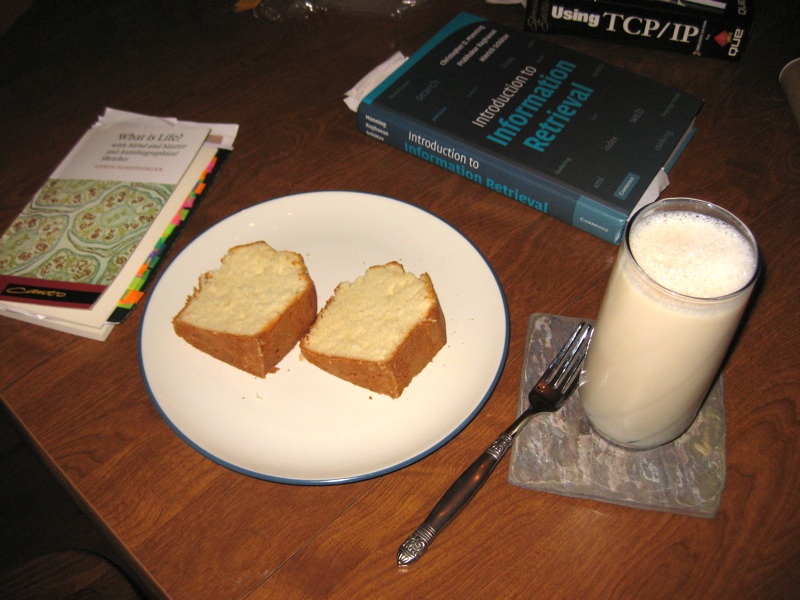
pound cake, soy milk and book spread

I enjoy a couple of slices of pound cake and milk as a late night dessert, but have difficulty finding pound cake that meets my standards. Forget the "loaf cakes" made by the big commercial bakeries: they're not bad, but they're not what I'm talking about.

ring pound cake


I'm talking about ring pound cakes. My neighbors made a dense, dry pound cake around Christmastime that was very good, but my favorites growing up were cakes you could get from Ingles: ring-shaped, light-textured, with a fluffy yellow center wrapped in a dark brown crust.

Usually there's only one store in any given region that makes these, the others sticking to loaf cakes. As I moved from Greenville, South Carolina, I found Kroger in Atlanta and later Safeway in San Jose had cakes that were similar, with slight variations in density and crust.

But there's something wrong in our modern commercial paradise: in the pursuit of the dollar or fashion businessmen tweak their good products until they become crappy and then discontinue them. I'm sure that's happened to all of you; and sure enough it happened to my pound cake.

First, Safeway started selling them only as half rings. Then they cut back on quantity. Then they replaced them entirely with "vanilla loafs" pre-cut entirely too thin. Whole Foods had decent-flavored loaf cakes, but they too have started pre-slicing them and cutting back on quantity.

I don't know what people have against pound cakes, but I can't find them locally baked, not even at bakeries - only icing-covered disasters, pudding cakes, and other variants, or alternatively Entenman's not-bad-but-not-good-enough butter loaves.

So, I am working on a pound cake recipe.

I made my first pound cake years ago, back in Atlanta. I was using the approximate "one pound" recipe: a pound of sugar, eggs, butter and flour. I didn't have a motorized mixer, and the hand mixing and stirring didn't cut it. It's fair to say this was a total FAIL. The flavor and crust were good, but the texture was dense as a brick and it was too hard to eat.

More recently, I tried again. I had planned to try this with sugar first, then introduce Splenda on the next cake, but dumb me forgot to buy sugar thinking we had some, which I discovered halfway through prepping the recipe. I adapted the recipe primarily from "Butter Sugar Flour Eggs" with a little help from the 1997 "Joy of Cooking":
  • One pound of unbleached allpurpose flour
  • One pound of eggs, separated
  • One pound of butter
  • Two and a half cups of Splenda baking sugar
  • 1/4tsp vanilla flavoring
  • "Just a pinch" of nutmeg and cinnamon
Preparation was much easier with a $25 handheld motorized mixer from Fry's, which cost less than the ingredients of the cake itself (to be fair, I think I bought other staples the night I bought the pound cake ingredients). The "trick" recommended by "Butter Sugar Flour Eggs" was to beat the egg yolks and egg whites separately; this worked out so-so in the egg whites step. In "Just Here For More Food" Alton Brown recommends a different method, which I will try next time.

pound cake and cookbook

That's right, all of the shots of pound cake shown in this article were from my first try of this recipe. It was a beautiful looking cake. The texture of this cake was slightly dense, but smooth and serviceable. The crust was very slightly dry but serviceable. The flavor I have to say was poor - it was in the right ballpark, one might even say it tasted right, but it had a chemical aftertaste. And I'm sad to say I don't think it was the Splenda ... I may have simply added too much vanilla extract.

two slices

I've been consuming this cake for a while for my late night reading sessions, but I finally broke down and got the Whole Foods cake for comparison, having one slice of each. Ah, drat - the Whole Foods cake was much better, both in texture and in flavor, though it didn't rise to the level of the long lost Ingles, Kroger or Safeway ring cake.

one slice

Oh well. Better luck next time.
-the Centaur

Clutterhound

centaur 0
clutterhound, n:
  1. Someone who takes joy from excessively collecting a lot of different things.
  2. Someone who wouldn't be caught dead reading Real Simple magazine.
  3. Anthony Francis
-The Centaur
P.S. I have nothing against Real Simple, a fine magazine.  All comments are of a humorous nature, related to the fact that if the editors of Real Simple saw my home, they would catch on fire.