
The Charlotte airport, as I recall. Enjoy. One day behind, but it's 3am and I gotta call it.
-the Centaur
Words, Art & Science by Anthony Francis

The Charlotte airport, as I recall. Enjoy. One day behind, but it's 3am and I gotta call it.
-the Centaur

A brainflash by my wife, turned into an out-of-nowhere concoction. Breakfast-burrito sized spring rolls, filled with almost entirely raw veggies, backed up by an amazing mix-and-match sauce, all entirely vegan.
We're going to have to add this to The Rotation.
-the Centaur

Eight pieces of sushi from P. F. Chang's. Sadly, even their "vegetarian" options have added fish flakes, making them not vegetarian, much less vegan - so me and my vegan wife no longer eat together there. Sad, because it was one of our favorite date night places until they updated their menu and she re-asked about whether her favorite dish was still vegan - only to find out that it had never been. :-(
-the Centaur
SO part of the reason we moved from California (other than the fires and the burning and the lack of water falling from the sky and all that stuff) to South Carolina was to reduce friction. Since here we can afford a house that has, like, floor area, my wife gets a big art studio on one end (spoiler: it's not enough - she's taken over the garage and living room too) ...
... and I get a big library at the other. In that library, I've been trying to remove creative barriers to all my different projects, which started me on the Drawing Every Day series earlier, and has been very helpful for research on my fiction and my science. One of those friction-reducing tools is a floating bookcase:
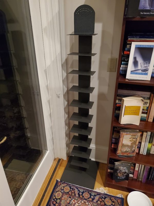
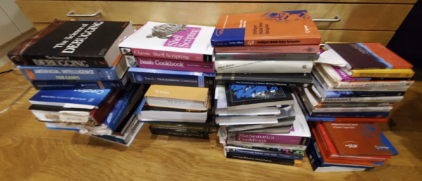
I got one of these from the Container Store to organize a set of books I had collected at work related to robot navigation (pictured up top), and since the piece of software that controls a navigating robot is called a "navigation stack", and it was a stack of books about navigation, hence, it is my, um, "navigation stack". (Hey, I never said it was a particularly clever nickname).
These have proved super useful to pull all the books on a given topic into a prominent place so it is easier to see, think about, and find them. I've been doing that to all the topics in my library just by organizing, but it is really useful to have some things much more clearly visible to kickstart that process.
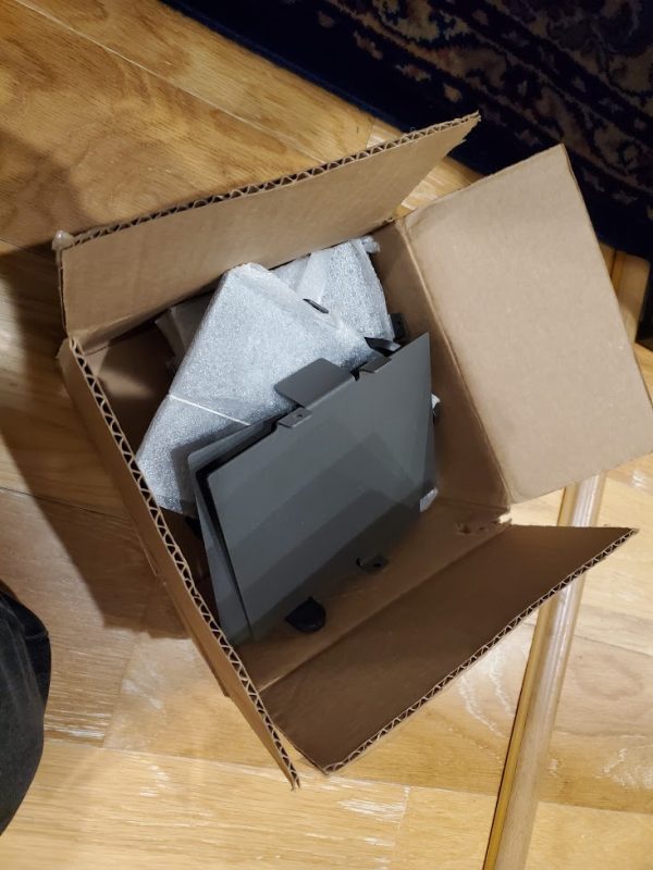
During the pandemic, I ordered another one, but they shipped it without its heavy, sturdy metal base. Rather than give me a replacement base, they sent me an entire new floating bookcase - which was great, mind you, but that left me with the bunch of weird shelves above and the bookcase's long spine.
We're all about recycling here at the Boobie Hatch, so I started thinking about how to salvage these pieces and make a whole nother shelf. Unfortunately, the hard metal base is a carefully machined component. How to make a sturdy shelf when I don't have the ability to make what's arguably the most important piece?
Enter power tool girl.
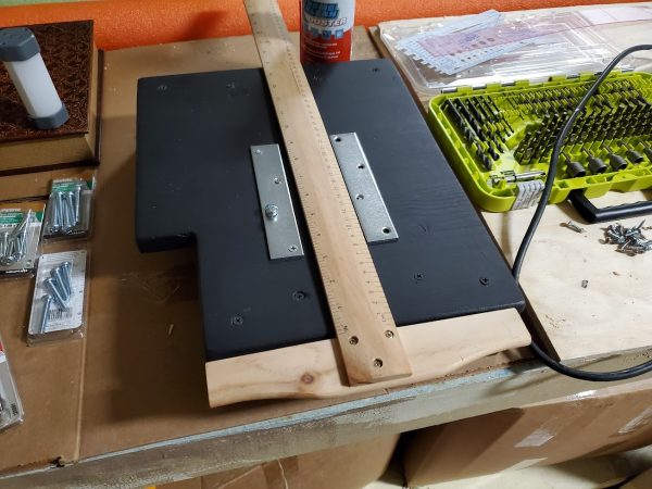
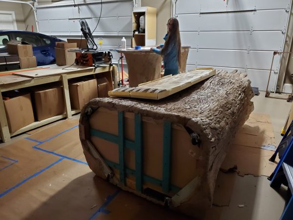
Sandi and I have a great working relationship: I know how to design sturdy, offbeat pieces of office furniture, and Sandi has the woodworking tools to turn more of those designs into reality than I am able to do myself. After discussing it, measuring the quirky space it would have to go into, and designing the overall concept together, she cut the above wood to shape and painted it for me to match the other furniture.
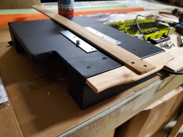
Here I come back in. Often these pieces have something weird about how to put them together, and I take over the last mile of construction, using my careful, patented "measure several times, cut once, curse when it doesn't fit, then re-measure and re-cut again while grumbling under my breath" technique.
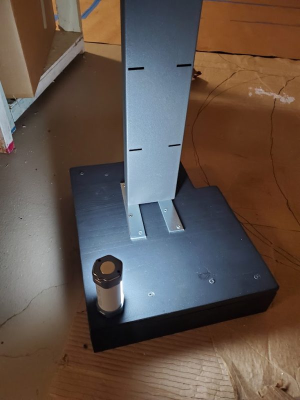
Getting this to work was tricky, because we had to ensure two kinds of stability. The spine of the shelf is a rectangular metal tube, designed to firmly bolt into a heavy metal plate to make sure the shelf stays upright; the edges of this tube would cut straight into an ordinary piece of wood, causing the shelf to sway over time. On top, we used two carefully aligned strips of metal to prevent the spine from cutting into that wood ...
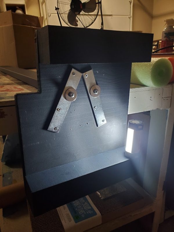
... and on the bottom, we have two not quite so prettily aligned strips of steel, set at off angles so the screws do not collide with the ones coming from above (and are not co-linear, potentially causing splits in the wood). If I remember my geometry, these will prevent the bolts from pulling all the way through the wood. The result is a shelf that stands upright and is reasonably stable:
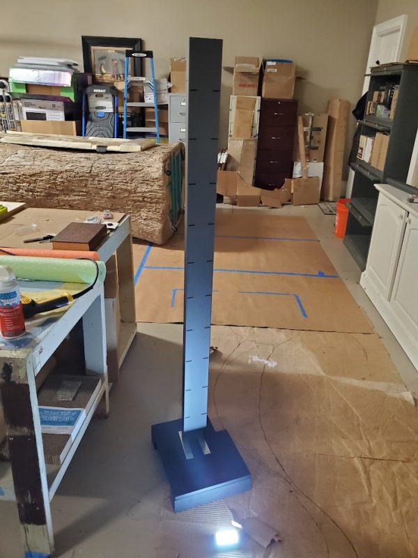
You may have been wondering what that weird notch is in the bookcase, and why the feet are so big.
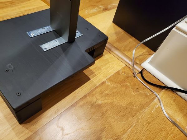
The answer is this weird corner of the library, where a room divider and power cable can't be moved ...
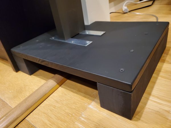
... but a shelf can be designed and cut to fit. A small block of wood hides underneath there, to provide extra stability under the shelf; also we added felt so the floor would not get scuffed (though the wood the previous owners chose already looks pre-scuffed; go figure).
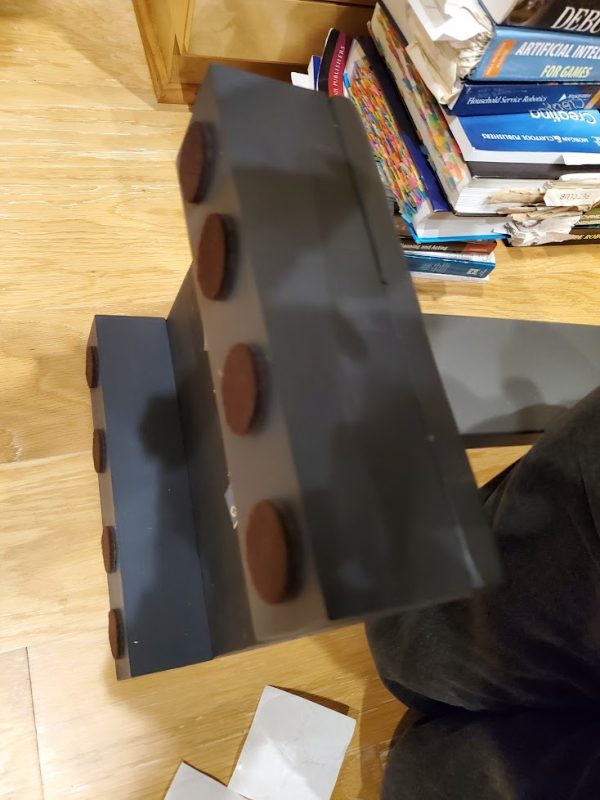
Now the shelves can be added back in ...
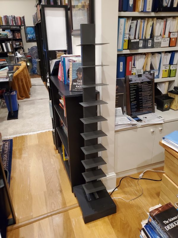
... and then, the books!
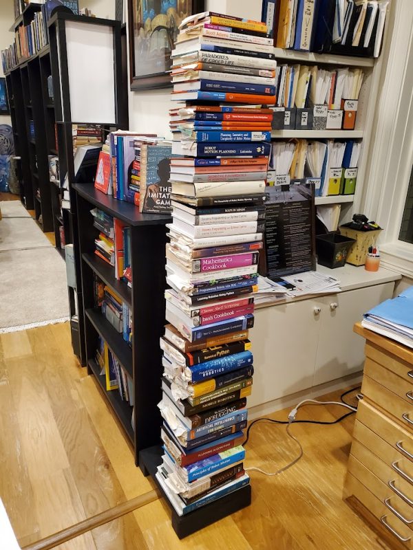
The navigation stack is reloaded!
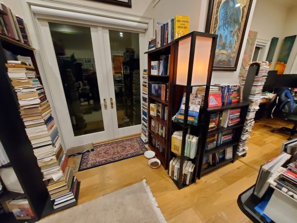
Now I have three much more topical collections of books, far better organized and discoverable. (The three collections are Thomistic philosophy, consciousness, and the navigation stack; these are sandwiching bookshelves on AI, deep learning, free will and executive control, and sleep and dreaming, among others; all these topics are far more related than at first they appear, but more on that later).
One more project down.
1001 to go!
-the Centaur

7am fare at the Charlotte airport. Can't quite remember the name of the place, but one of the adventures of red-eye travel is finding a breakfast joint open at 7am (or earlier) on the Atlanta or Charlotte layover prior to the last leg back to South Carolina. There are a few good options in Atlanta - strangely enough, not the fast food ones, which often open a bit later, but as I recall Gordon Biersch is open at 6am, and there's usually some fun quirkly place which you can find to help take the edge off after the long overnight flight.
-the Centaur

I'm updating the site, which unfortunately means my beloved book banners need to change. The combo of banner, slider of featured posts, and sticky intro post meant the blog content was way, WAY below the fold, which I do not like (and is not recommended). I had plans to revamp the theme, but didn't find one that easily let me do what I want, and the best was becoming the enemy of the good.
So I fixed the glitch instead. I un-stuck the intro post and moved it into both the about sidebar and into the slider, and eliminated the banner, which now puts the recent content above the fold.
Hopefully this works for you. More updates will roll out as I think of them.
-the Centaur
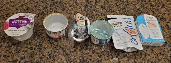
Brands of cat food, that is. As I recall, the farther it is to the right, the more likely it is that Loki will eat it. The farther it is to the left, the more likely it is that Loki would rather go outside than even smell it.
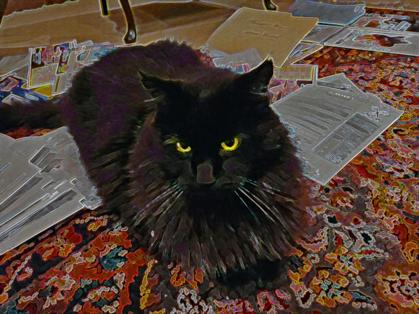
Oh, I'm sorry, were you working here?
-the Centaur
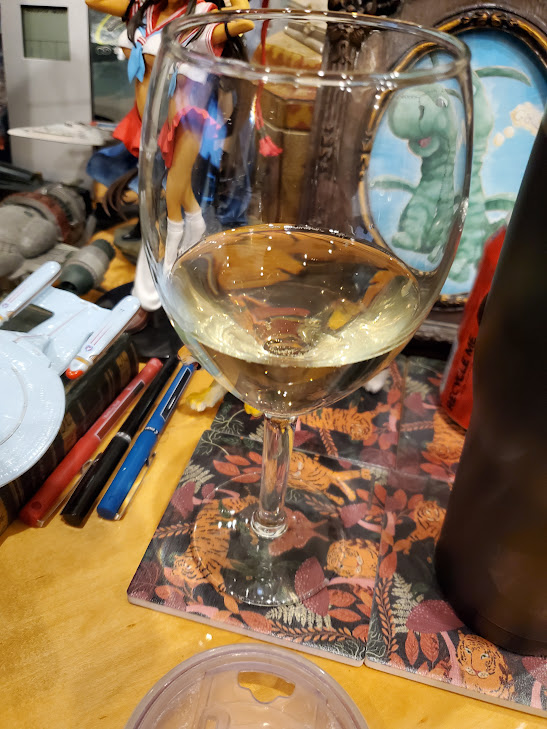
I'm sorry, but that is NOT alcohol.

THIS is alcohol.

There, I fixed it for U. You're welcome.
-the Centaur
Pictured: (1): Wine leftover from the Edgemas party; it was not impressive. (B, or 2): Neil Peart's favorite drink, Macallan, bought special for the party; it was quite impressive. (iii, or C, or 3): the La Parilla Margarita, medium, on the rocks, extra salt on the rim; about the best drink you can get - locally in the Upstate, that is, not counting driving to Reposado in Palo Alto to get their Cadillac Margarita, again, extra salt on the rim.

... makes six pieces. Mathiness says that the maximum number of pieces you can end up with from this is sixteen, which is apparently one plus the 5th triangle number, but on reflection I don't think sixteen pieces would make a good quesadilla. I think you're better off ordering the nachos instead.
-the Centaur
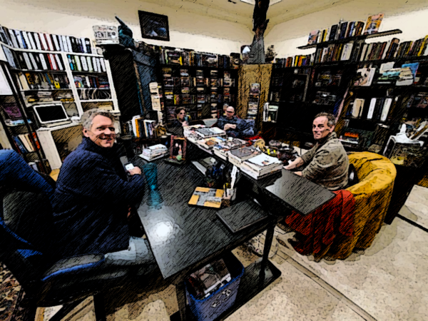
Better late than never. I really should develop a Photoshop filter or macro (is there such a thing) for this lines-and-shading effect, but it does actually require some tweaking to get right.
-the Centaur
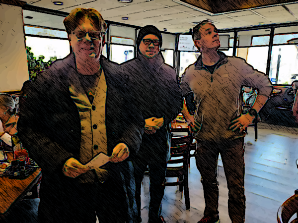
Four friends, thirty-five (plus) years after high school.
-the Centaur
Wow! 2023. What the hell? Seems like Blade Runner was just yesterday. But it was actually pre-pandemic! But in the real world, it's a "new year", as most Americans mark it, so it's time for New Year's Resolutions.
Or is it? As far as I recall, the science of New Year's Resolutions - whether it works or not to set new goals at the start of the new year - is decidedly mixed, and a brief check seems to confirm that.
But New Year's Aspirations, yes, I have those. For one, I'd like to start blogging every day. For another, it would be great to resume drawing every day. And Wednesday, my wife and I are going to buy bicycles.
For this year, though, I plan to edit my fourth Dakota Frost novel, SPECTRAL IRON, in the hope it breaks the logjam of the eight (8!) unedited novel drafts sitting on my hard drive, and to make progress on several other creative projects, at work and in life. To get started on that ... I'm now going to get back to work.
Onward!
-the Centaur
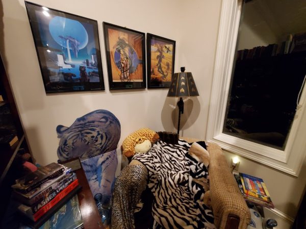
Pictured: an aspiration made real: the hand-me-down "comfy chair" from Francis Produce, which I have kept for 25+ years, now turned into a reading nook in my new library. That nook is filled with artwork and standees and books and novels and comic books, and in that comfy space there I have actually, like, started to read books again and stuff after years of and years of stunted fiction reading, post-grad-school.
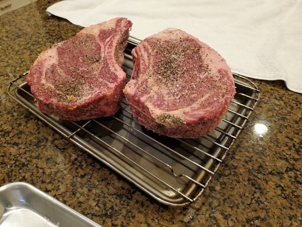
Two tomahawks in all but bone for the high school gang's 30th annual "Edgemas" party, prepped with my own custom almost-dry rub and set aside to rest for 24 hours prior to a reverse-sear:

I hear it turned out pretty well. :-D
-the Centaur
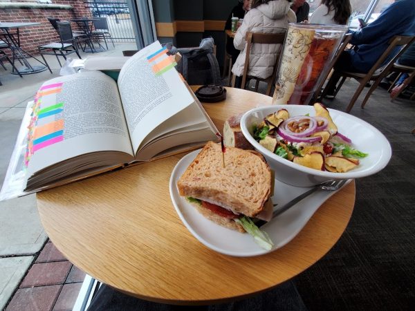
It's a [re]start. Welcome to 2023, everyone.
-the Centaur
... I finished Nano for the umpteenth time. But it's just shy of 3am, so I am going to hit the hay and do my usual "Viiiictory N times" post tomorrow.
-the Centaur
P.S. (It will be "Viiictory, 34 times", for 1.8 million words written in Nano).

So I dropped in to Cafe Intermezzo near Perimeter Mall to get a little editing in on SPECTRAL IRON and realized that THIS was where I and my wife went for our first date, almost exactly twenty years ago! (I think we were sitting just out of view, not far from the chair you can see at the left of frame.)
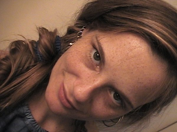
I wasn't taking pictures as regularly then and selfies certainly weren't a thing, so the closest pictures I have of Sandi were from a photo shoot we did almost a year later when she needed reference images for some paintings she was doing. Many of those are just Sandi striking odd poses that corresponded to something that she needed to draw, but I think the one above turned out quite well.
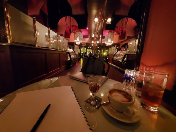
Cafe Intermezzo will always hold a place in my heart as it's one of my best late-night thinking and writing places, but the one at Perimeter has an even more special place, as it's where Sandi and I, who had met at the Chamber a few weeks before, shared our first date and our second kiss.

Here's to another twenty great years!
-the Centaur

Well, it's that time of year again ... 65,000 of my closest friends have gotten together in five hotels and two convention halls in Atlanta to celebrate all things science fiction!
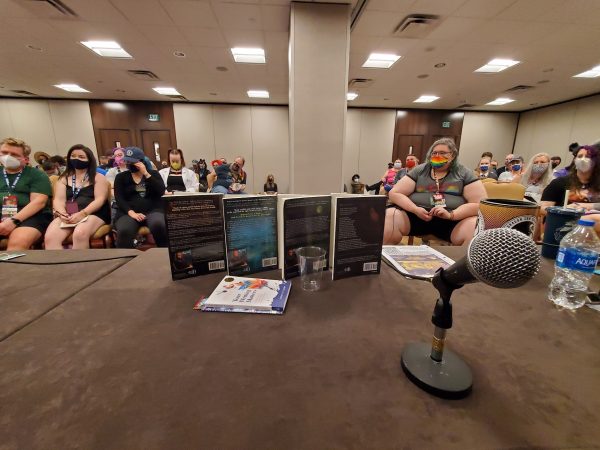
My schedule is below. I worked right up to the start of the con, so am just now posting this two days later, but for the benefit of the time travelers in my audience, I'll include the first two panels:
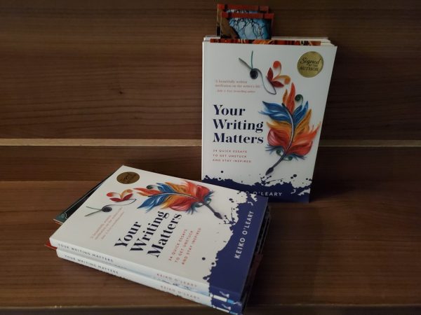
At each panel, I'll be giving away signed copies of the writing inspiration book Your Writing Matters by my friend Keiko O'Leary. This is the latest release from Thinking Ink Press, and we're very proud of it! No matter where you are on your writing journey, I think this book can probably help you, so come on by!
See y'all tomorrow!
-the Centaur
So Dragon Con has come and gone again. I can't tell you how great it was to see my friends again, to be in that environment again, to get a fresh supply of genre t-shirts again. Last year, while the zombie apocalypse was shambling past, we hunkered down and met virtually, which was actually quite nice - one of my friends shared a picture of the Westin bar where a lot of writers used to meet, and we used it as a backdrop for our our Zoom calls:
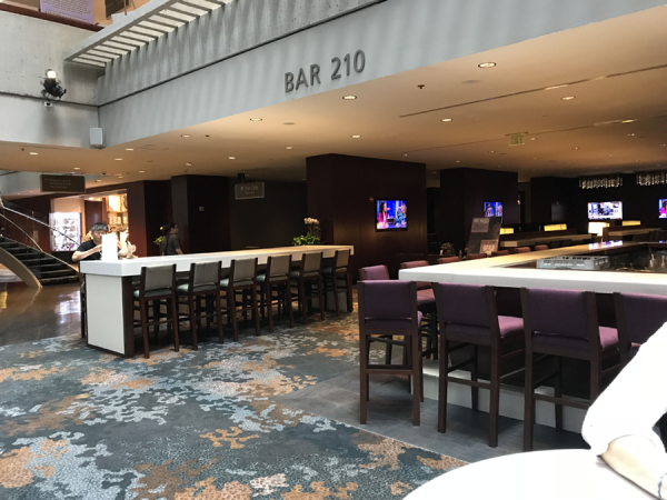
That year (2020), I was having so much fun in the mentoring sessions I never checked out the other content. But this year (well, now, 2021), despite the raging zombie apocalypse being worse than ever (except for the presence of the vaccine) I didn't check out any online content in favor of real-world experiences.
-the Centaur
P.S. Almost a year later (now 2022, with Dragon Con coming up in 3 months), I just noticed this post never went up. Sigh. I wonder what else I was going to say.
Up it goes.

the amount of work needed to put up that one-word, one-image blogpost was entirely out of proportion to the amount of benefit involved. I have fixed site errors with fewer hoops than it took to publish something via the WordPress app, and the fix was actually uninstalling and reinstalling the app, which apparently had gotten into some kind of cruftly state in which it could no longer upload posts.
To be clear, I'm not picking on WordPress here. But I have a Ph.D in Artificial Intelligence and used to work on the front end of Google search. If I can't post a one-word, one-image post on the world's most popular blogging platform using their own easy-to-use official phone app, how are people who have not spent thirty-plus years in the industry supposed to get any work done?
This experience I just had - almost the simplest possible post not uploading after a few minutes - in another industry would be like ... like .. like picking up a hammer and nailing one nail into a piece of wood, only to find the nails popping out a minute later and flying across the room. You ask your carpenter buddy, "what gives," and they say, "Oh, that. You've got hammer voodoo going on there. Just take the hammer back to Home Depot, return it, and buy a new one. Then the nail will go in just fine."
You know what? I'm going to learn from this.
I will endeavor to make the robots less irritating when something goes wrong.
-the Centaur
P.S. AAAA! And this post didn't publish because the interface threw up an extra dialog box after I tried to publish, asking, "Are you sure?" I'm sure I didn't need you throwing up that extra dialog box AFTER I left the page so I spent time looking for it on the home page when it hadn't actually published at all. Aaaa!
It is not like riding a bike.