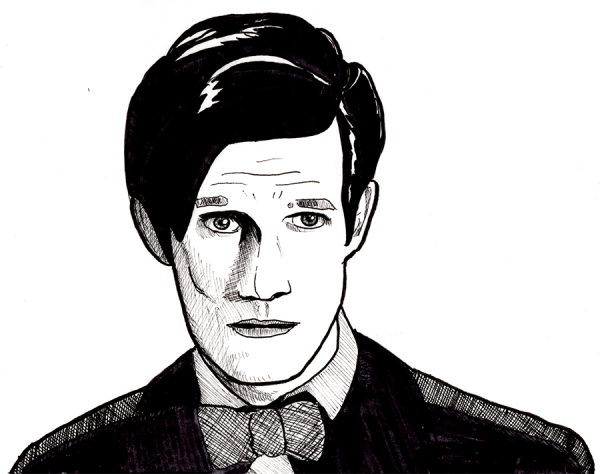
To see what was wrong with the previous day's drawing, I traced - literally traced - the outlines of the image and then rendered it as before. To facilitate this process, I spent a good part of the day yelling at my drawing table, Photoshop, and Google Chrome. Oh wait, that came before and after what I did to facilitate the process - I took the Matt Smith image and Photoshop filtered it to bring up the outlines:
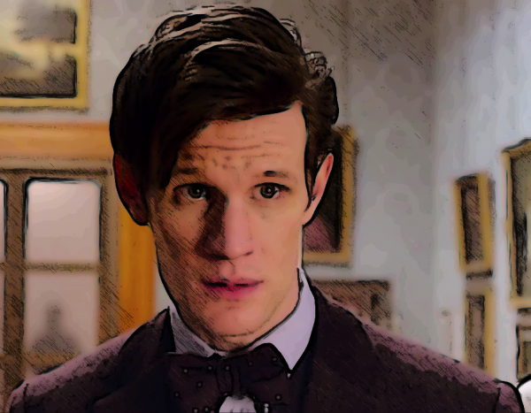
This process of mine, which you've probably seen on other art such as the current banner to the Library, involves duplicating the background layer, smart blurring it to create a softer look (and to make the outlining features work better), then duplicating it 3 more times and applying the following filters:
- Top layer, set to Darken, Opacity ~75%: Filter Gallery > Stylize > Glowing Edges, then Inverse
This creates a heightened set of outlines.
- Middle layer, set to Darken, Opacity ~50%: Filter Gallery > Graphic Pen, often Inverted
This creates a shading layer. You may need to play with levels, contrast, or lightness, possibly with other filters, to create the necessary dark and light areas for this filter to give good results.
- Back layer, set to Normal, Opacity ~90%: Filter Gallery > Poster Edges
This creates a cartoony layer; a 75% to 90% opacity lets part of the original image through to fill in tiny details to create a slightly more realistic look.
This combination creates the impression of a colored drawing. I like how it turns out, though your mileage may vary. Regardless, in this case, it punched up much of the outlines and dark/light areas of the drawing, which facilitated doing the tracing layer.
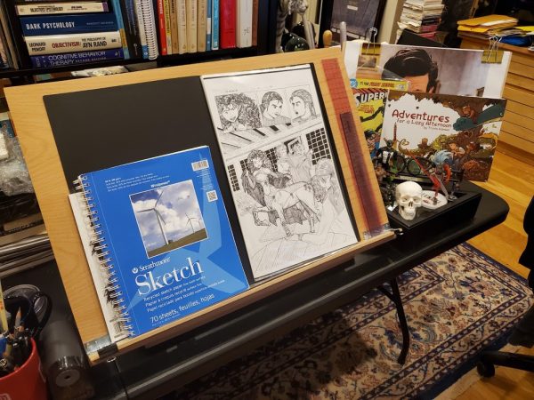
The screaming and yelling came in when I tried to compare today's work to yesterday's. Well, actually, it started when I tried to make a minor upgrade to my drawing setup above, a lip to prevent things from falling off; this was a pain in the ass because my nice but cheap drawing "table" had a lip so short that not only would notebooks and such fall off it, it was hard even to attach something to extend it. Yelling ensued. But eventually I did extend it, using a thin lip of oak held on by carefully angled screws:
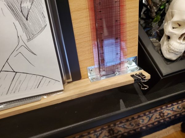
It's a little too deep now, but that can be compensated for with a mat, whereas not having a decent lip can't really be compensated for at all. Regardless, I drew on that tonight, and when I was done, I scanned the image and compared it.
Or tried to, as I hit a wall in my Photoshop knowledge, right when my disk filled up so I could neither undo changes, nor save files, nor really look anything up online. More screaming ensued, followed by an exhaustive closing of apps and Chrome windows. (Note to self: clean off the hard drive of your main computer, there must be some free space somewheres).
I hit the place I call "stuck in molasses" where every attempt to fix a problem creates a new obstacle (down to Chrome not even wanting to close web pages when I'm trying to free space, or web pages popping up "Would you like to sign up for my newsletter" right over the instructions as I'm reading them). This is often related to "the novice penalty" where you have all the general knowledge needed to tackle a problem but none of the specifics, so nothing you try getting started works; it can also happen to experts working in an area where they've grown rusty or the equipment, real or virtual, has bitrotted through disuse. The solution, I've found, is staying with it, focusing on an area of work, constantly seeking ways to either improve your skills, streamline your process, or eliminate blockers. As you build up this library of solutions, you reach a point where making progress is quick and easy, despite blockers.
In the end, ears ringing from yelling, I did manage to find the solution I wanted - to lighten "black" ink layers to a midscale grey prior to trying to colorize them - and that enabled me to produce this:
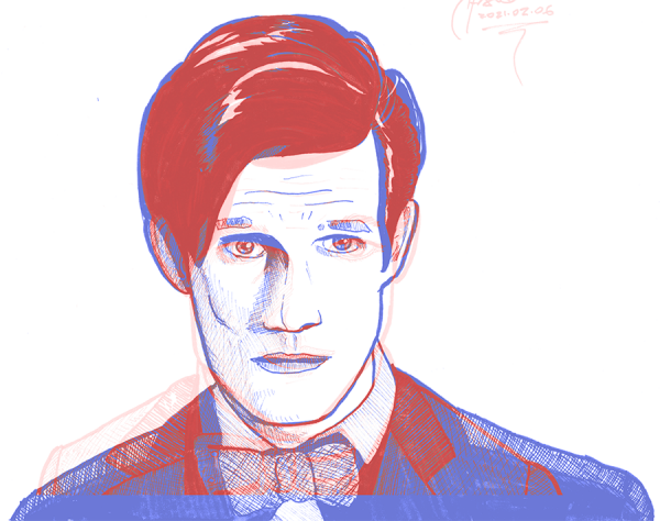
Red is yesterday's drawing; blue is today's rendered trace. Trying to line this up by matching nose to chin, I discovered various things:
- I got the top of the head pretty OK: Matt's hair is roughly in the right place. That doesn't surprise me: I like drawing hair, as all my favorite character creations are well-coiffed.
- I was correct in thinking I'd gotten the eyes too wide.
- I tend to exaggerate chin shapes, or at least I did here (and even in the trace before I caught it), leading to the too-wide original face. Human heads are narrower than I tend to draw them.
- I underestimate shoulder shapes, or at least I did here, or, more accurately, only Matt Smith could make someone as totally ripped as he is look like a goobery old professor.
Well, now I have some more things to work on. Onward!
Drawing every day.
-the Centaur
P.S. You may be wondering, "Yelling until your ears are ringing ... are you OK?" No, no I'm not. Welcome to the pandemic, which is actually the least of my problems. Thanks for asking!
 Who's that? Another exercise in trying to make a face look like a face. This is a new set of techniques based on Erica Henderson of Guilded Age and The Unbeatable Squirrel Girl. According to Wikipedia (original article here) she sketches on a Cintiq using Paint Tool Sai, liberally exploiting the Undo feature to get the sketch right; then she prints this out in blue-line and inks over it, exploiting the ability of Photoshop to remove the blue-lines once scanned.
I tried the same thing here, using Photoshop rather than Paint Tool Sai, and using both Undo and Puppet Warp on various layers to move things around until I had a good sketch, which I printed in blue (greyscale lines below were removed prior to printing, this just shows the evolution):
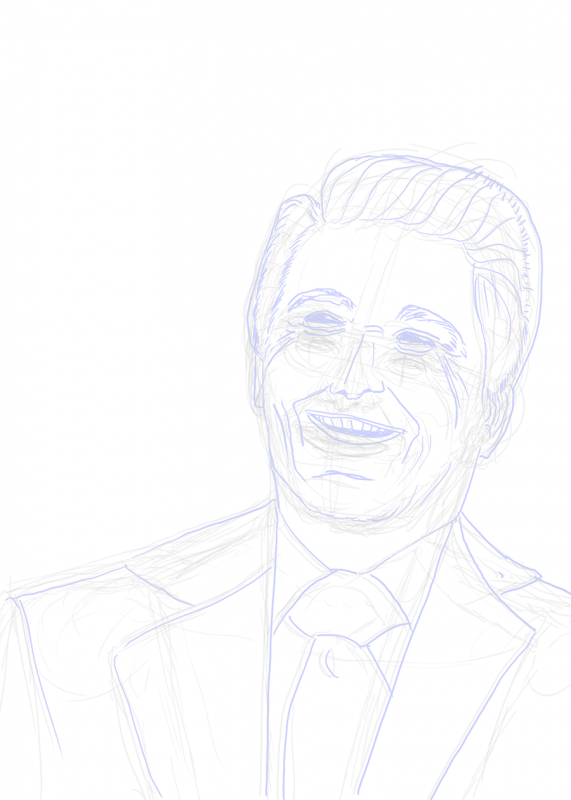 Actually, I inked this in black, then (roughly) followed the guidance in this YouTube video to first turn one layer to grey, then from grey to light blue. Printing just the blue-lines on 11x17 paper and inking over that gave me a lot of control, and thanks to Graphic Design Stack Exchange I found an easy way to make the blue go away by converting to CYMK, using Curves to push down the Cyan and Yellow layers, then Channels to suppress Magenta and just get the Black channel without the blue lines, which can be copied and pasted into a new grayscale or RGB document for further processing or inking. Levels brought the inks up to the desired level of darkness, approximating the original physical inks.
As for whether it looks like a face ...
 ... I'm still rating this a "meh". I'm still having trouble landing the overall map of the face - not say the curves at point A or B or even the overall outline, but the relationship of the various parts so they're correctly sized with respect to each other and properly angled with respect to the original.
Still ... drawing every day.
-the Centaur
P. S. Gosh it is drawing a super wrinkly face and making it turn out right. I hadn't realized how much of Reagan's distinctive look was not just the shape of his face, but all those genial wrinkles.
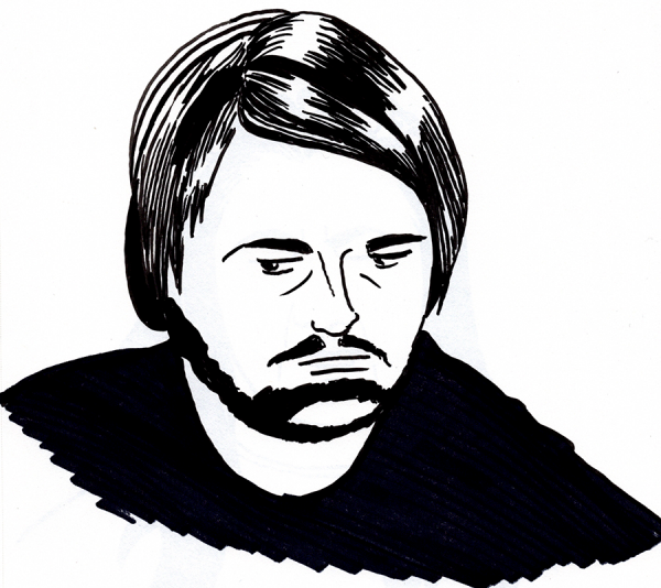
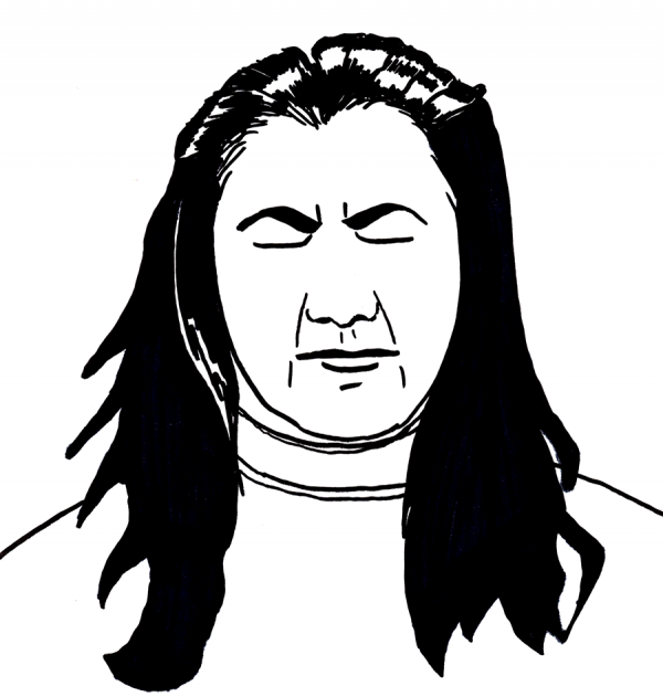
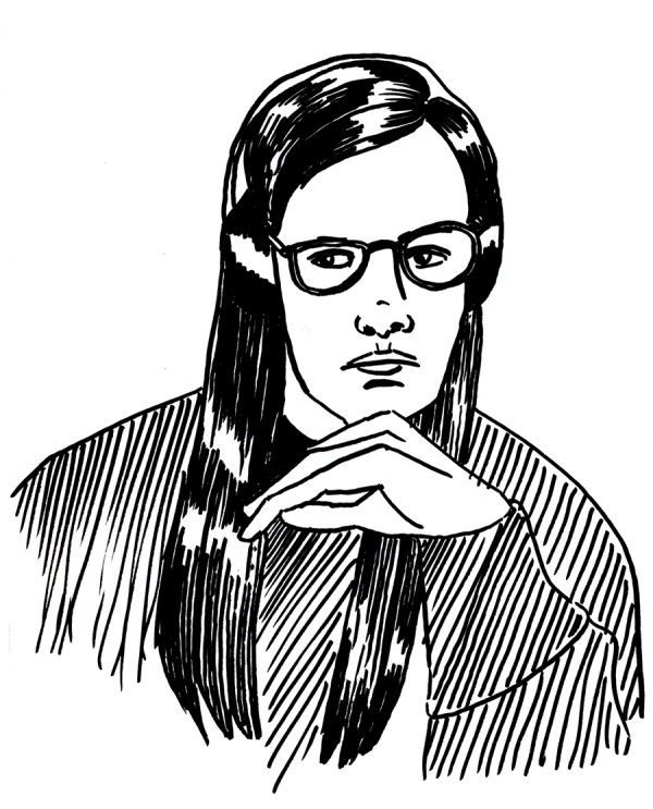
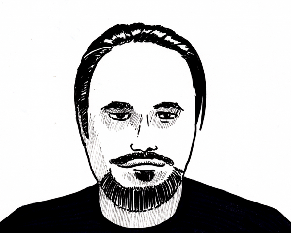 Quick sketches of writers on tonight's
 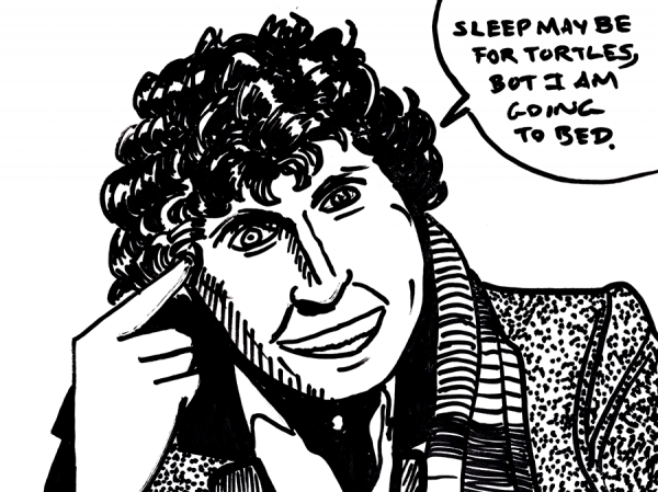 As it says on the tin: it's late, I'm tired, and I have early meetings tomorrow (fine, fine, FINE, 10am Pacific, which is 1pm my time, but it's 3am already) so here's a quick sketch of the Fourth Doctor on Strathmore using a dry erase marker, because damnit, the point is not to perfect the drawings, but to not break the streak. This one could really have used a preliminary sketch and a normal render though:
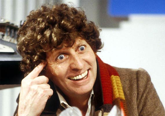 I'm happier with the jaw, but the hair could have extended about another 10%. Another thing to watch out for (though it's easier to get right when you're doing preliminary sketches before diving in, instead of jumping straight out of the airplane with nothing but a dry erase marker and hope).
Drawing every day.
-the Centaur
  To see what was wrong with the previous day's drawing, I traced - literally traced - the outlines of the image and then rendered it as before. To facilitate this process, I spent a good part of the day yelling at my drawing table, Photoshop, and Google Chrome. Oh wait, that came before and after what I did to facilitate the process - I took the Matt Smith image and Photoshop filtered it to bring up the outlines:
 This process of mine, which you've probably seen on other art such as the current banner to the Library, involves duplicating the background layer, smart blurring it to create a softer look (and to make the outlining features work better), then duplicating it 3 more times and applying the following filters:
 The screaming and yelling came in when I tried to compare today's work to yesterday's. Well, actually, it started when I tried to make a minor upgrade to my drawing setup above, a lip to prevent things from falling off; this was a pain in the ass because my nice but cheap drawing "table" had a lip so short that not only would notebooks and such fall off it, it was hard even to attach something to extend it. Yelling ensued. But eventually I did extend it, using a thin lip of oak held on by carefully angled screws:
 It's a little too deep now, but that can be compensated for with a mat, whereas not having a decent lip can't really be compensated for at all. Regardless, I drew on that tonight, and when I was done, I scanned the image and compared it.
Or tried to, as I hit a wall in my Photoshop knowledge, right when my disk filled up so I could neither undo changes, nor save files, nor really look anything up online. More screaming ensued, followed by an exhaustive closing of apps and Chrome windows. (Note to self: clean off the hard drive of your main computer, there must be some free space somewheres).
I hit the place I call "stuck in molasses" where every attempt to fix a problem creates a new obstacle (down to Chrome not even wanting to close web pages when I'm trying to free space, or web pages popping up "Would you like to sign up for my newsletter" right over the instructions as I'm reading them). This is often related to "the novice penalty" where you have all the general knowledge needed to tackle a problem but none of the specifics, so nothing you try getting started works; it can also happen to experts working in an area where they've grown rusty or the equipment, real or virtual, has bitrotted through disuse. The solution, I've found, is staying with it, focusing on an area of work, constantly seeking ways to either improve your skills, streamline your process, or eliminate blockers. As you build up this library of solutions, you reach a point where making progress is quick and easy, despite blockers.
In the end, ears ringing from yelling, I did manage to find the solution I wanted - to lighten "black" ink layers to a midscale grey prior to trying to colorize them - and that enabled me to produce this:
 Red is yesterday's drawing; blue is today's rendered trace. Trying to line this up by matching nose to chin, I discovered various things:
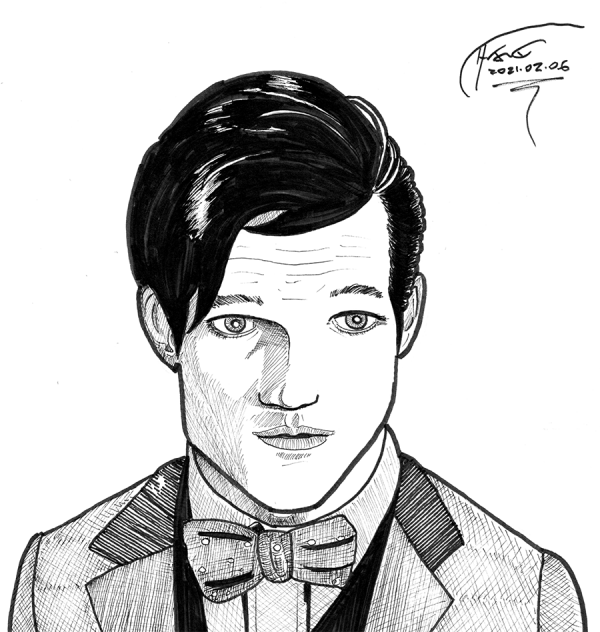 11th Doctor sketch, done with much tighter pencils than normal. Forget the crosshatched shadingo on the coat - wasn't trying to get that right, it was just a means to the end - but as for the face ... Meh.
Much about this sketch is better than many of my previous ones, but there are still proportionality issues - the left side of his jaw is lopsided, the eyes are too big and too far apart, and the whole proportions make the head too big and too squat despite my attempts to get the rough proportions right before I started the detailed pencils. The real Matt Smith is ... shall we say ... more lantern-like:
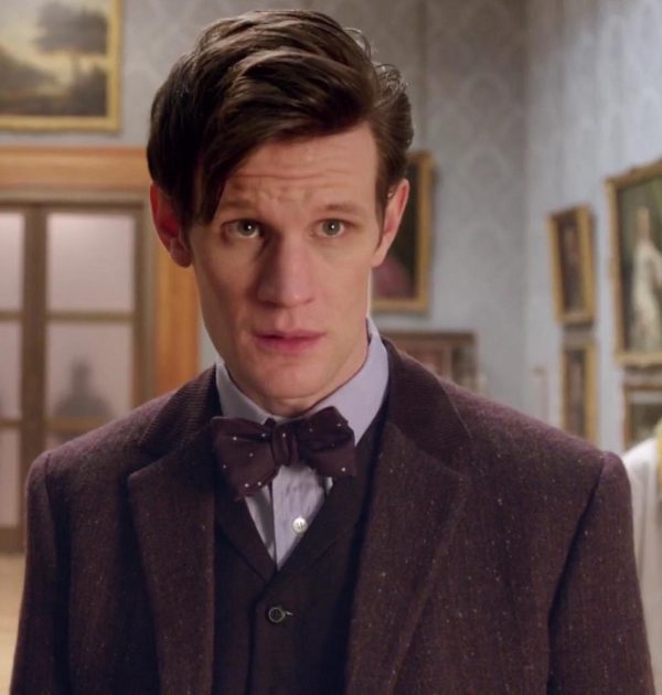 Not quite sure what I'm doing wrong there, but it's something to pay attention to. While I could do some work on proportions and drawings with graph paper, or read more books on anatomy, I think the real solution is to draw a heck of a lot of faces and keep doing this analysis to them.
Which is why I am ... drawing every day.
-the Centaur
 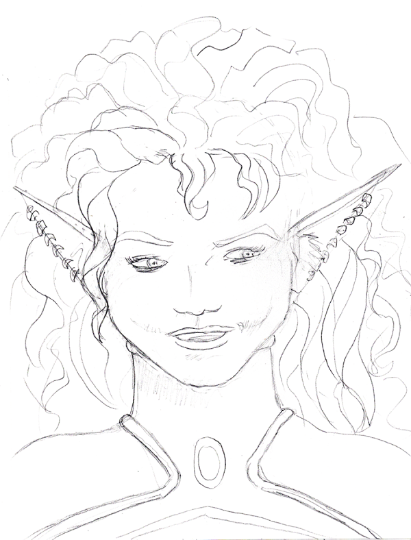 A deliberate attempt to just sketch in pencil and not ink. I decided to sit down and methodically start working through Wizard's How to Draw: Getting Started, working on roughs, when I noticed that one of the things I like about the book is that it has a mental model of artwork.
That inspired me to dial it back even further and to try to generate my own theories of art. I measured a Green Lantern figurine and a drawing dummy looking at proportions (hips are about midway in the figure), then examined old Superman comics and sketched one trying to see what I'm doing wrong.
Since I cut my chops inking my own webcomic, as fast as I could manage, wherever I draw it, I got in the habit of inking right over my own pencils, trying to get a good rendering in one go, which is a thing people do. But I've noticed many great artists use roughs to plan for success in their drawings.
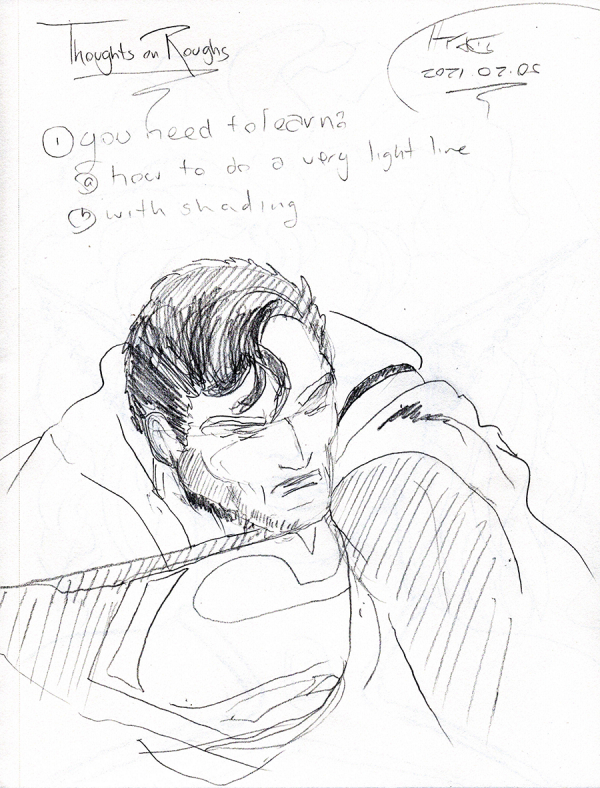 These roughs often have several levels of shading, which right there is an improvement over my "everything is an outline" style, when in reality, outlines are mostly in our minds, not in reality. So I sketched out a few figures, with shading, in greater detail than I normally would in pencil.
I can't tell you how hard it was to NOT start inking.
Still ... drawing every day.
-the Centaur
 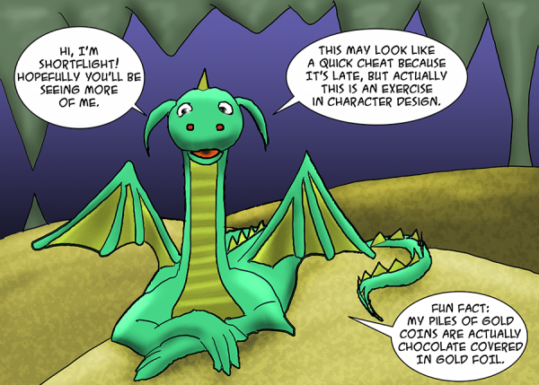 Shortflight is a dragon stuffed animal given to me by my childhood neighbor Marilyn. He's got tiny little wings and is, um, rotund - dare I even say "pillow-shaped" - so I always called him "Shortflight". I think this name may have come from a childhood book The Dragon Circle, but I'm not sure. If I still own that book, it is buried in boxes somewhere.
And while this was not quite a cheat, it was (a) a good exercise in use of the Wacom, character design, and more practice with coloring, and (b) easy to work on while I finished watching Tenet.
Drawing every day.
-the Centaur
 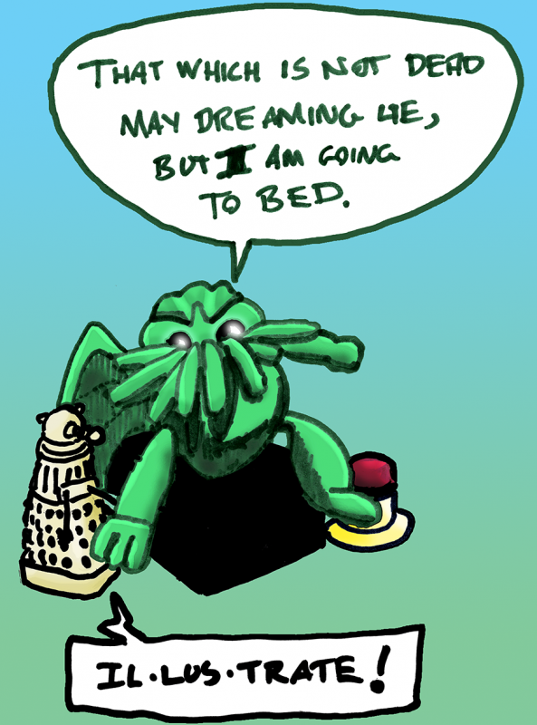 Trying very hard not to break the streak of drawing every day, but it's late and I have workmen coming early in the morning (sure, sure, FINE, they're coming at 9, that's early for ME because I go to bed at 2-4am most evenings, er, mornings). I present dread plush Cthulhu and friends, rendered with whiteboard markers on 9x12 Strathmore, briefly colored in Photoshop to give it dimension, and as always ...
Drawing every day.
-the Centaur
 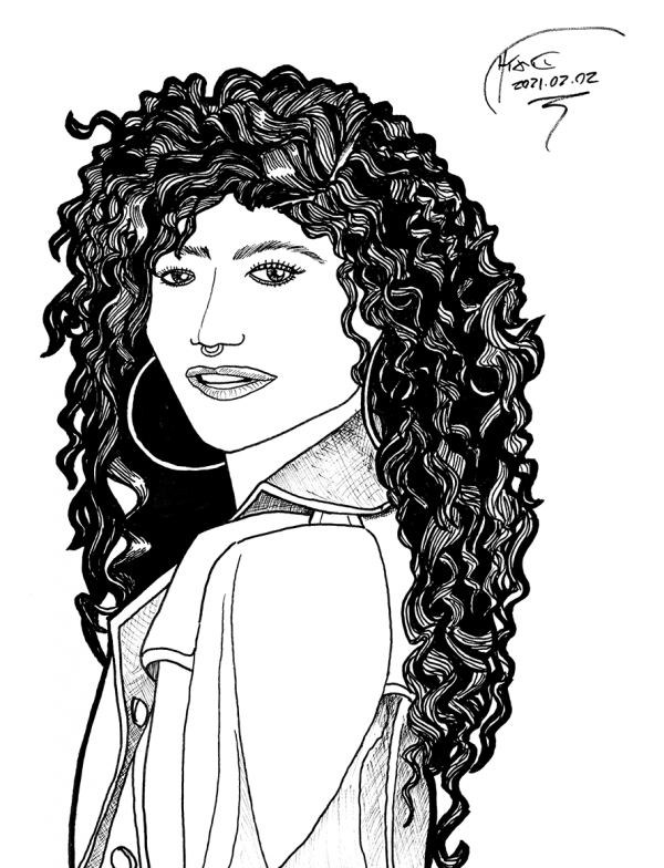 Another attempt at space hair. I did a better job at creating dimension in the hair, I think, but fell for two classic blunders: first, the face is too large compared to the size of the head, causing the top of the head to appear cut off, and second, this first error was caused by me leaping too quickly from roughs to inks, which may not be a classic error for everyone, but is classic for me. Also the eyes are off angle:
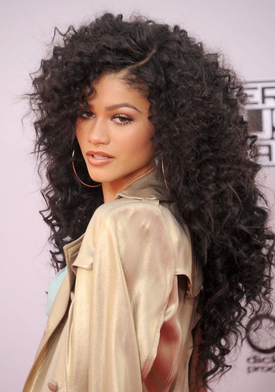 According to Google Image Search, this is
 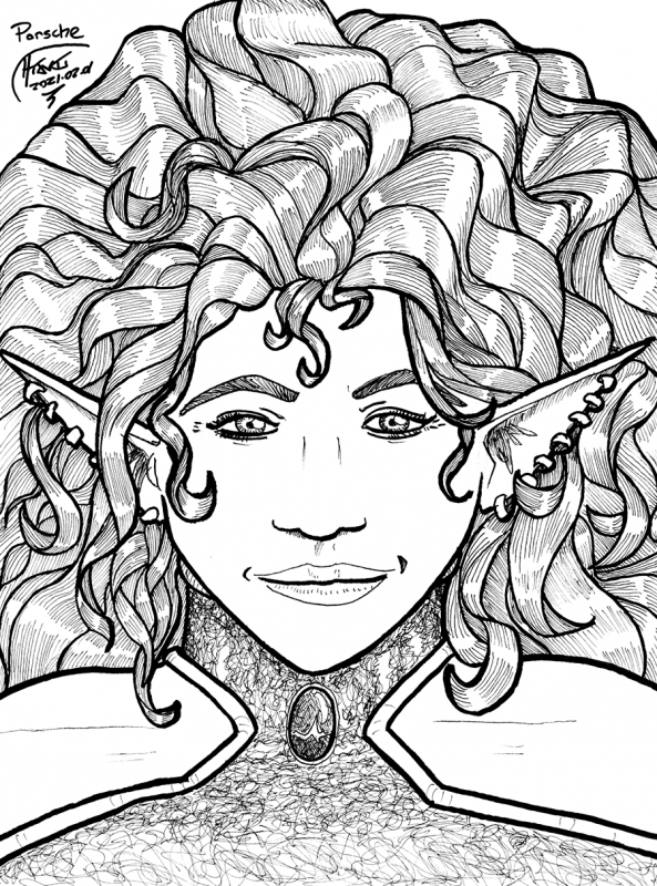 Now that's more like it. Another exercise in making a face look like a face, except this time I was not using a real person as a reference, but older drawings of one of my own characters, centauress explorer Porsche Kirkpatrick-Saint George, from yesterday's entry. Here's a couple zoomed in shots:
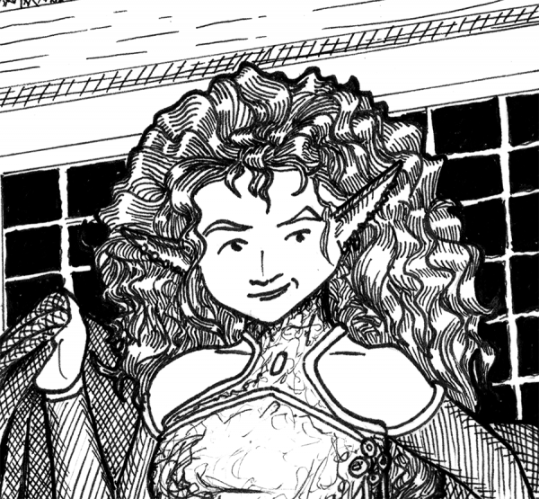
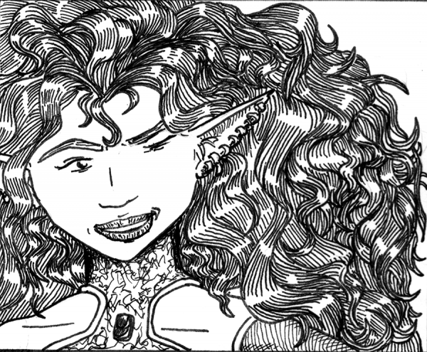 Differences in the new version: slightly narrower face to better fit what I currently understand about human proportions; slightly wider nose, because she's a frigging centaur and needs to breathe; slightly thicker neck, because even at 22-23 here she's supposed to be an exceptional martial artist (and lives in 1.7 gravities). Otherwise, I tried to abstract the older proportions and recreate the same person.
I think I got close, but my faces are still not yet stable. I see I still have the same problem with the "errant pen" occasionally jerking and messing up my lines; I also see I could be making her giant mass of hair more dimensional and less flattened to two planes (though I note my time-traveling action archaeologist and her space hair predates River Song by quite a bit, even if Stephen Moffat beat me to the screen).
Lots of work to do, clearly. Took me two hours. Need to do that in half or a third the time. Still ...
... drawing every day.
-the Centaur
 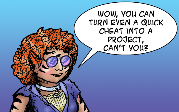 As it says on the tin. Fell down a rabbithole trying to clean up my files prior to doing my art, decided to cheat by posting a sketch I did earlier today, then fell down more rabbitholes since I apparently can't not experiment with coloring a sketch. For reference, here's the sketch from earlier, the first entry in a notebook that I hadn't written in in over 18 years:
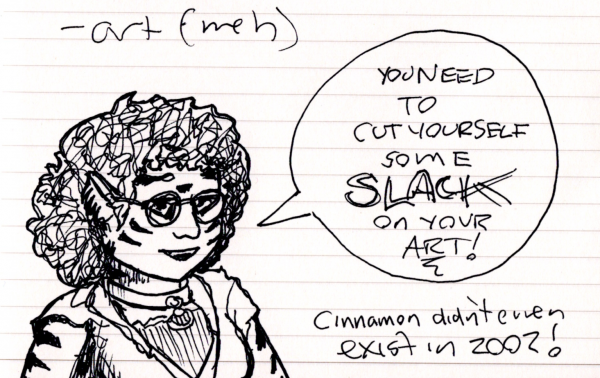 I came across this notebook just trying to find an appropriate notebook for a science idea (my sketchbook is at hand, but the science notebooks are ... buried in boxes?? Not sure) and found this one, a "commonplace book" filled with various ideas, including a life review from almost 20 years ago. I'm ... actually pretty happy with how things turned out over the last 20 years, between my wife, my novels, my comics and Google, but there's so much more to do.
Finally, for reference, here's a piece of art I found while I was re-organize my files. This is from 24 Hour Comic Day, mind you ... a bit ambitious, I think, but this pre-break art I think shows the kind of work that I'm intimidated by when I try to get back into drawing:
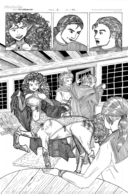 Yes, there's a lot to be improved with this art, but (a) my inking was a lot better, and (b) wow, I had forgotten how much the Porsche St. George character was supposed to be a "knockout". So much of what I've written / drawn about her since then has been the workmanlike space warrior stuff, not so much the original romance between the twentieth-century time traveller and the thirtieth-century centaur.
Ah well. Lots of work to do before I can get back to that level of quality, even though I see a lot of work I need to do to improve upon that once I get there.
Drawing every day.
-the Centaur
 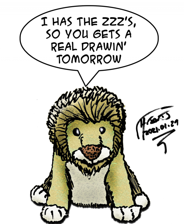 As it says on the tin. Quick sketched with a dry erase marker on 9x12 paper, then rapidly colored / filtered / rendered in Photoshop. Subject: one of the plush lions from my vast collection of genre toys that I once had on my desk at work - with the excuse that these were my motivation to keep working. "This is why I'm doing this: to be able to afford to enjoy that."
 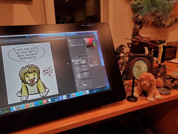 So far, the motivational experiment seems to be working.
Drawing every day.
-the Centaur
 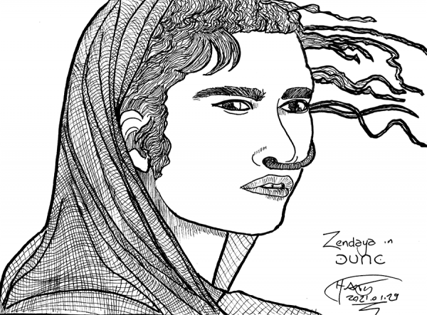 A quick sketch of Zendaya portraying the character Chani in Dune. (Yes, I put a lot of effort into this sketch, but I call it a "quick sketch" because I specifically optimized getting the sketch done for its purpose - making faces that look like particular faces - rather than solving all problems, e.g. developing a strategy for rendering her woven shawl with crosshatching). As for making a face look like a face ...

 Another exercise in trying to make a face look like a face. Started with Daniel Craig, but ended up with Vladimir Putin before he lost his hair. "The name's Putin ... Vladimir Putin." Clearly more work is needed in this area: I see little things wrong, but there's a subtle "offness" that eludes me. More practice!
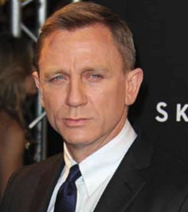 Drawing every day.
-the Centaur
 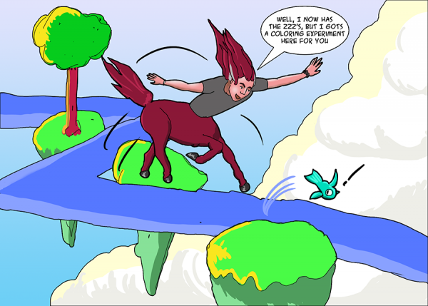 As it says on the tin. I noticed that Travis Hanson uses negative space and shading with layers of flat colors (in at least a couple drawings I happened to have on hand, not saying that's all the time) and tried the same experiment in this little visit to the Roger Deaniverse and all its floating rocks. Though I didn't end up using negative space because clouds were in my composition, but hey.
Ehh, not the best drawing, but it's an interesting experiment in coloring without the normal Photoshop filters I use, but instead just using two or three colors per layer (excepting the skin tones, which had a few more and blending). I did use the "stroke" effect on some of the layers to fake inks, but the centaur and fish inks are drawn in a full inks layer, from which I took flats and then did coloring, using the select function to help me keep highlights / shadows to the right layers.
Drawing every day.
-the Centaur
 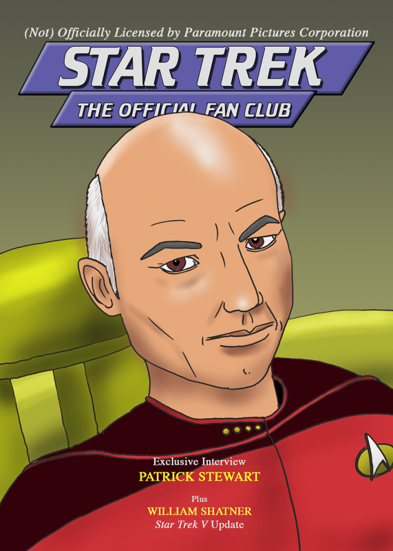 An attempt to recreate the March/April 1988 issue of "Star Trek: The Official Fan Club". Could have matched the cover more closely, but, really, this was an exercise in trying to make a face look like a particular face. Comparing with the original cover, I don't think human eyes are supposed to be that large - it's interesting how your mind distorts what you're seeing when you try to recreate it on the page.
Drawing every day.
-the Centaur
 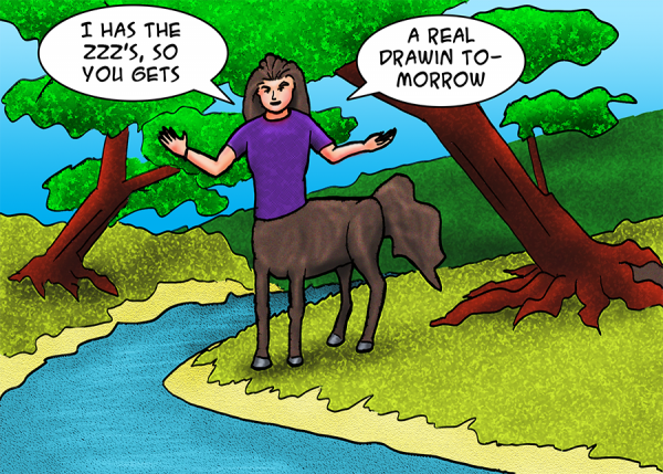 As it says on the tin. A brief experiment in a cartoony style, inspired by the work of my see-them-only-at-San-Diego-Comic-Con friend
 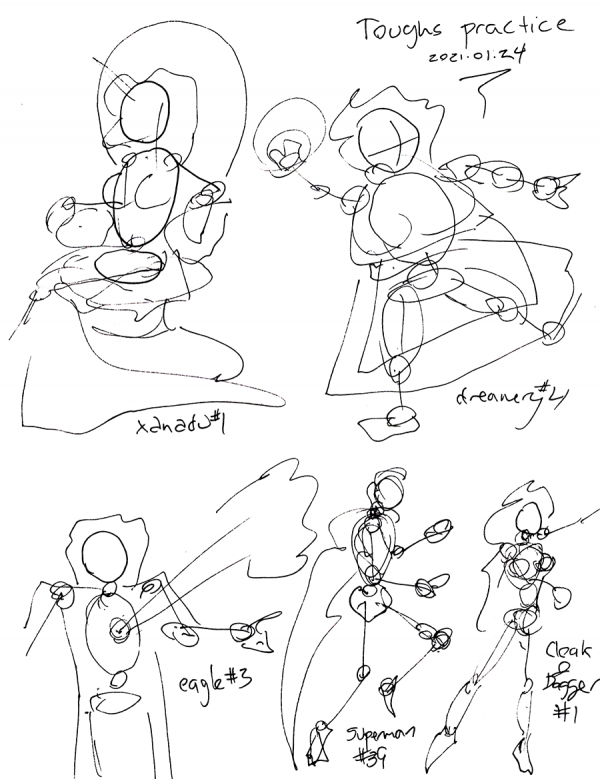 Well, this may have been quick, and it may look sketchy, but actually, this is real drawing practice. I've long had a copy of
 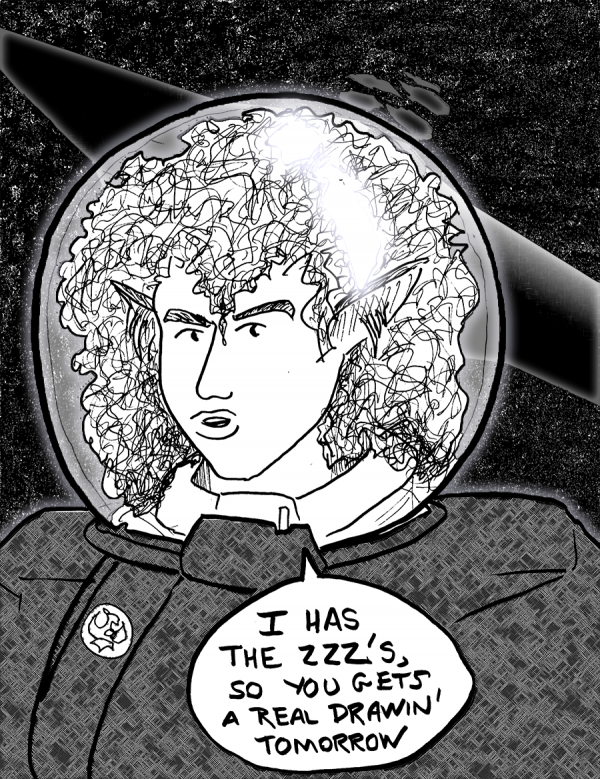 As it says on the tin: I has the ZZZ's, so you gets a real drawin' tomorrow, as Cinnamon would say. The purpose of the exercise is to make sure I draw SOMETHING, every day, in whatever medium comes to hand. This centaur in a spacesuit (well, you can't see the legs, but they're there) was sketched on a Strathmore 9x12 sketchpad with a Winsor-Newton 2B pencil, then inked hot to broad outlines with a Faber-Castell "B" Pitt Artist Pen Brush, with details via Micron 03, 08, and 1 Pigma pens. Scanned on an Epson 7720, retouched in Photoshop to pull up the inks, and then separations, fills, filters and effects to create the starfield, kettledrum starship, Porsche's uniform, transparent helmet section, main Porsche inks, and the glare off the reflection in the helmet. So while it's a quick sketch, I exercised quite a few things trying to pull the whole composition together. Hopefully these exercises are helping.
Drawing every day.
-the Centaur
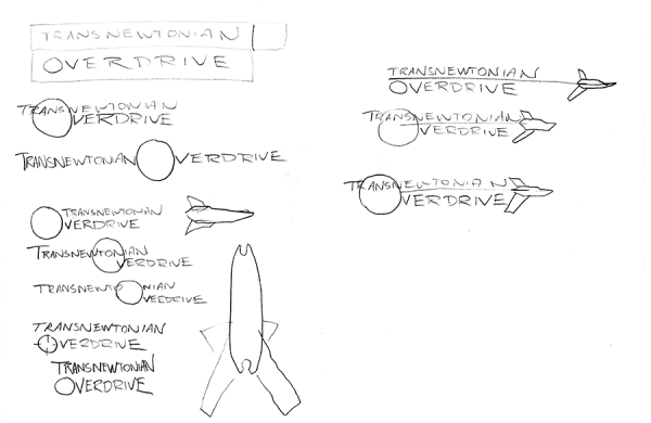
  Well, not a "drawing" per se, though I went through four pages of sketches of this comic book banner logo before I cracked open Illustrator. (Here are a couple of those, not very impressive though).
 I'm still not satisfied with how this turned out ... there's some image in my mind with this logo which I haven't been able to translate into an actual drawing, much less a realized logo.
But what's up with this logo, you may ask? Well, it's from a 24 Hour Comics Day comic I did, way back in the day, but never finished - "Transnewtonian Overdrive: The Front":
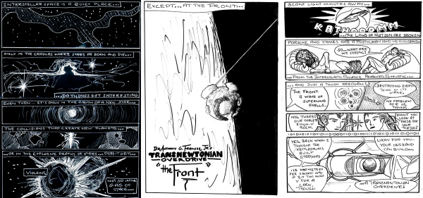 The "transnewtonian overdrive" proper is that little device in the last panel, an aftermarket component to our protagonists' Porsche Hexwing staryacht (first panel) which enables them to go places where other people can't. The idea, you see, was that in an era of faster-than-light travel, no-one would seriously be interested in the relativistic corners of our universe - but by inverting a normal hyperdrive to go just slower than the speed of light, our heroes could dive headlong into places with weird physics.
When I revisited the logo, my sketching - and looking at other logos of other comics - led me to the idea of the Hexwing cutting across the logo, with a thin line connecting it to the "O" of overdrive representing the invisible hypermass that our heroes are bungee jumping off of (and back to) to travel. I feel okay about it - the logo could be sleeker - but I can't quite articulate what the logo as drawn is missing from the image I have in my mind. If I could "see" that, perhaps I could fix it. This will require research, I think: I didn't figure out what was wrong with my Batman page (don't worry! I'm not going back to it) until I looked into