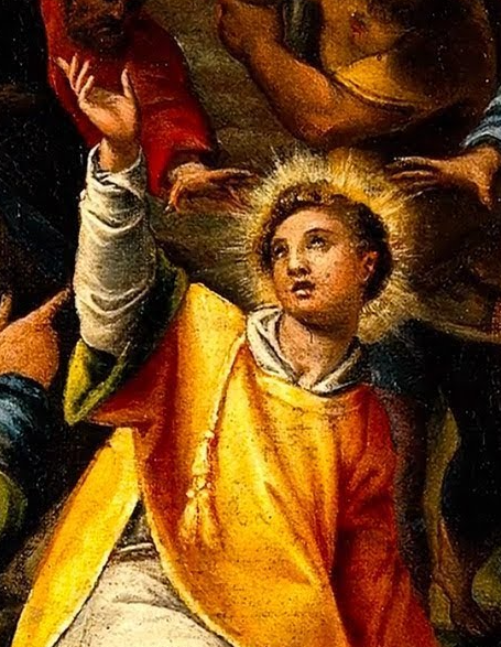
What, did you think I was not going to do Drawing Every Day just because I did a Photoshop graphic for the Lent entry?
So, today's exercise was something very difficult for me: abandoning a failed rough and starting over.
You see, many artists that I know will get sucked into perfecting a drawing that has some core flaw in its bones - this is something I ran into with my Batman cover page. I know one artist who has worked over a handful of difficult paintings for literally 2-3 years ... but who can produce dozens of new paintings for a show on the drop of a hat. But it's hard emotionally to let go the investment in a partially finished piece.
This is tied up with the
Sunken Cost Fallacy Fallacy, the false idea that if you've decided a venture has failed you should cut your losses despite your prior investment in it. This is based on the very real ideas of
sunk costs - costs expended that cannot be recovered - which should not be factored into rational decisions the same way that we should
prospective costs - costs that can be avoided by taking action. The "Sunken Cost Fallacy" comes in when people don't cut their losses in a failed venture.
The "Fallacy Fallacy" part kicks in because in the real world
costs do not become sunk as a result of your decisions. When a self-proclaimed "decider"(1) chooses to proclaim that a project is a failure, the value
invested in the project doesn't magically become nonrecoverable based on that decision and the classical Sunken Cost Fallacy does not apply. I have seen a private company literally throw away a two million dollar investment for a dollar because the owner didn't want to deal with it anymore.
Fortunately, most artists are better businessmen than that. Deep down, they know any painting could be the ONE that gets them seen; deeper down, each painting is an expression of their creativity. Even if the painting has flaws, one never knows whether the piece will be fixable, even ultimately excel. I have seen paintings go through years of work and many difficulties, only to finally turn up amazing. Drawings, paintings and novels are like investments in that way, always tantalizing us with their future potential.
But, deep down, I feel like it's possible to do better than that. That by painting or drawing more, and being more ruthless earlier in the process, that it's possible to recognize wrong turns and truly sunken costs and to start over. Once a huge canvas has covered with paint over many months, or a large manuscript has been filled with words over an equal period of time, it represents an investment in images and ideas that can potentially be salvaged ... but a sketch or outline, now, that you can throw out straightaway.
You may not get the thirty minutes doing the sketch back, but at least you'll be starting in a better place.
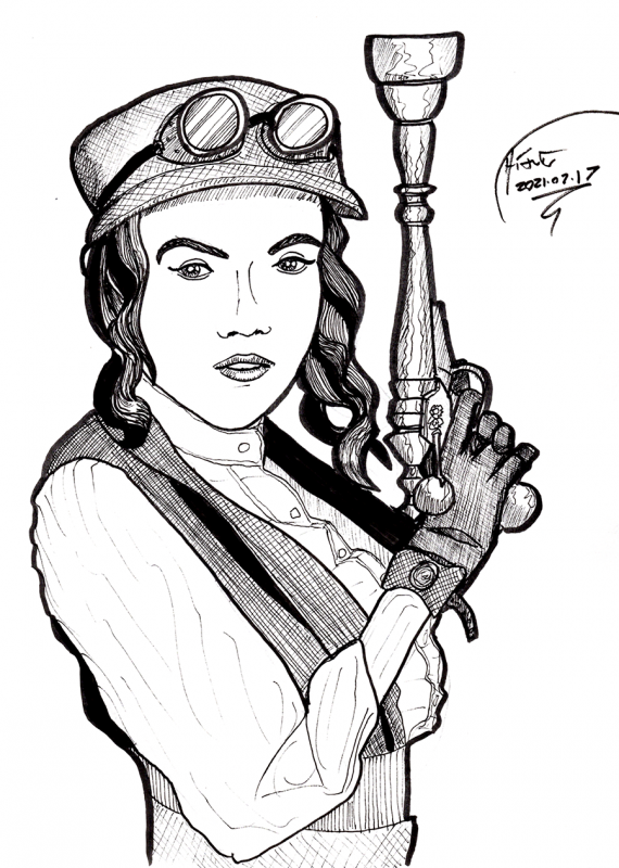
In my case, I was starting here, the cover for
Steampunk Gear, Gadgets and Gizmos I had lying about:

I started what I intended to be a quick sketch, and got partway into the roughs ...
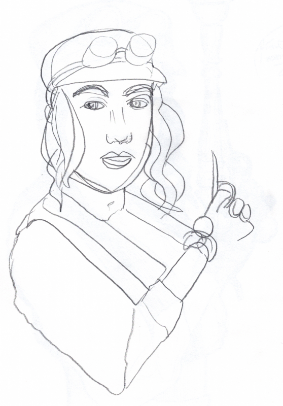
... when I decided that the shape of the face was off - and the proportions of the arm were even further off. I started to fix it - you can see a few doubled features like eyes and lips in there - but I decided - ha, decided - no, stop, STOP Anthony, this rough is too far gone.
Start over, and look more closely at what you see this time.
That led to the drawing at the top of the entry. There were still problems with the finished piece - I am continuing to have trouble with tilting heads the wrong way, and something went wrong with the shape of the arm, leading to a too-narrow, too-long wrist - but the bones of the sketch were so much better than the first attempt that it was easy to finish the drawing.
And thus, keep up drawing every day.
-the Centaur
(1) I'm not bitter.
 Suuuuper quick sketch of Willem Dafoe in The Last Temptation of Christ, done with a big honking Sharpie. My first failed drawing on Strathmore 9x12 served as a basis for a quick resketch on 9x12 tracing paper, again with the Sharpie - it has such a crystallizing effect on your drawing, as those huge darn lines cannot be taken back and you just gotta GO with it. Not altogether bad for 10 minutes, though that darn "head de-tiltification" thing is still working against me:
 Drawing every day.
-the Centaur
Drawing every day.
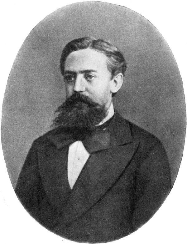
-the Centaur 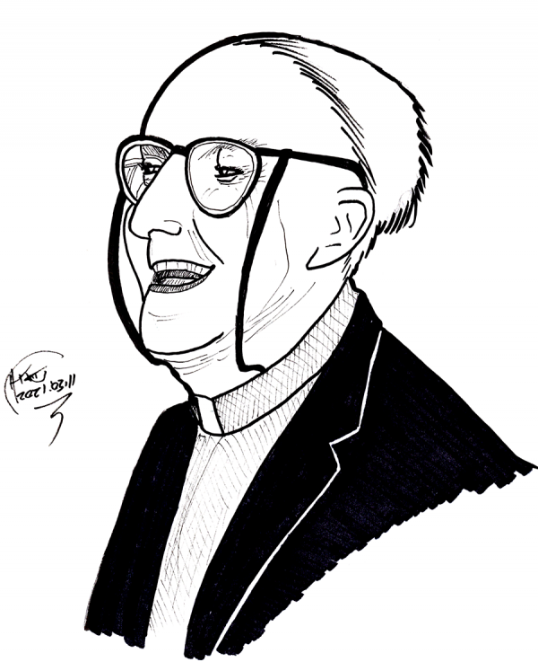 Quick sketch of Reginald Fuller, using pencil roughs (started upside down to get the proportions, then rotated back to normal to fix the details, which was harder than expected; the first upside down one turned out to be more useful for me to see the features and relationships, but I only got it right once I put it right side up). Then a quick render with Sakura Pigma and Micron pens and a Sharpie.
Not ... altogether bad, though it could have used another pass.
Quick sketch of Reginald Fuller, using pencil roughs (started upside down to get the proportions, then rotated back to normal to fix the details, which was harder than expected; the first upside down one turned out to be more useful for me to see the features and relationships, but I only got it right once I put it right side up). Then a quick render with Sakura Pigma and Micron pens and a Sharpie.
Not ... altogether bad, though it could have used another pass.
 He, also, looks so happy.
Drawing every day.
-the Centaur
He, also, looks so happy.
Drawing every day.
-the Centaur  Super quick sketch of Robert Axelrod, done by tracing over my own roughs twice then rendering over that with my standard Sakura Microns. Eyes WAY too big, face too wide, I didn't quite get the head tilt (as usual), and it seems like I cut off part of the top of his head, though I was partially able to fix it.
 Drawing every day.
-the Centaur
Drawing every day.
-the Centaur 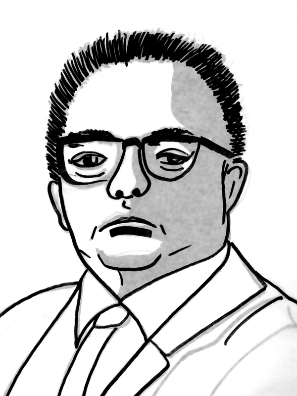 Suuuper quick sketch of E. T. Jaynes with minimal roughs and one big honking Sharpie, rescued from a bad shading attempt by tracing over my own drawing, and them I'm like, hey, I can leave the tracing paper over the original attempt and that gives me my grey layer. Didn't quite get the head tilt:
 Drawing every day.
-the Centaur
Drawing every day.
-the Centaur 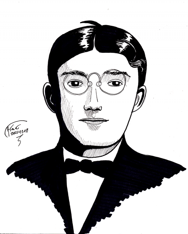 Quick sketch of John Watson. Kind of reminds me of a cross between H. P. Lovecraft and Clark Kent.
 Drawing every day.
-the Centaur
Drawing every day.
-the Centaur 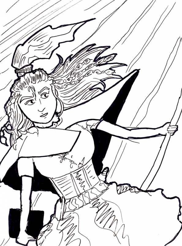 It's late and I'm tired and want to get to bed early, so here's a suuuper quick sketch of Xiao from f@nu fiku hanging out at a bridge of some kind. (She's up in the cables, goofing around over a vast drop, because she is insanely acrobatic and unafraid of heights, living as she does on a lighthouse cantilevered out over a sheer cliff face).
Drawing (well, sketching) every day.
-the Centaur
It's late and I'm tired and want to get to bed early, so here's a suuuper quick sketch of Xiao from f@nu fiku hanging out at a bridge of some kind. (She's up in the cables, goofing around over a vast drop, because she is insanely acrobatic and unafraid of heights, living as she does on a lighthouse cantilevered out over a sheer cliff face).
Drawing (well, sketching) every day.
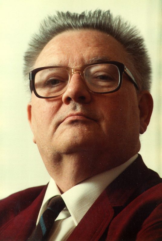
-the Centaur 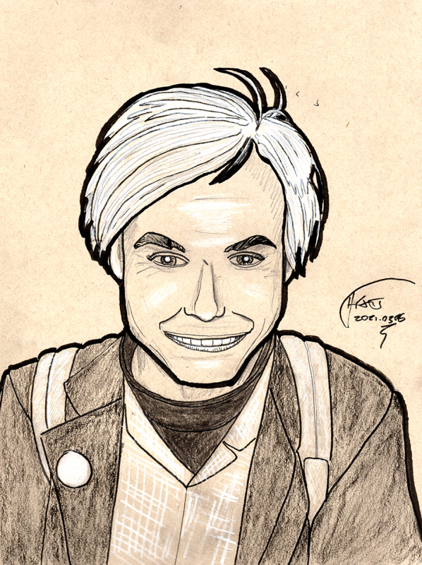 What started to a quick sketch ended up with me pulling out all the stops so I didn't have to stay up to 4:30 in the morning. Roughed with a 2B pencil on Strathmore 9x12 Toned Tan, then inked with Sakura Micron pens, with shading and white highlights with Winsor-Newton Hard, Medium and White Charcoal plus a little 2B and final outlining with a Sakura Pigma brush pen. I like doing renderings on toned paper as you can go up to white and down to dark, giving you more ways to push the drawing. The face still is too wide, and is missing something, compared to the source image (
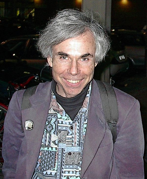 Douglas Hofstadter in Bologna, Italy - 06 March 2002[/caption]
Drawing every day.
-the Centaur
Douglas Hofstadter in Bologna, Italy - 06 March 2002[/caption]
Drawing every day.
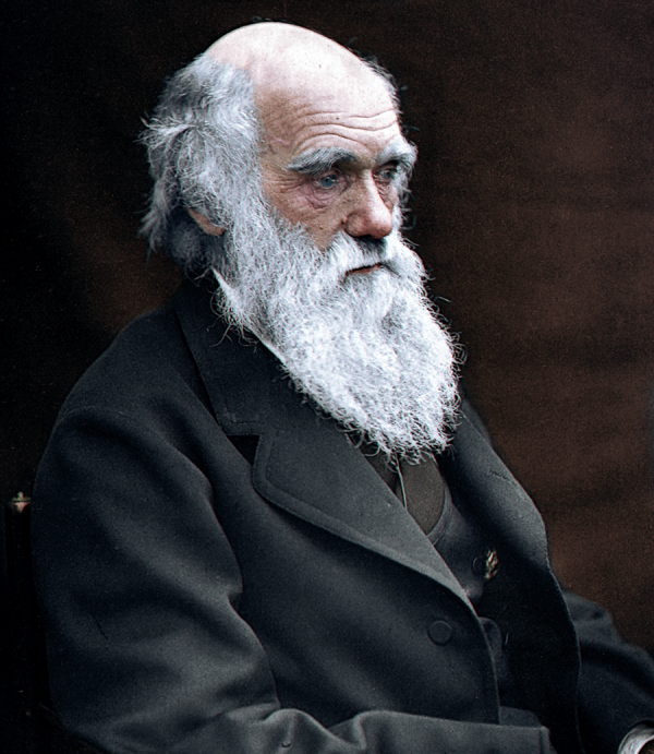
-the Centaur 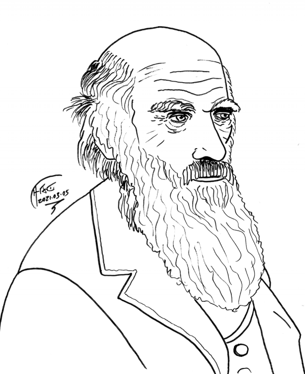 Charles Darwin, roughed on tracing paper, then traced over the roughs, both with a Sakura Micron 1 pen on the theory it's late and I'm tired (and I'm more comfortable sketching with ink than pencil anyway).
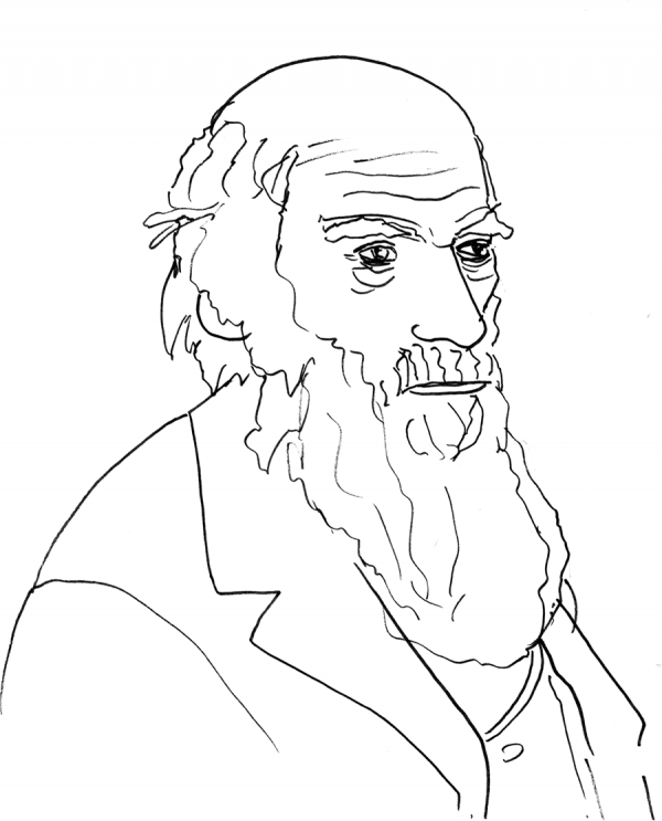 The rough enabled me to get the guidelines of the shape in place, letting the drawing focus on the details. Still, I'm exaggerating eyes and especially noses. Sigh. More work to do ...
 ... drawing every day.
-the Centaur
... drawing every day.
-the Centaur 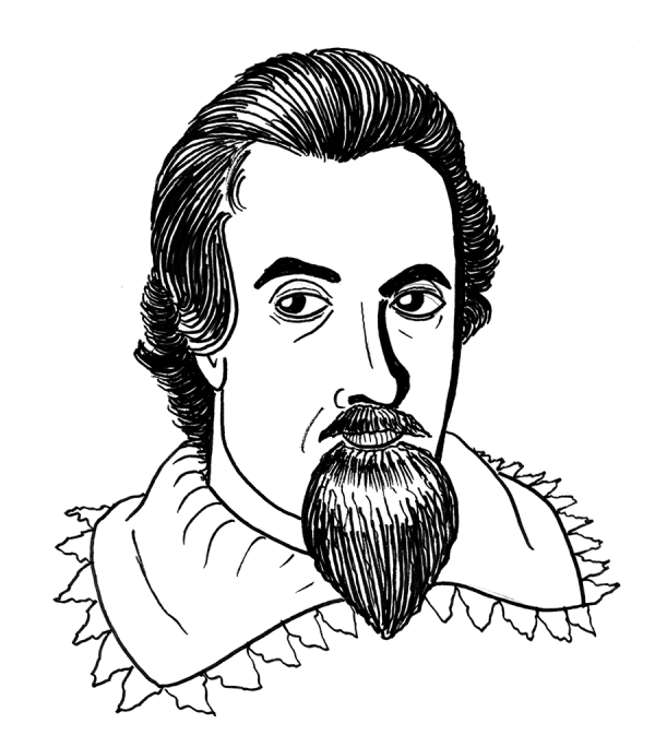 King James, a quick sketch roughed out with a 2B pencil and inked straight with a Sakura Micron 1 on the theory it's late and I'm tired. Face came out a little too tall, at least based on comparison with this detail of the original painting by John de Critz:
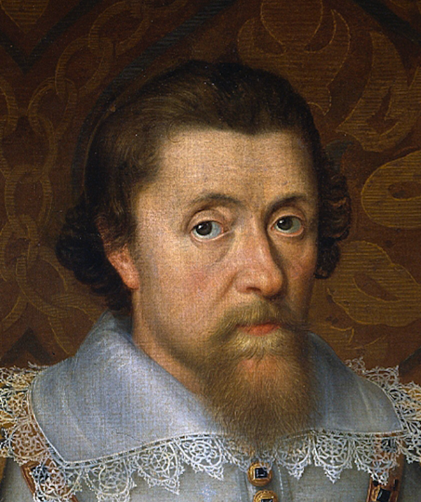 Drawing every day.
-the Centaur
Drawing every day.
-the Centaur  Ayn Rand, roughed and inked in my usual fashion on Strathmore 9x12, No.2 pencil, Sakura Pigma and Micron pens, Sharpies for deep blacks. I squeezed the face proportions a bit, trying to get it right, and started dropping a few of my crutches on this (the heavy outlines). Again I did the trick where I turned it upside down to get the landscape right, particularly the triangle of eyes and nose; I even got the eyeline right, but failed to extend that courtesy to the mouth, which is bent a bit to the horizontal.
Nevertheless, I think, it came out pretty well: she looks so happy.
Ayn Rand, roughed and inked in my usual fashion on Strathmore 9x12, No.2 pencil, Sakura Pigma and Micron pens, Sharpies for deep blacks. I squeezed the face proportions a bit, trying to get it right, and started dropping a few of my crutches on this (the heavy outlines). Again I did the trick where I turned it upside down to get the landscape right, particularly the triangle of eyes and nose; I even got the eyeline right, but failed to extend that courtesy to the mouth, which is bent a bit to the horizontal.
Nevertheless, I think, it came out pretty well: she looks so happy.
 Drawing every day.
-the Centaur
Drawing every day.
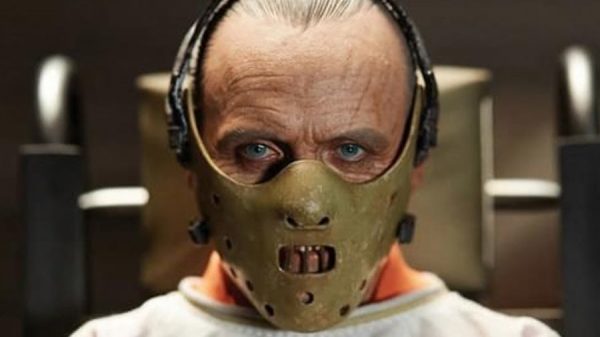
-the Centaur 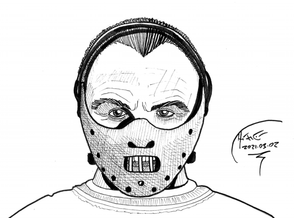 Hannibal Lecter, sketched on Strathmore 9x12 in #2 pencil followed by inking via Sakura Micron and Pigma pens. I think this one turned out pretty well, though the eyes are a tad less symmetrical than Sir Anthony Hopkins, eyebrows too far, and a few subtle details of the collar and mask aren't quite right.
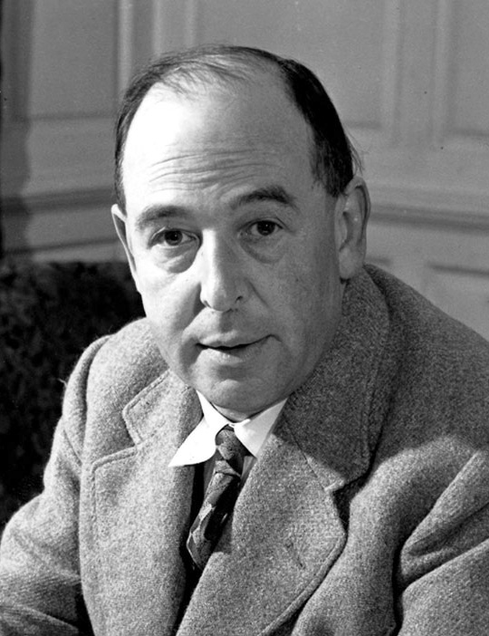
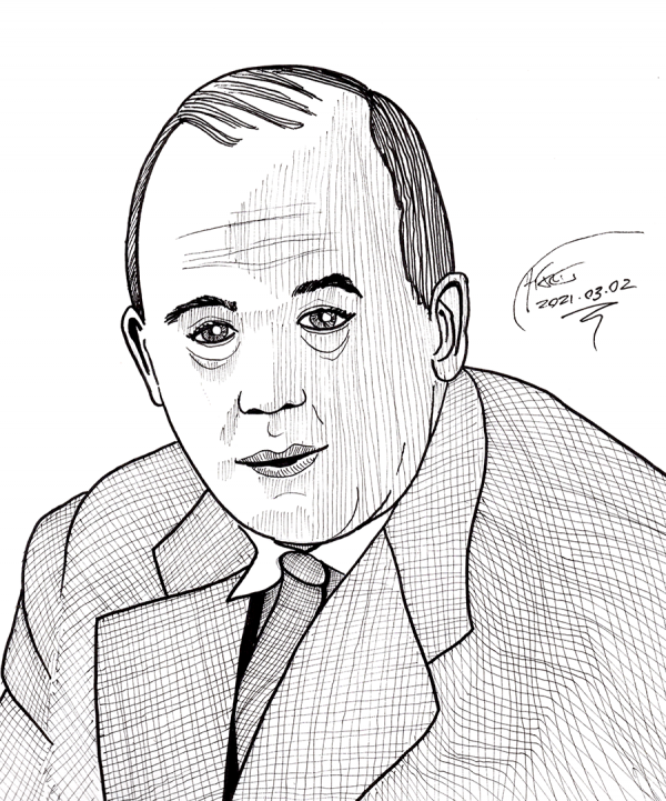 C. S. Lewis, same medium as Lecter. His face came out a bit bloated, I think - probably, I rushed it since it was late. Nevertheless, spinning the picture 180 still helped how it came out quite a bit.
 Drawing every day.
-the Centaur
Drawing every day.
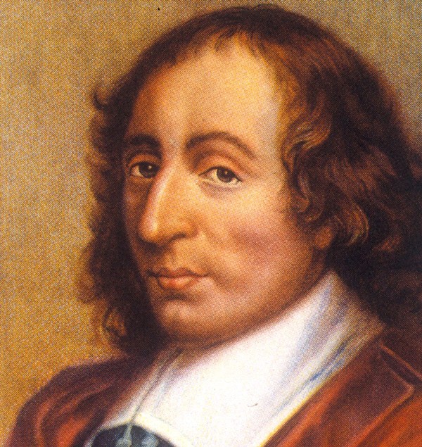
-the Centaur 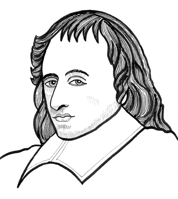 Blaise Pascal, roughed on Strathmore 9x12 with a 2B pencil (upside down to get the shapes right) and inked with Sakura Pigma and Micron pens. Forehead's a little off, slightly too big compared to the drawing; the left eye is not bent downward in the same way; actually, it seems like I squeezed that in a bit as I've been doing on some other drawings. In all fairness to myself, I actually increased the size of his head on purpose, as many older paintings seem to collapse the head a bit, and I didn't bend the left eye down, as I didn't see that distortion in any of the other paintings I could find of Pascal.
 Drawing every day.
-the Centaur
Drawing every day.
-the Centaur 
 Drawing every day.
-the Centaur
Drawing every day.
-the Centaur  It's late and I'm tired, so you get a quick sketch of
  Still, drawing every day.
-the Centaur
Still, drawing every day.
-the Centaur 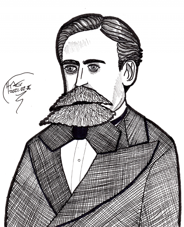 Andrey Markov, roughed with a 2B pencil on Strathmore 9x12. I then rotated the drawing and the reference photo 180 to correct errors, over a couple of quick passes, before inking directly on the paper with Sakura Pigma and Micron pens. Not completely terrible, but I still need to practice drawing eyes.
 Drawing every day.
-the Centaur
Drawing every day.
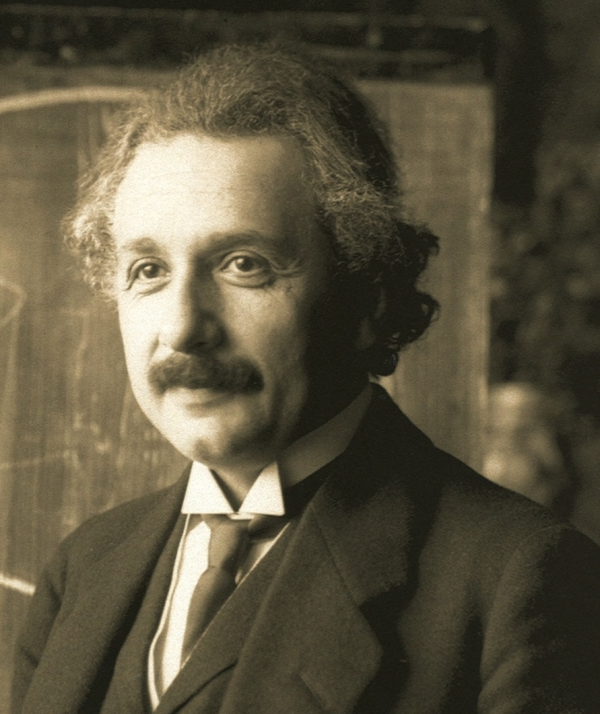
-the Centaur 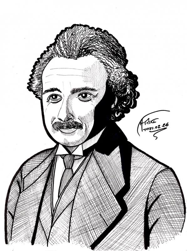 Einstein on Strathmore 9x12. First roughed with a #2 pencil, again using the trick of rotating it 180 so that I could force myself to see and draw what was there, not a caricature of a face. This came out good enough that I half-erased it, finessed the lines, and half-erased again, tightening up, before inking with Sakura Pigma and Micron pens. As for whether the face looks like a face ...
 ... I do see things to fix, but I am not so unhappy with this one. I put special focus on the relative position, shape, and direction of the eyes, and cross-correlated with the mustache, hair and ears; a few more tweaks to the eyes, eyebrows and lip direction, plus the eye direction, really brought out the smile.
Drawing every day.
-the Centaur
... I do see things to fix, but I am not so unhappy with this one. I put special focus on the relative position, shape, and direction of the eyes, and cross-correlated with the mustache, hair and ears; a few more tweaks to the eyes, eyebrows and lip direction, plus the eye direction, really brought out the smile.
Drawing every day.
-the Centaur 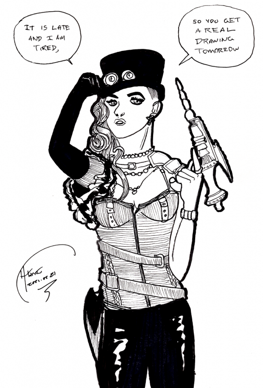 As it says on the tin: trying to get to bed earlier and did a quick sketch. From the cover of a random comic "Gearhearts" in my inspiration pile. The sketch didn't turn out ... terrible ... in fact, the arms almost came out right, and it sort of looks like the cover. But as usual, doing one or two iterations of roughs would have helped the layout of the head and face. My eyes just seem to move around, man.
Drawing every day.
-the Centaur
As it says on the tin: trying to get to bed earlier and did a quick sketch. From the cover of a random comic "Gearhearts" in my inspiration pile. The sketch didn't turn out ... terrible ... in fact, the arms almost came out right, and it sort of looks like the cover. But as usual, doing one or two iterations of roughs would have helped the layout of the head and face. My eyes just seem to move around, man.
Drawing every day.
-the Centaur  Full drawing of
 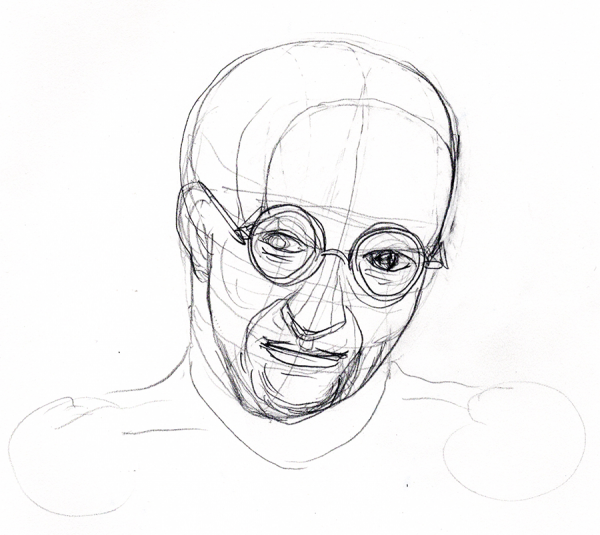 Rather than starting over on Strathmore, I switched to tracing paper and tried the following. In some ways I like this drawing more than some of the later sketches - it captures a bit of Gödel's distinctive face - but I rapidly realized I'd again got the macro-architecture of the sketch wrong, shoulders ending up in the wrong place and such. Also, though you can't tell from this crop, it was too small on the page.
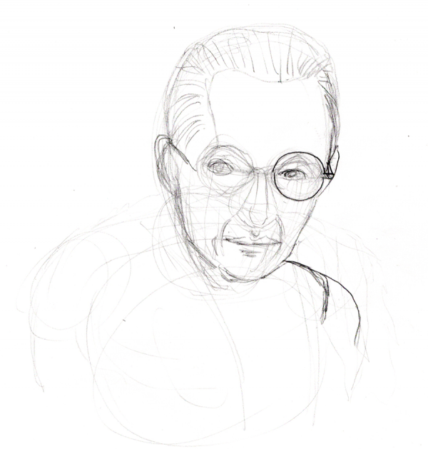 So I started over, producing the following sketch. The face is a bit off here, too wide, looking something like a cross between Mr. Magoo and Joe Biden (if either wore glasses). But I could tell the overall layout was good this time - things were roughly in the right place, and could be corrected with some effort.
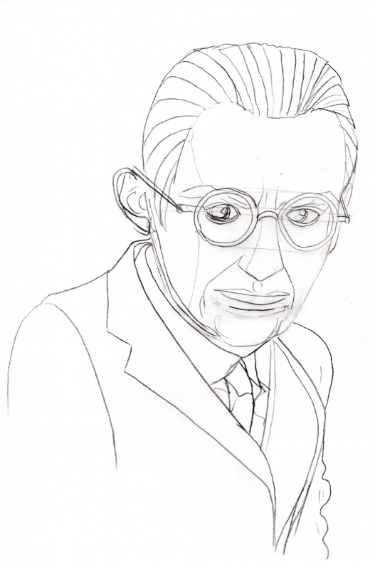
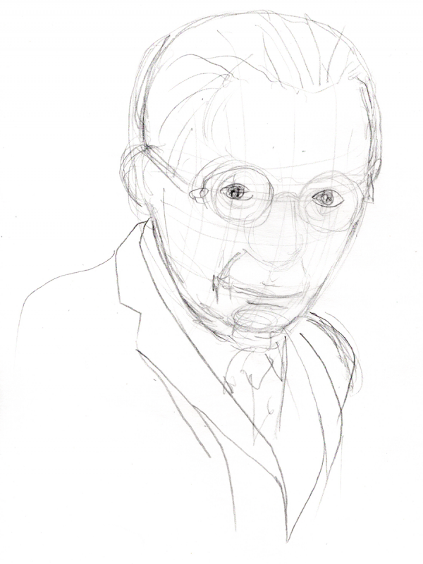 I traced the following directly over the previous sketch, correcting for the shape of the nose and face, but keeping the parts that seemed like they were a good fit. This sketch wasn't perfect either, but it was close enough for me to get started - I had blogposts to write! - and led to the drawing at the top of the page, which I traced over the below drawing, making a few more corrections and allowances for rendering.
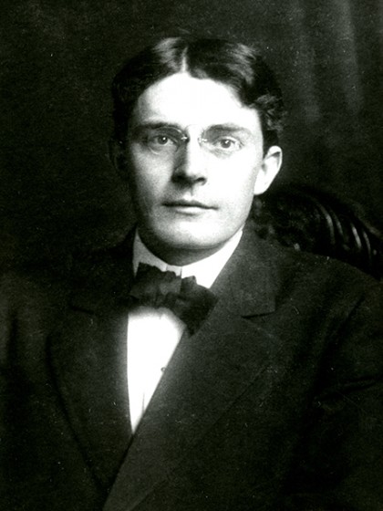
 The original? Below, from a
  My drawing ... sorta looks like the guy? I still think I can do better, particularly in making faces longer and narrower (a problem I had with the Eleventh Doctor as well). But still ...
Drawing every day.
-the Centaur
My drawing ... sorta looks like the guy? I still think I can do better, particularly in making faces longer and narrower (a problem I had with the Eleventh Doctor as well). But still ...
Drawing every day.
-the Centaur 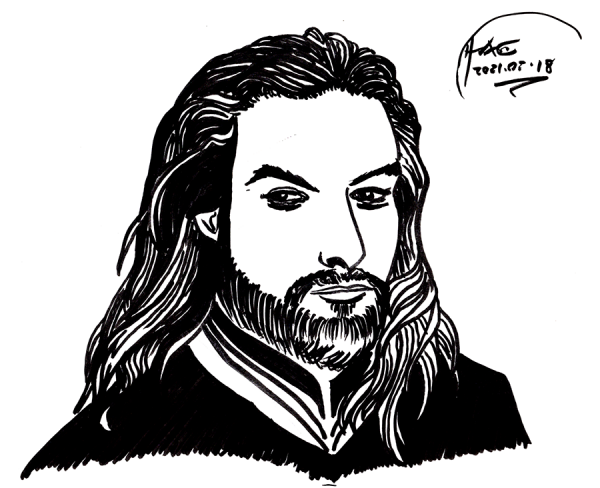 Quick sketch of
  Not ... terrible, but the proportions are still off, and my sketch gave him way too big a schnoz. Jason Momoa is a good looking guy, and unfortunately my sketch makes him look more like a rejected villain from the Princess Bride. Ah well. Perhaps I'll eventually be able to sketch good looking superheroes ...
... if I keep drawing every day.
-the Centaur
Not ... terrible, but the proportions are still off, and my sketch gave him way too big a schnoz. Jason Momoa is a good looking guy, and unfortunately my sketch makes him look more like a rejected villain from the Princess Bride. Ah well. Perhaps I'll eventually be able to sketch good looking superheroes ...
... if I keep drawing every day.
-the Centaur 