posted from my nexus one ... hopefully.
Posts tagged as “Webworks”
So, last year I had an extraordinarily complicated series of New Year's Resolutions which almost completely failed. Looking back, I succeeded at my major goals for the year, but the complex plan of weekly / monthly things completely failed.
So, here's a simpler set of New Year's resolutions, goals, what have you:
In other news, Warren Ellis has already blogged 365 times since January 1st. Damn him.
-the Centaur
So, here's a simpler set of New Year's resolutions, goals, what have you:
- Establish a weekly pattern of exercise, including some karate
- Set aside some time each month to do art in addition to writing
- Post to this blog on the average once a day, measured each week
In other news, Warren Ellis has already blogged 365 times since January 1st. Damn him.
-the Centaur
Yes, I'm trying to fill out those 1-blog-posts-a-day I promised at the beginning of the month. But there is a serious topic: I realized today, for reasons which will become clear shortly, that I'm just plain awful about blogging stuff that happens in my life. So that's going to change, shortly; however, it wasn't appropriate to put this message in that article. Go about your blogrolling business; nothing to see here.
Some time back I received a spam email that was blank. This is understandable, actually; probably just someone trying out a list of email addresses. I also got one containing the cryptic text "podmena traffica test"; this turned out also to be a "spoofing traffic test". Now I've got a bit of comment spam, which also seemed mysterious, until I dug into it a bit. From my email:
The deleted URL is to a French eBay site, "acheter levitra" is French for "buy Levitra," which is a brand name of Vardenafil, which is, of course, a Viagra clone. So this is essentially random pseudo-English text with a "buy Viagra" link, depending on the 1% of people who click on such links and the 1% of people who buy to pay for the cost of putting this spam on my blog. Charming.
Comment reeejected.
-the Centaur
UPDATE: I got a similar post of with a less obvious spam form, targeting one of the more popular pages on my blog (can you say pooound cake?):
But the [url=XXX]TEXT[/url] pattern was a dead giveaway. A search on Google for ["[url=http://google.com]google.com[/url]"] - note that's the '[url.../url]' thing in double quotes; the outermost brackets are the syntax you use to indicate a chunk of text is a query, like [centaur] - SO anyway, a search on Google for that nonsense revealed that the exact text of that comment has appeared elsewhere. So this is just more comment spam, trying to see if comments are unmoderated here.
Comment flattering! But reeejected.
Anonymous has left a new comment on your post "Why I Write":
I can not participate now in discussion - it is very occupied. I will be released - I will necessarily express the opinion. [url=DELETED]acheter levitra[/url] This rather good idea is necessary just by the way
Publish this comment.
Reject this comment.
Moderate comments for this blog.
The deleted URL is to a French eBay site, "acheter levitra" is French for "buy Levitra," which is a brand name of Vardenafil, which is, of course, a Viagra clone. So this is essentially random pseudo-English text with a "buy Viagra" link, depending on the 1% of people who click on such links and the 1% of people who buy to pay for the cost of putting this spam on my blog. Charming.
Comment reeejected.
-the Centaur
UPDATE: I got a similar post of with a less obvious spam form, targeting one of the more popular pages on my blog (can you say pooound cake?):
"I found this site using [url=http://google.com]google.com[/url] And i want to thank you for your work. You have done really very good site. Great work, great site! Thank you! Sorry for offtopic"
But the [url=XXX]TEXT[/url] pattern was a dead giveaway. A search on Google for ["[url=http://google.com]google.com[/url]"] - note that's the '[url.../url]' thing in double quotes; the outermost brackets are the syntax you use to indicate a chunk of text is a query, like [centaur] - SO anyway, a search on Google for that nonsense revealed that the exact text of that comment has appeared elsewhere. So this is just more comment spam, trying to see if comments are unmoderated here.
Comment flattering! But reeejected.
The only way to make something happen for certain is to prioritize it. Normally when Nanowrimo rolls around I become a submarine and don't blog so much, but if the inhuman writing machine that is Warren Ellis can blog multiple times per day in between writing comic book epics, then so can I, dag nab it.
So, for the month of November, when I'm supposed to be writing 50,000 words of Liquid Fire ... I will blog once a day. So far, so good ... 3 days, 3 posts. Here's to committment - meh.
-the Centaur
So, for the month of November, when I'm supposed to be writing 50,000 words of Liquid Fire ... I will blog once a day. So far, so good ... 3 days, 3 posts. Here's to committment - meh.
-the Centaur
Fortunately, the problem had a quick fix.
In the top half of the picture, you see Firefox 3.0.14 on the Macintosh running the (corrected) version of the Library of Dresan home page. In the bottom half, you see Internet Explorer 7 on Windows Vista, running in a VMWare partition on my Mac, from approximately the same position on the same page. From a graphical and typographical perspective they're both doing a fairly creditable job of rendering the layout. Everything looks roughly OK.
However, they're not doing the same job interpreting the width of the layout. I haven't debugged the precise problem in detail - this is a voodoo quick fix - but essentially Internet Explorer interprets the widths of the columns and their spacing and padding different than Firefox. The result: images, which on Library of Dresan blogposts are always a maximum of 600 pixels wide, roll over the end of the column, also 600 pixels wide, making it jog out. You can see that in the stairstep on the second half of the image.
Part of this is my error; prior to my quick fix all browsers were showing at least slight stairstepping. But all browsers I tried - Firefox on the Mac, on Windows, and on Linux; Chrome on the Mac, on Windows, and on Linux; and even Safari on Mac and Windows - handled this correctly except IE, which widened the whole column. This made the three columns wider than the whole width of the container, and the third column had to jog halfway down the page so that it could fit, effectively becoming invisible to people just entering the site, unless they were willing to scroll a lot in the hope hidden features would leap up at them.
Now, I could have dug into CSS manuals and tried to fix this the "right" way, and indeed I plan to. However, there was a quicker, better, way: experimentation. Before I even knew for sure what was the problem I browsed to the front page of the Library on a Windows machine, downloaded the page to a local HTML file, and started hacking out parts of the file until something changed. I was very quickly able to show that there was nothing wrong with the right column itself; even reduced to a few lines and an image it wasn't showing up.
So I then went to my test file, research, which I had gotten to work in IE before I launched the style change to the whole library. One difference between that page and the broken page I immediately noted was the fact that the images were smaller; then I started to suspect the stairstepping phenomenon. That needed a fix on all browsers, so I simply made the content column slightly wider - from 600 to 610 pixels, fixing a gaffe I shouldn't have made in the first place - and widened the overall page from 1000 to 1024 pixels.
The result: it worked, in all browsers I have available to me right now. And, because my buddy Nathan had impressed upon me the importance of using CSS stylesheets, I was able to push the fix by simply uploading the revised stylesheet to the Library and reloading the page.
Shouldn't have happened - I shouldn't have made the column too narrow, Internet Explorer shouldn't be misinterpreting the white space, I shouldn't have pushed the template without testing it on Internet Explorer, and Blogger should have a better preview function so I could have tested it successfully offline without pushing it to the entire blog. But a quick fix was possible, because I used reasonably good site design practices, the scientific method, and a healthy supply of beans and vinegar.
-the Centaur
The problem, for those of you who browse the site in standards-compliant browsers, was that the last column of the Library's three-column layout was not showing up in Internet Explorer - and only Internet Exporer, one of the world's most popular and, unfortunately, least standards compliant browsers.
The solution: make the layout wider, so the max image width used in the blog does not cause the first column to widen.
In the top half of the picture, you see Firefox 3.0.14 on the Macintosh running the (corrected) version of the Library of Dresan home page. In the bottom half, you see Internet Explorer 7 on Windows Vista, running in a VMWare partition on my Mac, from approximately the same position on the same page. From a graphical and typographical perspective they're both doing a fairly creditable job of rendering the layout. Everything looks roughly OK.
However, they're not doing the same job interpreting the width of the layout. I haven't debugged the precise problem in detail - this is a voodoo quick fix - but essentially Internet Explorer interprets the widths of the columns and their spacing and padding different than Firefox. The result: images, which on Library of Dresan blogposts are always a maximum of 600 pixels wide, roll over the end of the column, also 600 pixels wide, making it jog out. You can see that in the stairstep on the second half of the image.
Part of this is my error; prior to my quick fix all browsers were showing at least slight stairstepping. But all browsers I tried - Firefox on the Mac, on Windows, and on Linux; Chrome on the Mac, on Windows, and on Linux; and even Safari on Mac and Windows - handled this correctly except IE, which widened the whole column. This made the three columns wider than the whole width of the container, and the third column had to jog halfway down the page so that it could fit, effectively becoming invisible to people just entering the site, unless they were willing to scroll a lot in the hope hidden features would leap up at them.
Now, I could have dug into CSS manuals and tried to fix this the "right" way, and indeed I plan to. However, there was a quicker, better, way: experimentation. Before I even knew for sure what was the problem I browsed to the front page of the Library on a Windows machine, downloaded the page to a local HTML file, and started hacking out parts of the file until something changed. I was very quickly able to show that there was nothing wrong with the right column itself; even reduced to a few lines and an image it wasn't showing up.
So I then went to my test file, research, which I had gotten to work in IE before I launched the style change to the whole library. One difference between that page and the broken page I immediately noted was the fact that the images were smaller; then I started to suspect the stairstepping phenomenon. That needed a fix on all browsers, so I simply made the content column slightly wider - from 600 to 610 pixels, fixing a gaffe I shouldn't have made in the first place - and widened the overall page from 1000 to 1024 pixels.
The result: it worked, in all browsers I have available to me right now. And, because my buddy Nathan had impressed upon me the importance of using CSS stylesheets, I was able to push the fix by simply uploading the revised stylesheet to the Library and reloading the page.
Shouldn't have happened - I shouldn't have made the column too narrow, Internet Explorer shouldn't be misinterpreting the white space, I shouldn't have pushed the template without testing it on Internet Explorer, and Blogger should have a better preview function so I could have tested it successfully offline without pushing it to the entire blog. But a quick fix was possible, because I used reasonably good site design practices, the scientific method, and a healthy supply of beans and vinegar.
-the Centaur
...the template looks fine in Firefox!
Grrr...
UPDATE: The template looks as intended in Firefox AND Chrome for Mac AND for Windows AND for Linux, and for Safari for Windows and Mac as well. Grrr...
Grrr...
UPDATE: The template looks as intended in Firefox AND Chrome for Mac AND for Windows AND for Linux, and for Safari for Windows and Mac as well. Grrr...
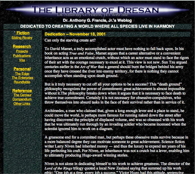
Please pardon the dust, but I am doing that long-threatened major overhaul of the Library's templates.
I realized that I was waiting until the overhaul was "perfect" and that was putting the overhaul on hold. I've read too many things recently - about the telegraph, the transcontinental railroad, even about creation of Google - in which immense success came from plucky people who didn't wait until things were perfect, or even necessarily known to be possible, before they threw their ideas up on the wall to see if they stuck.
So, I know my new template is not done, but it looks better than what I had before, and more importantly is more navigable. More work to do ... but for now, complain, and I'll fix it.
-the Centaur
And what happens if you reply?
-the Centaur
... let's see how well it works.
-the Centaur
So I was going through my junk in my car today and found some old light bulbs in my auto emergency kit. I wanted to find out whether a 921LL bulb would fit my Nissan Pathfinder or whether it was a leftover from my Isuzu Rodeo kit.
A few quick searches on Google seemed to indicate the answer was yes, but I didn't get a definitive answer until I got to Amazon and searched for the part number.
Amazon, surprisingly enough, had a form where you could indicate the year, make and model of your vehicle, against which it would check the part in question. But then it said something more: it said, "sign in to check this part against vehicles in your garage."
HFS.
I signed in, and frankly it was a bit of a bear to navigate to a point where I found "my garage". Essentially, I had to start looking for parts again, enter a vehicle, and then I found it automatically saved that information to "my garage".
This is definitely a "hidden feature": Amazon could make that more discoverable, and I haven't yet found any information on this feature online or on their site or on its help features. This may be an oversight, or the feature could be in development.
Once a vehicle was entered, though, it was relatively easy to add more information about the trim and features of my car, and Amazon then gave me a complete list of the parts they sold for my car - all 2,156 of them, at last count.
I've said it before, and I'll say it again: I'm glad I own Amazon stock. I bought it *after* the Internet crash convinced that ten years from now they'd still be going places, and they haven't proved me wrong yet.
Keep up the good work, Jeff.
-the Centaur
I can be such an idiot sometimes ... or, put in other words, the right way to solve a problem is often much, much easier than the wrong way.
For example, if you're doing woodworking, you may use a modern steel clamp to hold a part tight to work on it. That sounds good and does the job. Of course, when you need to change the position of the part you must unscrew it, reposition the part and rescrew the clamp.
So far, so good ... but, according to David Petersen, the author of Mouse Guard, there is a better way. Petersen researched medieval woodworking equipment for his Eisner-award winning comic and found there was a simpler scheme involving a foot pedal and a lever, which had equal gripping power but could release and reapply pressure in seconds just by lifting your foot.
Moral: newer and more complex is not always better.
Fast forward eight hundred and fifty years. Robert Kroese, a colleague at the Search Engine That Starts With A G, has his own book that he's working on, and an associated web site Mercury Falls. On that site he has a form to enter an email list, and I thought, what a great idea! I should have a form where someone can send me an email list on the Dakota Frost site.
So I started looking into it. To make the form work, you need not only a web form, which is easy to set up, but also some kind of server program on the back end which can accept the results of the form and a database to store it.
Historically, I've had bad luck with scripts and databases on my web sites: Earthlink / Mindspring basically welched on the scripting features of their web hosting that I was paying for, and my next provider, Tophosting, screwed up one of my databases.
So I was hesitant, and I started thinking. Then it hit me...
... there was a simpler way.
Instead of creating a form and the backend plumbing that goes with it, I should use the existing plumbing I had to achieve the same effect. What plumbing was already in place? A web site, a hosting provider, an ability to forward emails to a given address ... and a mail client with filters.
To make this work, I went to the GoDaddy control panel for Dakota Frost and set up a forwarding email: contact at dakota frost dot com. I had that sent to one of my catchall email accounts, and in Gmail I then set up a filter which collected all those email addresses into a single folder. Bam: problem solved.
Even if I want to do something more complex, this solution still works, as long as I keep looking at simple tools that are already available. For example, if I want an official email address list as a separate file, I could always download those email messages to the mail client of my choice, filter the messages to a folder, and grep over the email addresses in the file. For the scale at which I need to do it right now, the problem is still solved.
Moral of the story: the more you overthink the plumbing, the easier it is to stop up the drain. Keep it simple, and things should just keep flowing without effort.
Or, to translate this back into development speak: there are two kinds of solutions: solutions which are easy to think up, but take a lot of coding effort to make work, and solutions which require thought, but which can be implemented in staggeringly small amounts of code.
In this one, we have an extreme example: to make this problem work the "no thinking way" would require an HTML form, a CGI script, a database, and considerable configuration on the server side of my hosting provider. To make this problem work the "no effort way" required some thought, but in the end less configuration of my hosting provider and a few minutes setting up some email filters.
You see the same thing in software libraries: really good libraries don't take a lot of code, but that doesn't mean that they didn't take a lot of work. What happened behind the scenes was a lot of thought, wherein the library author searched the space of possible designs until he found a great one before ever publishing the library. You as the consumer don't see that effort, no matter how short or long it took: you only see the pure, parsimonious, elegant efficient piece of code that remains.
If you don't put thought into what you're doing, you might try it sometime. You'd be surprised how little thought can get you substantially improved results.
-the Centaur
Amazing presentation...
[youtube=http://www.youtube.com/watch?v=jpEnFwiqdx8]
Did you know?
-the Centaur
[youtube=http://www.youtube.com/watch?v=jpEnFwiqdx8]
Did you know?
-the Centaur
You can blog from your mobile phone with a text message. HFS!
UPDATE: But if you mistype something in your smartphone, Blogger does something weird with it ... I accidentally typed an upside down exclamation point after the "HFS" above (not sure why) and it translated that to "HFS?", which should have been "HFS!". Probably this is a language encoding issue or something similar.
Often when creating graphic designs I pounce on creative accidents. I start with an idea in mind of what I want to create, but as I do so I naturally play around with ideas and variations, creating accidental combinations that often look much better than my original intentions.
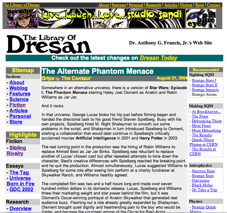
The Library of Dresan logo is an example of this: as I recall, I played around with larger logos in varying degrees of transparency and shading but didn't like them. I then made a smaller, shrunken copy of the logo, intending to delete the original once I had the little one positioned. However, I found I liked the small logo superimposed on the larger one so much it became the basis of the logo design you see above. The left-to-right fade is another happy accident I capitalized on - I was trying for a flat fade and hit the wrong setting.
When I was satisfied with this logo and look I then made specialized logos for various areas of the site - most of which you never see because they're off in obscure corners like Research. To make the name of each area stand out, I swapped my name onto the top and the area description to the bottom, requiring the change in the font size you see below in the Research logo. In some respects I liked this logo even better than the original Library logo, but didn't use it on my main site because I thought it made my name too prominent.
But recently as I was redesigning the site I was playing around with a prototype that was in the Research space, and looking at the logo I decided to take the recommendations of all those people who have suggested putting your name prominently on your own site (I know, duh, I shouldn't have needed Jacob Nielsen and Ayn Rand to tell me that, but at least now I've come around). But I had a problem: I no longer had the original source file from which I generated these logos.
Actually, that's not quite true. At first all I thought I had were the finished image files, which had glows which made them hard to edit in Painter or Photoshop. But eventually I dug around and found the original Xara files. But that was a problem: Xara doesn't work on the Mac, unless you're willing to compile it yourself.
So I tried Xara on my Windows Vista partition, and then found I didn't have the fonts I needed - in particular, Caeldera and Papyrus. Oddly, these fonts which I use so much were not embedded in my huge font library I've built up over the years - apparently they were put on some earlier system as part of a program which I didn't install on my Boot Camp Vista partition.
I struggled with the Xara files on Windows Vista for a while, then eventually decided to recreate the logo on the Mac in Corel Painter XI, a program I love but which is no more a vector graphics program than Xara is a natural media program. My results were mixed, as you can see below:
The Mac version of Papyrus had different sized capital letters, making the logo come out the wrong size. Worse, Painter had fewer options for playing with transparencies and glows, making it harder to experiment with the glow around the letters to get it right - causing the background to be too saturated and the black text to come out too blocky. Even worse still, I did this logo on my laptop, only to find out later its color balance was off.
But at home, my wife's computer has Windows Vista with the right version of Papyrus, and I was able to find a free version of Caeldera to fill in for the one in the huge font library I've built up on my primary laptop. Corel Painter is wonderful, I love Photoshop, and Adobe Illustrator is great, but for speed there's nothing like Xara. In less than thirty minutes I had essentially recreated the Research logo and saved it in a happy vector form that I can easily modify in the future. It isn't perfectly what I want, but it is easily modifiable; and so in mere minutes I modified it to serve as a new logo for the site, which you can see below:
The moral of the story? Taking advantage of happy accidents is great ... but make sure you write down the steps that got you there and capture all your dependencies, or recreating your accident later may make you rather sad.
-the Centaur
Google now has profiles, and I recommend the following wisdom from Elf Sternberg: Create your Google Profile NOW, before someone else does:
I hereby declare this an internet meme: forward this to your friends, and post a link to your profile on your blog. My profile can be found here.
-the Centaur
Go to Google right now and type "me" into the search box. You'll be given a chance to secure your name as Google knows it, and create a profile, a starting point, which you can "encourage" Google to give to people rather than allowing them to hunt around randomly.You can follow this handy link to this feature.
I hereby declare this an internet meme: forward this to your friends, and post a link to your profile on your blog. My profile can be found here.
-the Centaur
I easily could spend 8 hours a day blogging. There's just too much to write about; I don't know how people like Andrew Sullivan and Warren Ellis write so much. No, wait, I do: they're paid to write, dang it, where I am paid to make search engines smell better and must squeeze my writing in around the margins.
Recently I started work on redesigning the templates for the Library, and in my giant Mongo death Todo list I have an entry "blog updates to library". But I never got around to writing the article, because I kept on getting confused about what to write first.
Then I realized that's part of my problem. The point of blogging the redesign of the Library was to expose the thought process that normally goes into the redesign of any web site, rather than hiding all of the hard work behind the covers, springing it fully formed onto the world, and proclaiming: "See! Doesn't it smell better?"
So here's the thought process that was blocking me from writing articles on the Library:
But the point of this blogging exercise is NOT to go off and hide and try to figure these things out, then come back smiling with a solution. Instead, when I get stumped, that is a serious decision point in the development process and I'm SUPPOSED to write an article which says, here's what's on my plate, and boy did I get stumped.
So this is that article. And just articulating the things going through my mind gave me a sequence of things to do: now I can blog each of the elements on that list and show how I encountered the problem, how I tackled it, and how I got to a solution.
-Anthony
Recently I started work on redesigning the templates for the Library, and in my giant Mongo death Todo list I have an entry "blog updates to library". But I never got around to writing the article, because I kept on getting confused about what to write first.
Then I realized that's part of my problem. The point of blogging the redesign of the Library was to expose the thought process that normally goes into the redesign of any web site, rather than hiding all of the hard work behind the covers, springing it fully formed onto the world, and proclaiming: "See! Doesn't it smell better?"
So here's the thought process that was blocking me from writing articles on the Library:
- Anthony looks at Todo list, sees entry "Blog Update" and tries to figure out what to do with this horribly underspecified action item with no clear next action. Somewhere out in cyberspace, David Allen kills himself, then spins in his grave.
- Anthony decides "I've got a prototype for the new design of Library now! I just need to post the darn thing and get on with it!"
- Anthony starts work on cleaning up his Blogger template. During this process he finds he needs to figure out precisely what his Blogger template is doing, as he no longer remembers and the code is poorly documented.
- Anthony comes up with a clever way of visualizing how his Blogger template works which itself is probably worth blogging about.
- Then Anthony realizes that he doesn't know whether the design works well with Internet Explorer on Windows, or Chrome, or on small screens (notwithstanding my desire to support only large screens), or on super large desktop screens with different sized fonts.
- This leads to more questions: What browsers should this work well on? How should I test this? What if there are fundamental incompatibilities between IE and Firefox?
- Well, shazbot. I decide, screw it, let's just fix a small page somewhere and update that. So I update the Research page, which already needed an overhaul of its research statement.
- Anthony finds a system to help him test and prototype his content which is worthy of blogging about in its own right.
- The textual update goes swimmingly, but updating the CSS and HTML proves more of a bear, especially comparing Internet Explorer and Firefox.
- Anthony's system for updating the content starts to show failures which are worthy of blogging about in their own right.
- Well, shoot, now what do I do?
But the point of this blogging exercise is NOT to go off and hide and try to figure these things out, then come back smiling with a solution. Instead, when I get stumped, that is a serious decision point in the development process and I'm SUPPOSED to write an article which says, here's what's on my plate, and boy did I get stumped.
So this is that article. And just articulating the things going through my mind gave me a sequence of things to do: now I can blog each of the elements on that list and show how I encountered the problem, how I tackled it, and how I got to a solution.
-Anthony
Recently I've been getting a lot of pointless "spam" with a reasonable sounding subject line but a body that only says "podmena traffica test". Mysterious, and pointless, from a spam perspective; so I assumed it was some automatic program testing a variety of addresses to see which ones bounced.
Finally I decided to track it down, and while I don't know for sure I've now heard a good hypothesis:
Trying to verify his logic: Romanizing "podmena traffica test" gets me "подмена траффица тест", as predicted, and translating that back to English gets "substitution traffitsa test" which is close enough.
The specifics of the message I'm seeing don't match the description in that blog post, but it's enough to make me think that the author has nailed it: it's a Russian spammer testing out addresses and more importantly web servers.
Mystery solved! Now quit it, spammer guys.
-the Centaur
Update: I keep getting this spam. I have now received this spam almost 60 times in the last month, according to Gmail.
Finally I decided to track it down, and while I don't know for sure I've now heard a good hypothesis:
There seem to be some strange spam emails doing the rounds, with a body text of "podmena traffica test".. what gives? It makes a bit more sense if you transliterate it into Cyrillic, which leaves you with a Russlish phrase "подмена трафика тест" and that simply translates as "spoofing traffic test".
Trying to verify his logic: Romanizing "podmena traffica test" gets me "подмена траффица тест", as predicted, and translating that back to English gets "substitution traffitsa test" which is close enough.
The specifics of the message I'm seeing don't match the description in that blog post, but it's enough to make me think that the author has nailed it: it's a Russian spammer testing out addresses and more importantly web servers.
Mystery solved! Now quit it, spammer guys.
-the Centaur
Update: I keep getting this spam. I have now received this spam almost 60 times in the last month, according to Gmail.