Monday, April 27, 2009
Links for 2009-04-27

Instructions on creating your own Star Wars crawl on TheForce.Net:
Reviews of some spy gear, including a bulletproof dress shirt:
- At Wired: http://www.wired.com/reviews/product/pr_roundup_spygear
- Gizmodo has a whole category: http://gizmodo.com/tag/spy-gear/
- On Wikipedia: http://en.wikipedia.org/wiki/Papyrus_(typeface)
- Its Author: http://www.costelloart.com/fonts.html
- Some Criticism: http://modernl.com/article/5-terrible-fonts-that-you-should-not-use-in-print-design
- Papyrus Sightings: http://esotericappeal.typepad.com/papyrus/
- Papyrus Watch: http://www.papyruswatch.com/
- On Wikipedia: http://en.wikipedia.org/wiki/Michael_Masley
- His web site: http://www.artistgeneral.com/
- His very nice CD: http://www.amazon.com/Cymbalennium-Michael-Masley/dp/B0007VDF6S
-the Centaur
Labels: Pointers
Just a little bit harder...

Earlier I blogged about how to succeed at work or life you need to work just a little bit more than you want to. I mean that 'little bit' literally: not working yourself to death more, not a whole lot more, just that little bit more that can turn your day from one of frustration and failure into one with a concrete achievement.
Your mileage may vary, of course, but for me the point when I really want to give up is frequently just before I am about to reach one of my goals. All I need to do is hang on just a little bit longer, keep working just a little bit harder, and very frequently I'm rewarded by more than I could have expected.
Today this was once again confirmed. I got in late today and decided to work until 7, which was coincidentally what I felt was a good solid workday and about the time I would need to leave to make sure I can get some dinner and writing done.
But work was slow going: I'd recently switched to a new project but was stuck with some old tasks, and the mental gear switching, combined with some syrupy new software on my workstation, kept dragging me down. On top of that, one of my collaborators dropped in with a request for assistance putting together an evaluation, and since I owe him a few I worked on a scripting job for him while I was between compiles of the unit tests of my main task for the day.
7 rolls around, and I'm just about spent. I decide to call it a day, start to pack things up, and begin thinking of where I can go for dinner and what I need to be working on: my new novel, an illustration for my last novel, my web site.
And then I remember that blog post, and decide to push just a little bit harder.
In just 23 minutes, I got both the unit tests to pass on my main task AND finished a first trial run of the scripting job, complete with an automatically generated HTML page. With that, I was able to find a 'problem' with my script, spent about 20 more minutes debugging it, verified it wasn't really my script's problem, and fired off an email to my colleague telling him where to find the HTML for his evaluation, and asking him had he ever seen an error like that and did he happen to know how to fix it?
By 7:45, I'd closed up, walked out, and headed for Panera Bread. By the time I was done with my sandwich, I'd gotten an email back from my collaborator suggesting an easy workaround for the problem that I can implement with a one line change. I might even be able to start it up tonight to run overnight - meaning that, God willing, I will have completed by Tuesday morning a task I told my collaborator I couldn't even start until maybe Wednesday.
YES! By working just a little bit harder, I turned a frustrating day into a complete success - and freed my mind this evening to work on more creative tasks. I recommend it to all of you.
-the Centaur
Labels: Development, Philosophy
Comments:
Sunday, April 26, 2009
"Never get in a boxing match with a cat..."
Bwah hah ha. Watch to the end if you can. Link for those for whom embedding won't work. On the other hand, if you don't think the Internet should be used exclusively for pictures of cats, there's always Edison Hate Future.
-the Centaur
Labels: The Cats
Comments:
Saturday, April 25, 2009
Internet Meme: Create your Google Profile NOW
Go to Google right now and type "me" into the search box. You'll be given a chance to secure your name as Google knows it, and create a profile, a starting point, which you can "encourage" Google to give to people rather than allowing them to hunt around randomly.You can follow this handy link to this feature.
I hereby declare this an internet meme: forward this to your friends, and post a link to your profile on your blog. My profile can be found here.
-the Centaur
Labels: Webworks
Comments:
Aptera, Not Yet In the Wild
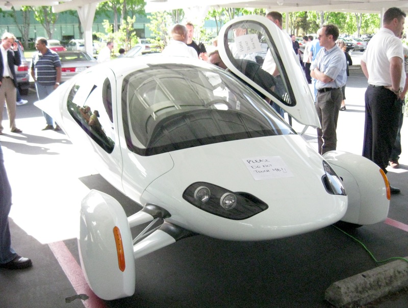
These cars will go on sale in November, starting at $25,000ish for the base electric model, something higher for a gas model, and up to $40,000 for a series gas-electric hybrid that runs entirely on its electric motors until the battery runs out, at which point a generator kicks in.
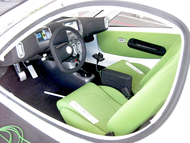
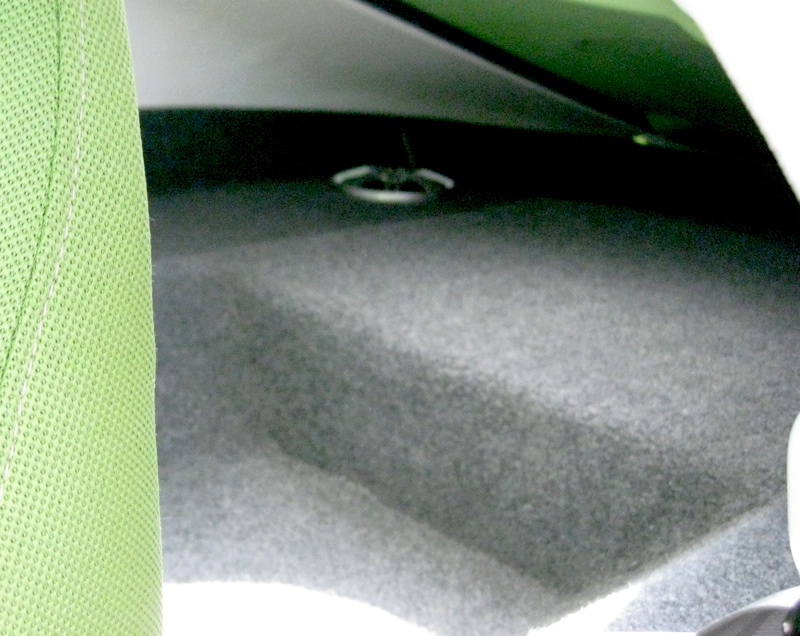
I wasn't one of the lucky few who got test drives, and the $1M prototype wasn't set up for people to sit in it, but from what I saw of the cockpit it looked comfortable. There wasn't a lot of space in the back, however:
Aptera's car is interesting in that it is a three wheeler. Part of the reason for this is aerodynamics: Aptera started with the most aerodynamic car it could and then has been adjusting it to make it more livable, rather than start with an old style car and bubblifying it.
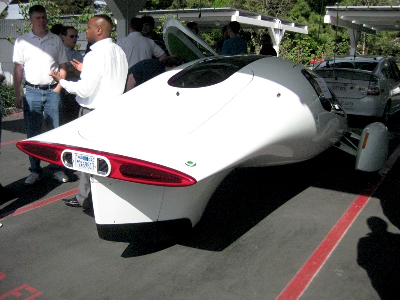
What's fun is watching these cars drive. I saw one slicing past me on the road as I was driving up to the demonstration in my beloved but gas-guzzling Nissan Pathfinder, and it was going so fast it looked like a bat out of hell. But they're almost completely silent:
I'm not sure it's my next car - I plan to test drive a Tesla shortly. But I'm definitely thinking about it, even though it is definitely 1.0 technology that will have a few kinks to it.
The series hybrid is most intriguing to me: if you drive to and from work everyday and charge up at work or at night, the gas motor will never have to kick in. If you want to take a road trip, however, you don't have to worry about running out of power and looking for a place to charge: the generator kicks in and you can drive it like a normal car - that is, just like a super efficient normal car that gets an equivalent of a kajillion miles per gallon.
-Anthony
Labels: Electric Cars, Your Money Is Your Voice
Comments:
Not enough hours in the day, redux...
Recently I started work on redesigning the templates for the Library, and in my giant Mongo death Todo list I have an entry "blog updates to library". But I never got around to writing the article, because I kept on getting confused about what to write first.
Then I realized that's part of my problem. The point of blogging the redesign of the Library was to expose the thought process that normally goes into the redesign of any web site, rather than hiding all of the hard work behind the covers, springing it fully formed onto the world, and proclaiming: "See! Doesn't it smell better?"
So here's the thought process that was blocking me from writing articles on the Library:
- Anthony looks at Todo list, sees entry "Blog Update" and tries to figure out what to do with this horribly underspecified action item with no clear next action. Somewhere out in cyberspace, David Allen kills himself, then spins in his grave.
- Anthony decides "I've got a prototype for the new design of Library now! I just need to post the darn thing and get on with it!"
- Anthony starts work on cleaning up his Blogger template. During this process he finds he needs to figure out precisely what his Blogger template is doing, as he no longer remembers and the code is poorly documented.
- Anthony comes up with a clever way of visualizing how his Blogger template works which itself is probably worth blogging about.
- Then Anthony realizes that he doesn't know whether the design works well with Internet Explorer on Windows, or Chrome, or on small screens (notwithstanding my desire to support only large screens), or on super large desktop screens with different sized fonts.
- This leads to more questions: What browsers should this work well on? How should I test this? What if there are fundamental incompatibilities between IE and Firefox?
- Well, shazbot. I decide, screw it, let's just fix a small page somewhere and update that. So I update the Research page, which already needed an overhaul of its research statement.
- Anthony finds a system to help him test and prototype his content which is worthy of blogging about in its own right.
- The textual update goes swimmingly, but updating the CSS and HTML proves more of a bear, especially comparing Internet Explorer and Firefox.
- Anthony's system for updating the content starts to show failures which are worthy of blogging about in their own right.
- Well, shoot, now what do I do?
But the point of this blogging exercise is NOT to go off and hide and try to figure these things out, then come back smiling with a solution. Instead, when I get stumped, that is a serious decision point in the development process and I'm SUPPOSED to write an article which says, here's what's on my plate, and boy did I get stumped.
So this is that article. And just articulating the things going through my mind gave me a sequence of things to do: now I can blog each of the elements on that list and show how I encountered the problem, how I tackled it, and how I got to a solution.
-Anthony
Labels: Development, We Call It Living, Webworks
Comments:
Friday, April 24, 2009
I can't read what I want right now
I recently completed the revision of Frost Moon, and am trying to get back into my groove on Blood Rock. I heard an author (I think it was Steven Barnes) recommend that you should read about ten times as much as you write, and while I don't strictly follow that I do believe you need to expose yourself to a lot of writing to prevent yourself from falling into your own linguistic ruts. (You should do a lot of living too, and observing that living, but how to do that is something you must discover for yourself).
SO I went to pick up a new novel to read. When I started Blood Rock, I had recently picked up Fool Moon by Jim Butcher. A few pages into it I saw the beginnings of a plot thread similar to one I'm exploring in Blood Rock and immediately put it down. I don't like to read things similar to what I'm working on "because stuff can sneak in even when you don't know it's happening" - a sentiment by Oliver Platt that's as true about writing as it is about acting. I wrote a story once about a man fighting a crazy computer, and later found entirely unintended similarities to an episode of the Bionic Woman that I hadn't seen in more than a decade.
So, no Fool Moon for you, not right now. I read Ayn Rand, H.P. Lovecraft, Steve Martin and many others, but finally wanted to roll around again to urban fantasy. So I picked up T.A. Pratt's Blood Engines. I didn't start it right away, and in the interim I attended a fire ballet at the Crucible out here in the Bay Area, and decided to set a scene in Liquid Fire out here in the Bay Area. So I open Blood Engines ... and finds out it opens behind City Lights Books in San Francisco.
So I put that one down. I then said, hey, let me get out my copy of Our Lady of Darkness by Fritz Lieber, which people have recommended to me as a classic precursor of the urban fantasy genre. Flip it open: a reference to Telegraph Hill in San Francisco. Dangit! What about this other book in my pile, the Iron Hunt by Marjorie Liu? Also features a magic tattoos. Dangit! Dangit! Dangit!
So I've given up on reading urban fantasy right now.
Instead I'm reading Severance, by Robert Butler, a series of flash fiction stories each 240 words long - the estimated number of words that someone could pass through someone's head after they've been decapitated.
After that, hopefully I'll be done with Blood Rock, and I can pick back up with the always dependable Anita Blake series by Laurell Hamilton. I love Anita Blake and think she's a great character, but Dakota Frost is my reaction against heroines that start off as uber-tough chicks before the first vampire shows up. I'm more interested in telling the story of how the uber-tough chick got that way, of showing how meeting vampires and werewolves and magical misuse would force someone to toughen up. Anita, of course, has been through that, and is more like a Dakota Frost t-plus ten years in the trenches. So it should be pretty safe to read Cerulean Sins.
Just no magical tattoos, graffiti or firespinning. Please. At least till I finish these three books.
-the Centaur
Labels: Dragon Writers, We Call It Living
Comments:
Monday, April 20, 2009
Podmena Traffica Test?
Finally I decided to track it down, and while I don't know for sure I've now heard a good hypothesis:
There seem to be some strange spam emails doing the rounds, with a body text of "podmena traffica test".. what gives? It makes a bit more sense if you transliterate it into Cyrillic, which leaves you with a Russlish phrase "подмена трафика тест" and that simply translates as "spoofing traffic test".
Trying to verify his logic: Romanizing "podmena traffica test" gets me "подмена траффица тест", as predicted, and translating that back to English gets "substitution traffitsa test" which is close enough.
The specifics of the message I'm seeing don't match the description in that blog post, but it's enough to make me think that the author has nailed it: it's a Russian spammer testing out addresses and more importantly web servers.
Mystery solved! Now quit it, spammer guys.
-the Centaur
Update: I keep getting this spam. I have now received this spam almost 60 times in the last month, according to Gmail.
Labels: Development, Webworks
Comments:
Sunday, April 19, 2009
Twitter? What's that?
I use Google Reader to follow a variety of blogs, including Lifehacker, so I knew that there was a Twitter Gadget for Gmail Labs's Gadget feature (specifically the Add Gadget by Url feature). If you haven't used Gmail Labs or the Gadget feature, don't worry; the Twitter Gadget site has detailed installation instructions.
Once I close the Twitter window, I don't open it again for weeks or months. I'd hoped that widget would help me twitter more, but, alas, the real important and functional features of Gmail - labels, chat, etc - push the Twitter client way, way down to the bottom of the page, so I rarely see it. TwitterGadget also has an iGoogle widget, but I rarely use iGoogle. So I'm still not plugged in to this thing in any meaningful sense.
But, well, occasionally I do twitter, but how can I surface this information to the rest of you who don't twitter? The Library of Dresan is supposed to be the primary repository of all my information - you shouldn't have to go to twitter.com to find out what I'm up to. Fortunately, Twitter has a variety of widgets, including one for Blogger. I've experimentally added this to my blog - making the need for a redesign even more pressing.
But, for now, I'm ready to, uh, tweet.
-the Centaur
Labels: Webworks
Comments:
-o-\_== @ warp factor 100
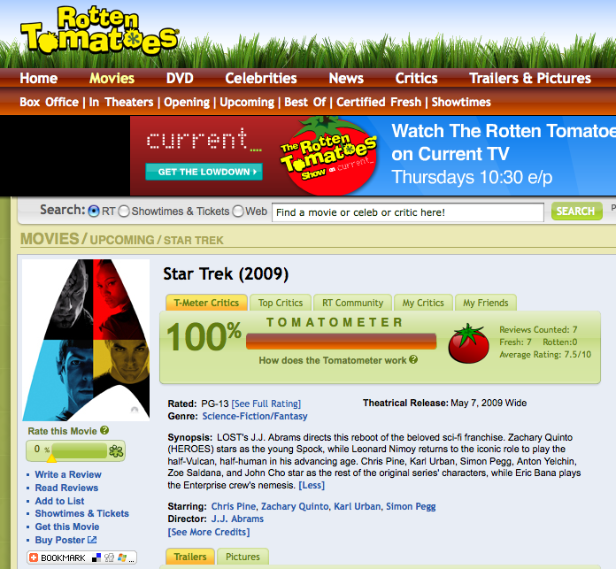
(Picture used under fair use thingy, all rights reserved Paramount and Rotten Tomatoes, yada yada.) I'm sure this will drop once a broader selection of reviewers tackles it, but here's hoping.
-the Centaur
P.S. I'm officially in my blackout period for Star Trek, so don't tell me anything else, I already know too damn much, unless they move the opening to May 7 at 7pm or something.
Labels: Sith Park
Comments:
Why I Use Transparent Terminal Windows
Combined with the microscopic fonts I like, this makes my screen hard to read for others; one of my collaborators used to insist I make the windows opaque and increase the font size so he could see them. So why do I do this? Even the Mac OS X tips page that tells you how says it "has no serious purpose" except to make your windows look pretty.
Well, I beg to differ. This screenshot shows why:
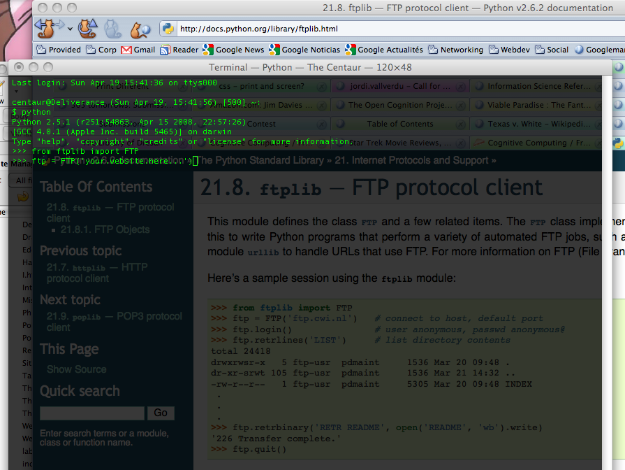
Here, I'm working on some Python code to automatically generate a list of labels for my web site. I've never used the Python ftp library before ... so I just Google'd the Python ftp protocol, found the Python doc page, and began prototyping my code straight at the Python prompt, looking through the terminal window to see the sample code beneath it.
Mmmm. Composity goodness, captured via Mac's Command-Shift-3 screenshot keystroke and edited with Preview. If you program at the command line you should try it - your eyes train up pretty quickly to ignore whatever's behind the terminal unless you need it.
-the Centaur
Labels: Development, Webworks
Comments:
Friday, April 17, 2009
Blog Labels at the Library: The Not-So-Dewey Decimal System
Blogger lets you categorize your blog entries with tags - like Development, Pound Cake or what have you. However, they don't provide an easy way to put these labels into your web page if your site is not hosted on a Blogger server, which the Library of Dresan is not. I've played around with this a bit, but have not yet figured out how to do it.
But the directory structure of the labeled blogs is simple - just the subdirectory "labels" and a bunch of eponymous files like "Mission to Mars.html" or "Sith Park.html". So I'm going to put these labels up myself right now, and write a 10-line or so Python program that will do it for me later.
To make things easy, I've added an index.html to the labels directory, so you can just navigate to it to see the current list of labels. For historical interest, here's what I've got right now:
- Artworks: Essays or announcements about my and my wife's art.
- Book Review: Um, what it says.
- Dakota Frost: Essays about the Dakota Frost series.
- Development: Software development.
- Dragon Writers: Creative writing and my friends in the writing life.
- Edgeworks: My circle of friends, the Edge.
- Hard Science: Essays on science.
- Hard Science: Essays on general science, usually physics.
- Intelligence: Essays on cognitive science and artificial intelligence.
- Mission to Mars: The Mars Desert Research Station.
- Philosophy: Essays about my personal philosophy.
- Politics: Commentary on politics.
- Pound Cake: My efforts to create a good homemade version of my fourth-most-favorite
food. - Restaurant Reviews: If all the tags were named like this then I wouldn't need to write
clever descriptions, now would I? - Sith Park: Science fiction fandom
- Taidoka: Studies of Taido, my favorite martial art.
- The Break: When I broke my arm.
- The Cats: Small, and covered in fur.
- This Guy Called Jesus: On Christianity.
- We Call It Living: My life.
- Webworks: Announcements about this family of websites, like this post.
-the Centaur
Update: removed the image for this post after investigating the license and finding it was a GNU-style "poison" license that required GNUification of the entire post. Sorry, Richard, I appreciate your efforts to make things available to the world but you don't get my blog entries in exchange. I can take my own dang photos.
Labels: Webworks
Comments:
Tuesday, April 14, 2009
Pound Cake Reloaded
Here's what I did differently.

First, I changed the recipe. This time, I adapted one from "I'm Just Here for More Food" by Alton Brown, a chef well known for his excellent, scientifically-based cooking. After cross-referencing against the Joy of Cooking, I felt safe leaving out the vanilla on the suspicion that last time's funny flavor wasn't just the Splenda but my fairly old vanilla flavoring (which I found was labeled "bourbon vanilla" which made me even more suspicious.) This left the recipe:
- Three cups of allpurpose flour
- Three large eggs
- Two cups of sugar
- One cup of buttermilk
- One half pound of butter
- One half teaspoon of salt
- One half teaspoon of baking powder
Electronics. I used a few tricks this time:
- Allow butter to warm to room temperature by itself - no heating in the microwave
- Mix the butter and sugar and blend until fluffy with no sugar grains visible in the mix
- Beat egg yolks and whites together and mix with butter and sugar blend in 3 batches
- Sift all the dry goods (salt, baking powder, flour) together 3 times
- Alternate adding the dry goods and buttermilk to the mix

Results: Yum. The texture was light and flaky, on the edge of being too flaky. The flavor was good, though slightly bland - it could have used more vanilla. The crust had a good texture, but it could have been a bit darker.

This was a good cake, but I got even better feedback from my coworkers and from myself. The cake needed vanilla, a slightly better mixing, and a slightly better cooling procedure. Nevertheless, the pound cake served its desired function:
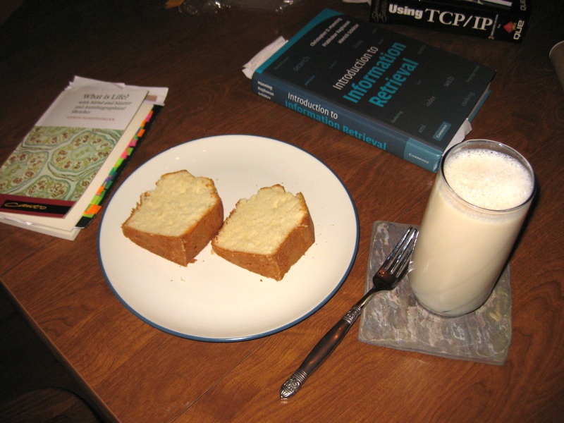
I will follow up soon with the details on how I tweaked the recipe until it was "perfect".
-the Centaur
Labels: Pound Cake, The Killer Cookbook of Marie Curie, We Call It Living
Comments:
Sunday, April 12, 2009
How Wide Should Your Website Be?
I remember reading an article (I don't remember where) that pointed out with browser sidebars and chrome, the width of the page could be far less than monitor width. I measured it on my circa-2000 screen and I found that I had about 800 pixels of width for the web page. So that led to the design of the Library: 800 pixels of width, 600 for the main content and 200 for the sidebar. The banner itself was a little over 1000 pixels so that it didn't end abruptly if the user made their screen wider.
But that was almost ten years ago. Does that logic still hold?
Many people view the web on laptops and phones. Dealing with phone resolution will require more than just dealing with screen widths, so I'll return to it in a later article when I tackle the CSSification of the Library. But a quick search suggests that typical laptop screen widths range from the 1024x768 XGA standard to the 1440x900 WXGA+ widescreen standard. There are some people who have smaller laptop screens, of course, but they are in the minority. Conversely, screens do get larger: for example, for many years I owned a glorious Toshiba Satellite laptop with a 1600x1200 screen. But on those larger screens users often use smaller windows for their browsers: for example, on this MacBook Pro, with a 1440x900 screen, I'm only using a little more than 1200 pixels for the browser window - and typically I use narrower windows.
So something more than 800 and less than 1400 appears to be a good guess. Discussion on the web seems to indicate people are starting to give up on the 800 width and moving to 900 or more, but rarely more than 1024.
Digging around, I found more articles with the same idea - Mario Sanchez argues the goal of web site width is to avoid horizontal scrolling, and recommends you design your web site for 800 pixels, with a layout that works well at 1024. Jacob Nielsen recommends straight out to optimize your site for 1024, but not to design for a specific size and let your layout be "liquid", changing width for your users's monitor sizes. Personally I think this breaks down if you have images to display, though I reserve the right to be convinced otherwise by CSS wizardry at a later time.
All of the above are opinions, of course; what about the evidence that they're based on? The Steam Hardware Survey put out by Valve Corporation suggests that 95% of users use screens of 1024 pixels or wider, with fully 50% at 1024x768, 1280x1024, or 1440x1900. Similarly, the Browser Display Statistics analysis by W3 Schools indicate 36% of users have a display resolution of 1024x768 ... and 57% have higher. Update: I checked the Library's own stats, and found that Google Analytics does indeed track screen resolutions. Less than 5% of all users had a resolution less than 1024x768, and only 1.5% had a resolution less than 800x600. Of that, 0.5% were listed as no resolution, leaving 1% at 640x480. Those numbers will come back later...
Take all that with a grain of salt given that some significant percentage use browser screens larger than their monitor resolution - Nielsen points out in the same article I mentioned above that as resolutions get staggeringly large (he predicts 5000x3000 in the future) users begin to display multiple side by side windows. True enough, at the Search Engine That Starts With a G, all of my officemates have dual monitors with aggregate resolution of 2400x1920, but none of us typically displays a browser window larger than half the screen - 1200 pixels, minus chrome or subtracted width to see other windows underneath.
So that leaves me with the feeling that Nielsen and Sanchez are essentially right. My personal take on it for the Library is:
- Your website should display well in no more than 1024 pixels of width. You may use a "liquid" layout that can expand to use more space, but it should not require more than 1024 pixels to display.
- The essential content of your web site should fit into the leftmost 800 pixels of width. If you are displaying graphics or images or have a lot of site widgets, some of these features may scroll off to the right on an 800x600 screen. Don't put anything essential on the right. Your mileage may vary if you are creating a web site for right-to-left languages, of course.
- Make sure your "liquid" layouts don't break down on very wide or narrow screens. A user who displays a very wide window on a 2400 pixel wide screen should not see all your paragraphs turn into long marching lines of text - these can become hard to read. Similar problems can happen when a screen is squeezed very small - for example, Wikipedia used to display terribly on certain mobile phones, creating vast blank spaces for the user to navigate through.
The new design for the Library uses around 1000 pixels, with the leftmost 600 for text (to satisfy the 1% of people who are still stuck at 640x480), the next 200 for site navigation (for the less than 5% stuck at 800x600), and the remaining 200 for everything (and everyone) else: search boxes, author pictures, and Flickr badges; in short, anything less important than the articles and navigation features. Technically this is not a "liquid" layout, but hopefully this will be something the vast number of users can enjoy with little scrolling, and something that other users can appreciate without feeling left out.
-the Centaur
Labels: Development, Webworks
Comments:
Friday, April 10, 2009
The Great Litany at Maundy Thursday Vigil
Maundy Thursday is the day Jesus instituted the Eucharist and was arrested, according to the Bible and tradition. Rather than a Maundy Thursday service, Saint Stephen's holds a vigil from evening to the time of the Crucifixion. Someone is in the church all hours of the night.
There's no way to know exactly when Jesus was arrested, but I've always thought the hour of darkness was pretty close to two to three AM, so that's a special time for me. Being arrested, humiliated and crucified for essentially telling the truth and trying to do the right thing would be terrible.
The first thing I read during my part of the vigil was from the Great Litany from the Book of Common Prayer; I thought it was apropos in our current time of trial:
We humbly beseech thee, O Father, mercifully to look upon
our infirmities; and, for the glory of your Name, turn from us
all those evils that we most justly have deserved; and grant
that in all our troubles we may put our whole trust and
confidence in thy mercy, and evermore serve thee in holiness
and pureness of living, to thy honor and glory; through our
only Mediator and Advocate, Jesus Christ our Lord. Amen.
Then I read from the Bible, first another apropos passage from Sirach 21:8:
8: He that buildeth his house with other men's money is like one that gathereth himself stones for the tomb of his burial.
After that, I started reading the Passion from the Gospel of John, and then went on to read the remaining readings for Maundy Thursday: first from the Gospel of John, then from Exodus, then from the Psalms, then from 1 Corinthians.
I leave you with the close of the Maundy Thursday service:
Peace is my last gift to you, my own peace I now leave with
you; peace which the world cannot give, I give to you.
I give you a new commandment: Love one another as I have
loved you.
Peace is my last gift to you, my own peace I now leave with
you; peace which the world cannot give, I give to you.
By this shall the world know that you are my disciples: That
you have love for one another.
Labels: This Guy Called Jesus, We Call It Living
Comments:
Wednesday, April 08, 2009
Gravity Wave Lasers and Faster Than Light
Chiao and co ask how big is this effect of a gravitational wave on a thin superconducting sheet compared to the effect on an ordinary conducting sheet. The answer? 42 orders of magnitude bigger....then just by putting two superconducting sheets together we would have gravity wave lasers. They'd probably be practical within twenty years, and Lord knows what we'd have within a hundred. Unfortunately this probably violates the equivalence principle and is likely nonsense:
First, Chaio assumes that coopers pairs fall differently than normal matter in a gravitational field...which basically means violation of Equivalence Principle....and there is no physical evidence for that assumption....neither does he give a rigorous treatment to prove that ASSUMPTION.In other news, scientists studying the Alcubierre warp drive have found yet another way it would not work: in addition to being unstable, non-steerable, non-startable, and requiring planet-sized masses of unobtainable negative energy, it would also cook the occupants as soon as you exceeded the speed of light.
Sigh.
-the Centaur
Labels: Hard Science


 By day, Anthony Francis makes computers smarter; by night he writes science fiction and draws comic books. He lives in San Jose with his wife and cats but his heart will always belong in Atlanta.
Comments: