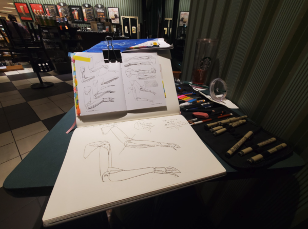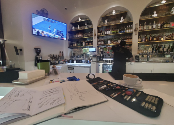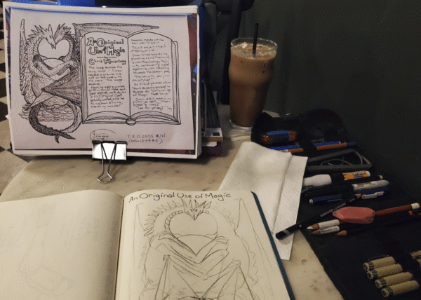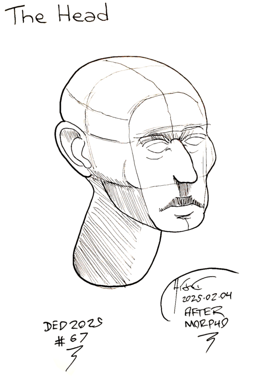
Similarly to Blogging Every Day, my Drawing Every Day project is a challenge to complete a single practice drawing every day in a year. I got inspired to do this after learning that Jim Lee, an artist I greatly admire and current Chief Creative Officer at DC Comics, took off a whole year after college to re-learn to draw instead of diving right into medical school. He set up a drafting table near his bed and drew 8 to 10 hours a day.
Now, I couldn't do that when I started Drawing Every Day back in 2021, as I was a roboticist at Google working to bank up savings for me and my wife's retirement. But I could commit to doing at least one practice drawing, as I was already experienced at doing writing challenges like this blog and National Novel Writing Month. My notes say I got at least 215 days in to Drawing Every Day in 2021.
But I seem to have skipped it entirely in 2022, and couldn't pick it up again in 2023 due to the Google layoffs and me scrambling to finish the papers we had in flight and to get contract work. Only in 2024 did I start the project again, this time, getting at least 135 days into it (I say at least, since I may have drawings in a notebook that I did not yet scan for my records).
2025 was the year that I really buckled down and won it. Here are the rules that I followed:
- The challenge starts in a calendar year.
- The goal is to produce one practice drawing for every day in the year.
- You can draw ahead as far as you have to to make sure you don't fall behind.
- Ideally, your buffer should be at least a month, a week, and two days.
- Drawings should be complex enough to take at least 10 minutes.
- Any drawing you finish, in any medium, can count towards Drawing Every Day.
- Conversely, don't pick a topic for Drawing Every Day too complex for a full 3 hour practice session.
- "Retro" posts for missed days OR YEARS are allowed.
- Success is doing a drawing for every day in a year before the year is over.
- Completion is doing a drawing for every day in a year, regardless of when it is drawn.
But there's more than that. There's one other trick: carry a portable drawing kit everywhere. So now, in the grey Google backpack that has my "portable office", I always carry a notebook, a small book of art instruction I can draw from, and a roll of sketching pencils, sharpeners, and erasers, and Micron pens.
With this, generally, I can allocate between 30 minutes and 3 hours to drawing on most days, but not every day. (For example, a day that you're sick, or flying or traveling, or the big friends and family Christmas party, are all days in which near zero drawing gets done). So building up a buffer is essential to finishing a year.
And once you've allowed building up a buffer, you can do more than that. The point is not to do a streak of consecutive days drawing; the point is having done one drawing for every day in the year - or, more precisely, doing a given amount of drawing practice in a year.
So first I started allowing myself "retro" posts when I got behind - originally, just for posting on this blog. But I decided it was more important to do the drawings than to blog them, and I focused then on building that buffer. Then blowing past the buffer. And finally, about October, blowing past the end of the year.
At that point, more than two months ahead, I had a choice: keep going until I finished my drawings for the year ... or start backfilling previous years. I picked the latter, allocating roughly two drawings to the future and one drawing to the past. This ensured that even if I lost a day, I'd still keep moving ahead.
I then blew past the end of 2025, and decided, rather than coast through the end of the year, I would just keep going. At this point, I'm over 90 days into 2026's drawings, and have around 120 to finish for 2024's. So as far as keeping the discipline up, I am feeling pretty good about this project.
Which is good, because around August to September, I wanted to give up.
After having spent much of 2024 and much of 2025 working on Drawing Every Day, not to mention the previous years, I started to feel my drawing wasn't improving. Frankly speaking, I wanted to quit, and seriously considered quitting as I was getting really busy around Dragon Con time.
But, I kept telling myself: you've been laid off. Your major consulting contract has come to a close. And you have time to write your novels. If you don't put in the time and the hours now, you'll never become a comic book artist, and the comic books that you want to write and draw will never be completed.
So I committed to finishing 2025. And as I did that work, I started, very slowly, to notice incremental improvements in my drawings. Feet were not quite as terrible. Hands were not quite as impossible. And the shape of the human body started to feel a little bit less like unknown territory and a little bit more mapped.
Frankly speaking, I don't ever think I'm going to be a "great artist". As I understand it, individual differences in innate talent can account for more than a tenfold difference in quantity and quality on many cognitive tasks, and I think I have been blessed with a great artistic interest but not as great an artistic aptitude.
But the bulk of the quality of any individual's performance is not related to their innate talent, but instead into their learned skill. The so-called "ten thousand hours of practice" needed to become an expert is a very real thing, and almost every expert has put in a similar number of hours to end up where they are.
At ~30 minutes to 1 hour for a drawing, I'm getting roughly 200 hours of practice in a full year, with about 500 hours under my belt in the Drawing Every Day project. For contrast, Kimon Nicolaїdes's The Natural Way to Draw course of practice is about 900 hours of practice, and if Jim Lee did 10 hours a day, 5 days a week for 50 days in his gap year, that would be 2500 hours of practice. Clearly, I have a long way to go.
But I could do it, in a year. Nothing stopped me - not friends or family, writing or research, consulting or even a full-time job, counting the 2/3 of a year I finished in 2021. In fact, I think with the principles of practice I've developed for Drawing Every Day at least a month ahead, I would have easily finished 2021.
And I enjoy it.
So nothing is stopping me from Drawing Every Day for the next ten years if I want to. And if I keep it up, the one day I'll find, ten years have got behind me ... and 3650 completed drawings will be under my belt, for something like 2000 hours of practice. I'm guessing comic book projects will be easier then.

Not that anything's stopping me from drawing more, or starting comics sooner. I started Drawing Every Day to help rebuild my confidence in drawing, which collapsed after I broke my arm in a karate match in late 2004 (I think November 30th, if I've done the math right) and my laptop was stolen and the replacement laptop could no longer run my webcomic software. I've tried to resurrect my drawing career before - most notably in that post from 2014, a decade after the break, but it didn't take - because I was out of practice.
Now, God willing, whenever I do pull the trigger on my comic projects, I hope practice won't be the problem.
-the Centaur
Pictured: My portable drawing kit, and "the break".


