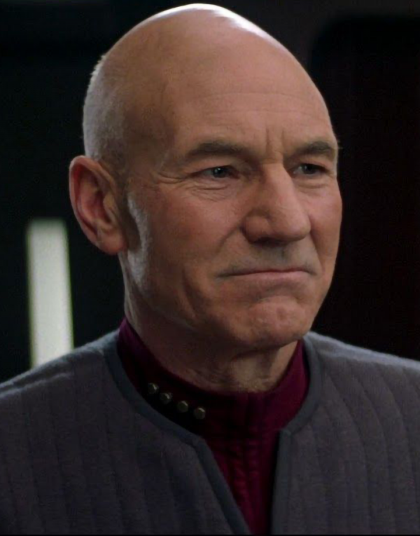
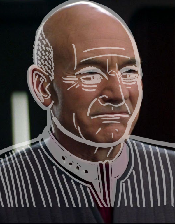
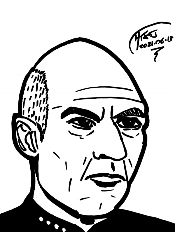
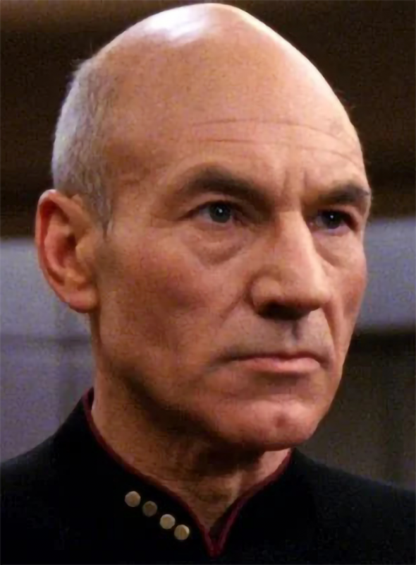
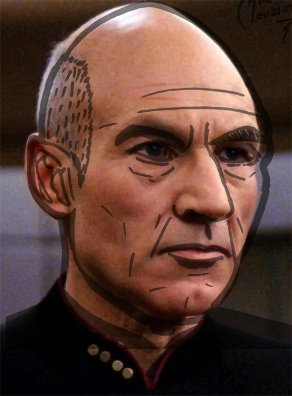
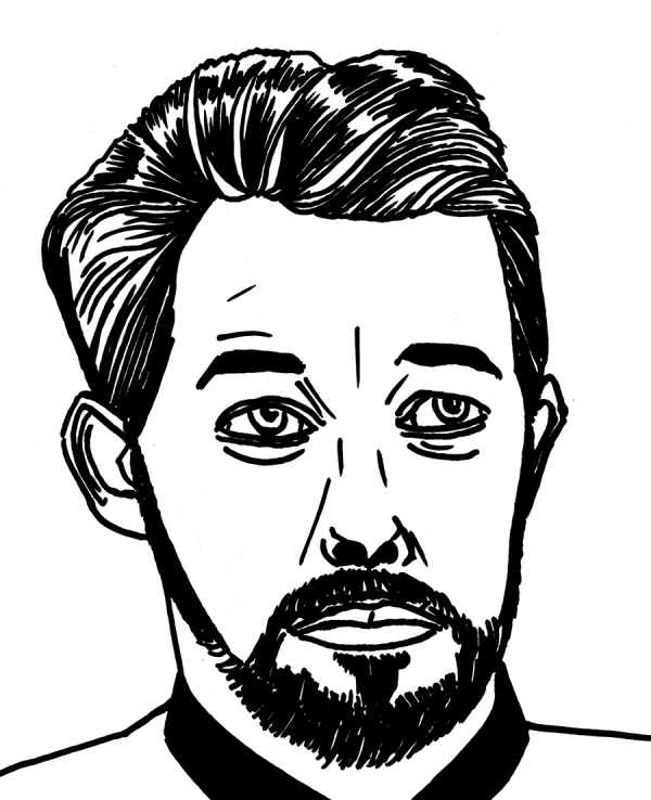
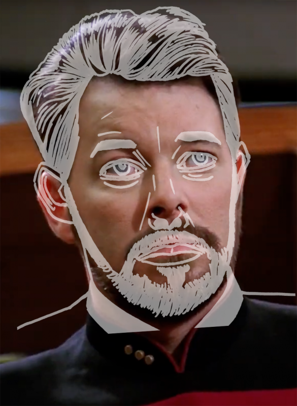
Picard, Level 2: non-repro blue used as roughs for the quick Sharpie sketch. I don't like how this one turned out at all - he's frowning in the sketch, and smiling below:
Worse, despite being careful, there's no way to line up the head and features. This, I'm afraid, was another failure of measurement - an error in the "landscape".
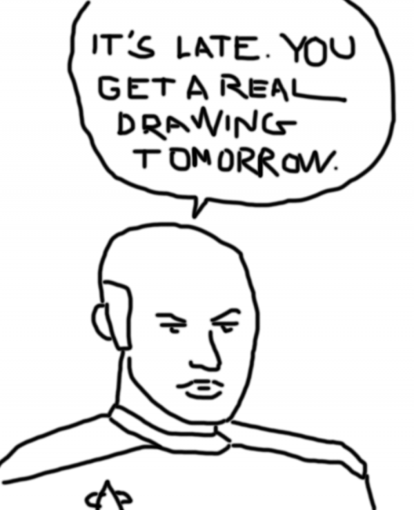
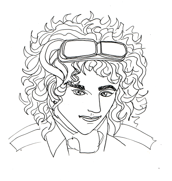
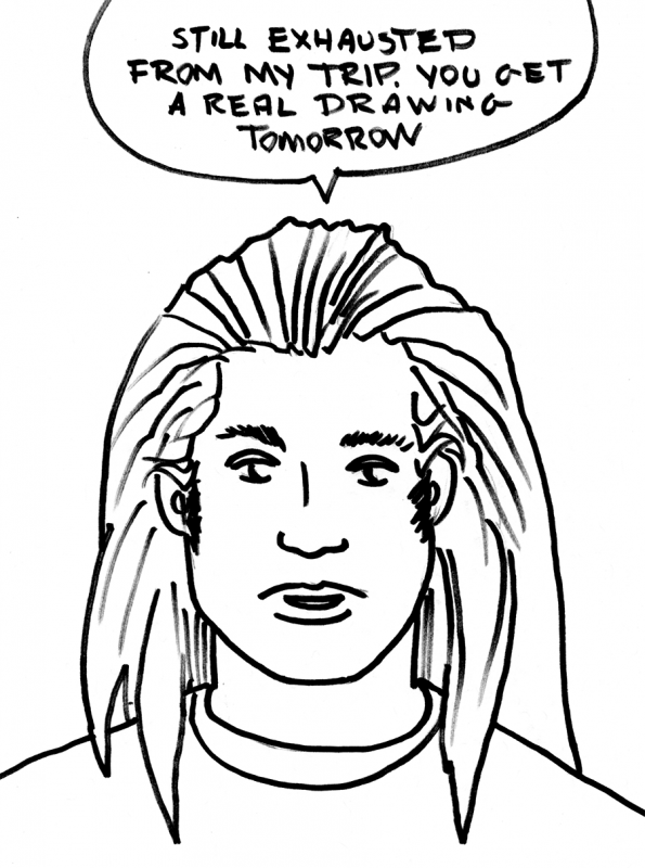
Super-quick Sharpie sketch of Commander Data from Star Trek: The Next Generation - I think this is from the rare lost episode "Tick Dracy in the Twenty-Fourth-and-a-Half Century" where Data plays the old cartoon villain "Light Bulb Head". I mean, man, this one is just awful, but, it's 2am, so I am going to bed.
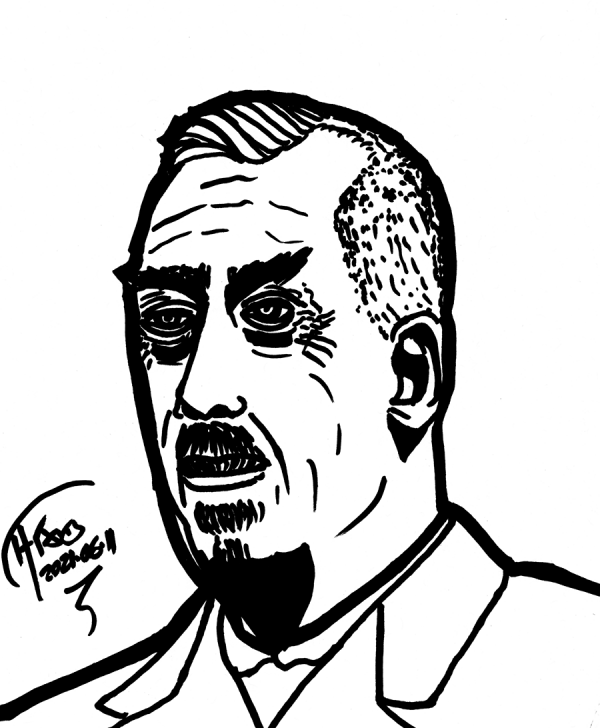
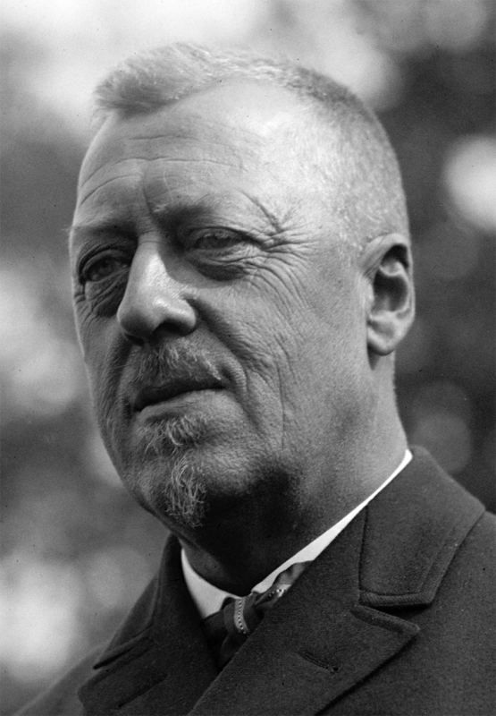
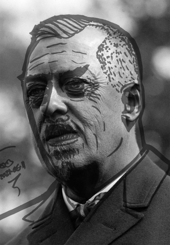
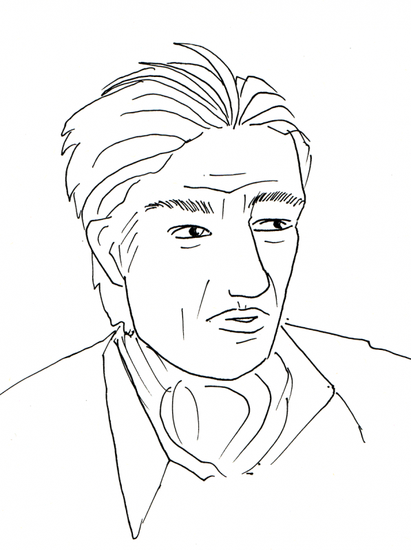
Dr. Hugo Eckener, the "Pope" of airship pilots. Even though I carefully noted the angle of the head, I nevertheless tilted the eyebrows wrong - and even caught myself doing it. But, even though I saw the problem, and did some work to correct it, it was too late to recreate the fullness of the face:
The comparison shows a 5 degree tilt and 10 degree horizontal squash, but, frankly, there's no way to make everything line up no matter how you stretch it, as the nose is misproportioned compared to the eyes, which led the dent on the face on the left side of the page compared to the original.
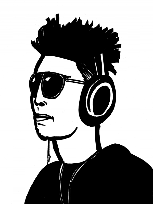
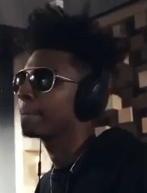
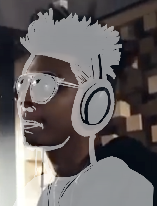
Masego from his amazing one-take performance on "Tadow" with looping artist FKJ. How did I do? Eh, meh, it looks like I dented his face in compared to the original.
As usual, I missed the ~3 degree tilt of the head, and while dude is thin, I gave him a giraffe neck because I stopped measuring when I got to the shoulder section. Sigh.
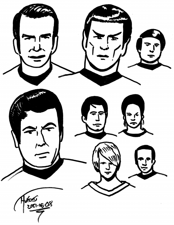
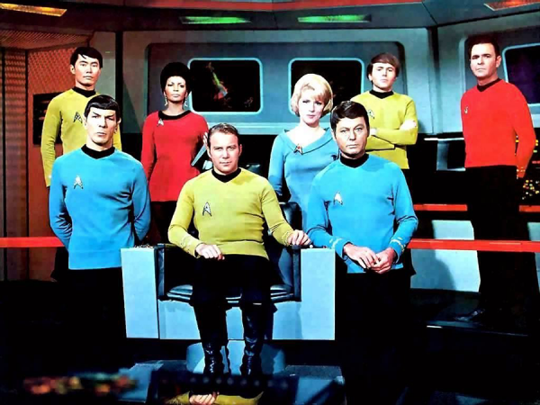
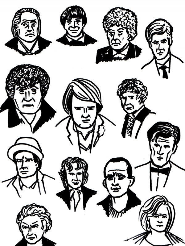
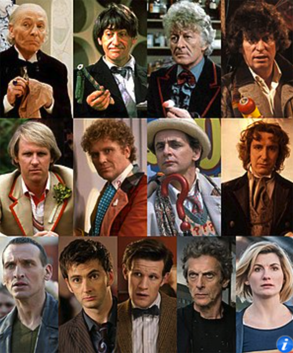
Quick Sharpie sketches of the Doctors. Some came out better than others, but it gave me practice drawing 13 faces quickly, without the luxury of obsessing over each one.
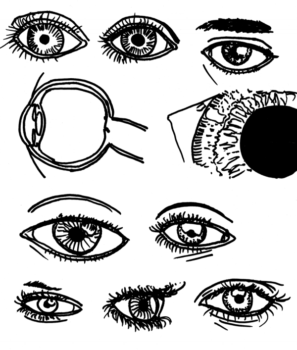
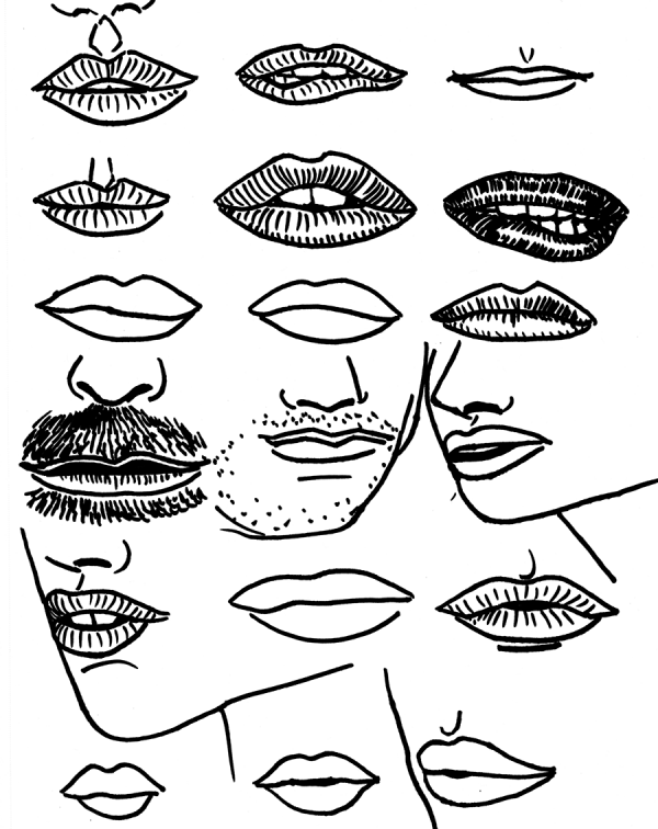
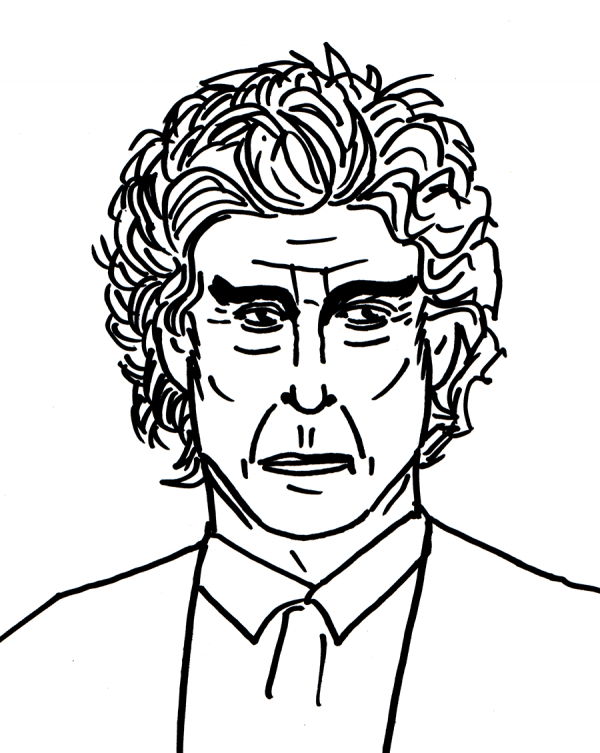
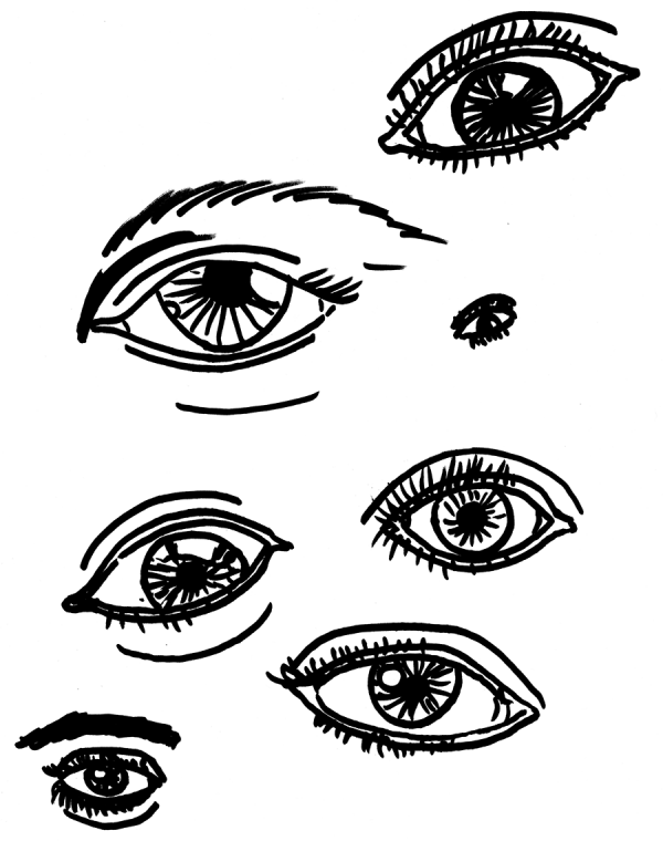
Another rushed day, another quick sketch from memory fail. Despite having drawn Capaldi like 4 times in a row, when I try drawing without reference it just doesn't look like him. The above is day 161; below is day 162, when I decided to focus on just eyes. Again, I'm doing quick Sharpie sketches to force me to focus on shapes and proportions, where my biggest flaws are, rather than fine details of rendering.
Now that's better. Tilting the page, pencil roughs, and measurements of the face were critical here to getting the drawing better - though, even with careful roughs, I did that weird thing where one part of the face lines up and the other doesn't, causing a dent on the right side of the page when compared to the original below:
Still, it doesn't line up too terrible:
I see a couple of places that need work, particularly my measurement of jawlines. Or, looking more closely, picking which line to emphasize in the jawline.
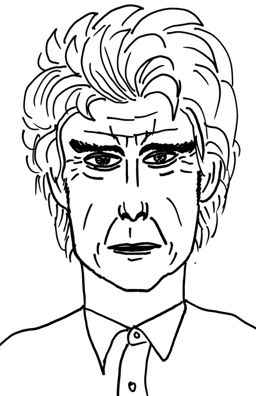
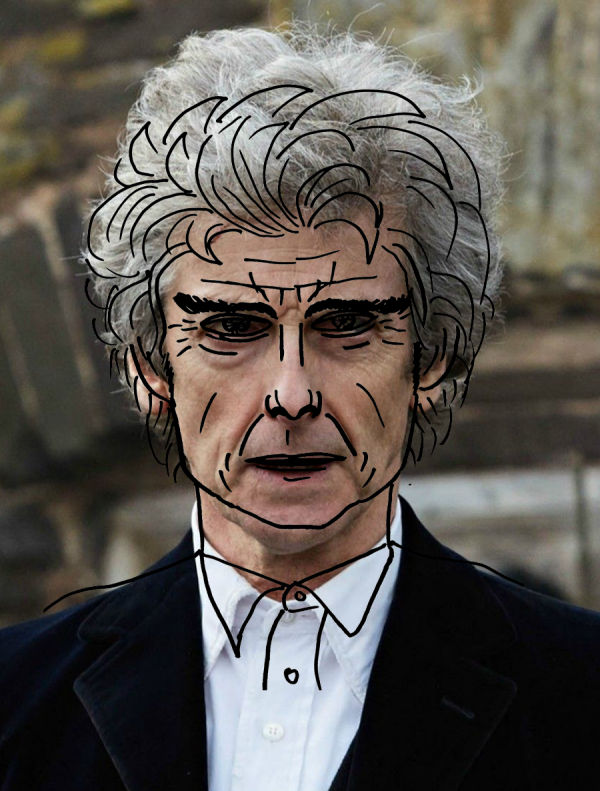
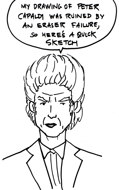
Wow, this quick Sharpie sketch of Peter Capaldi from memory was a complete fail. I was trying to save time so I can crash early, but the Twelfth Doctor here ended up looking like a bad extra from Aeon Flux. Comparing to yesterday's reference shot (which I did not use, but nevermind) you can't make them line up, but if you try, the features need to be squashed about 80%, the hair about 90%, and the neck, well, the neck is a caricature and is not fixable by any amount of warping:
Oh well. Back to reference drawing (or leaving myself more time).
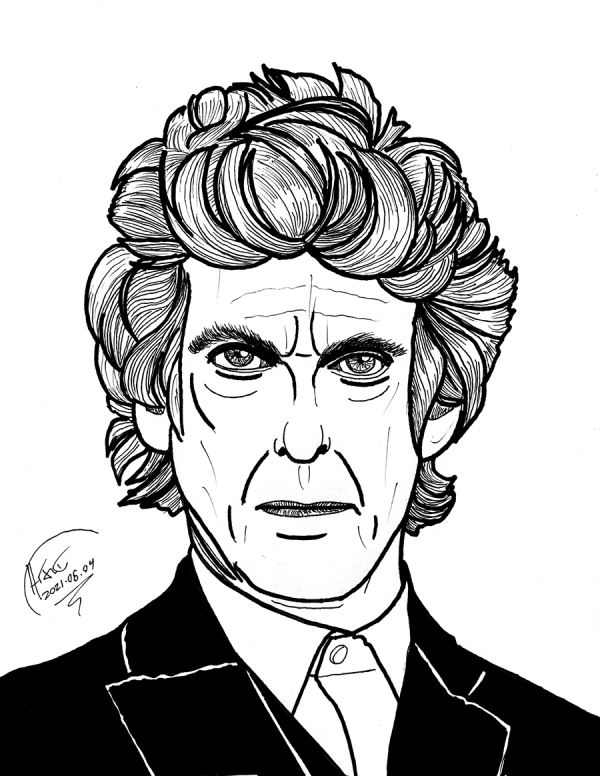
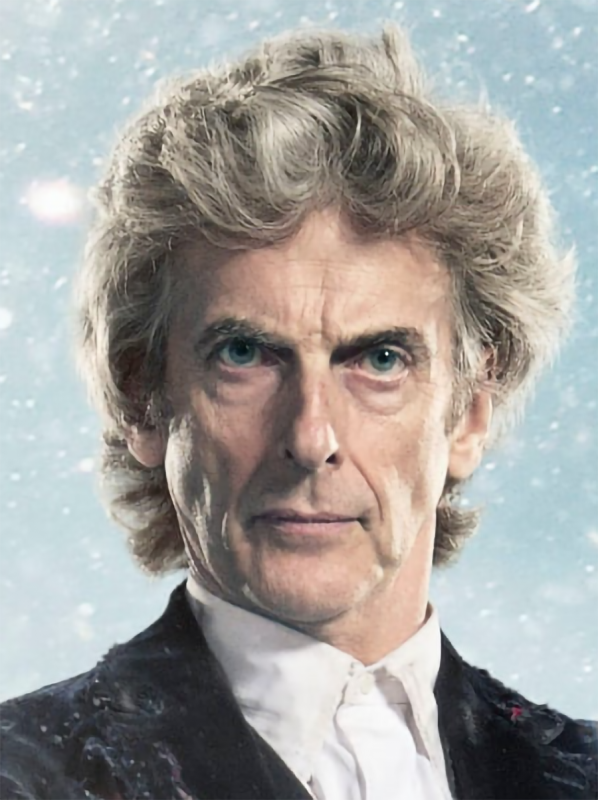
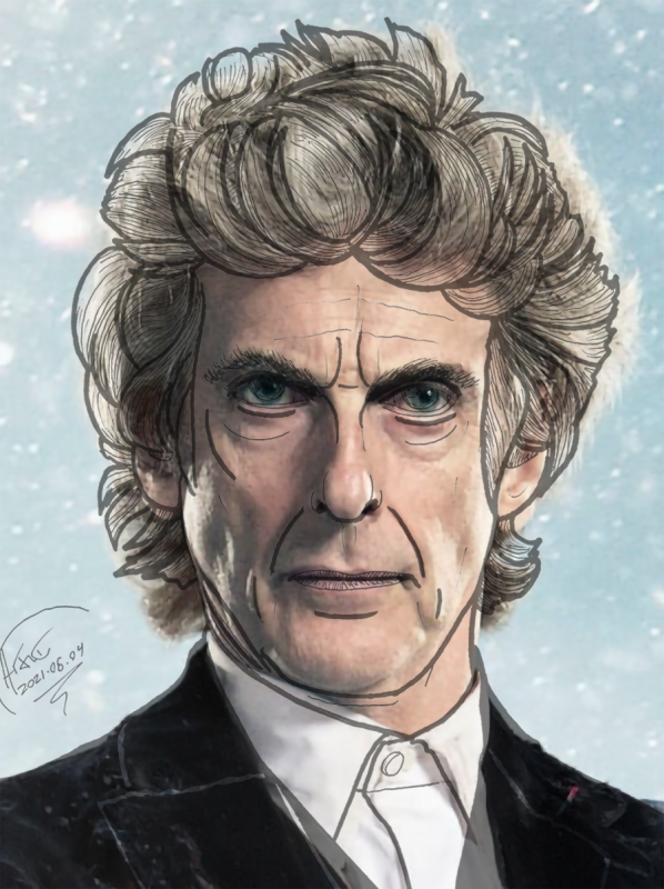
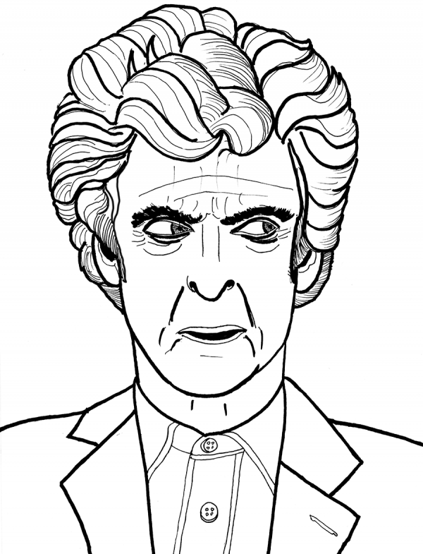
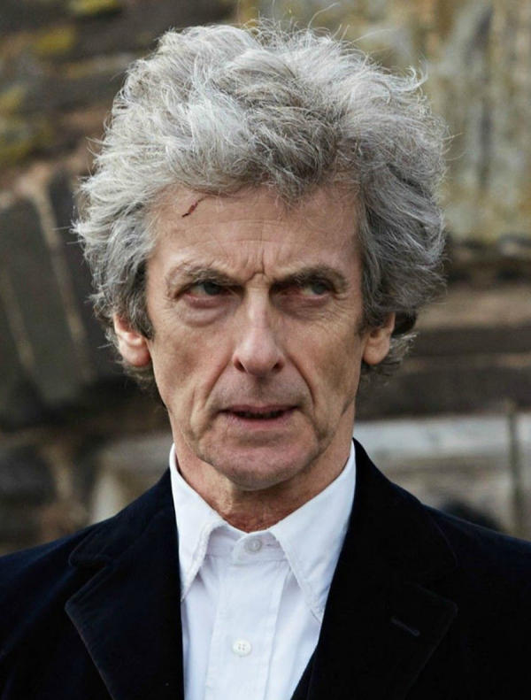
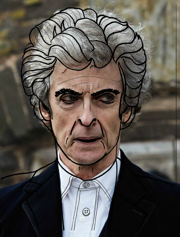
Now that's Peter Capaldi. Pencil roughs with Pilot V5 and Sharpie outlines (and erased with a Pentel Clic Eraser, not a 25 year old pieces of Bellcore swag). Let's see how I did:
Not completely terrible, and it even mostly lines up:
Much better than my first attempt, where that Bellcore eraser did me wrong:
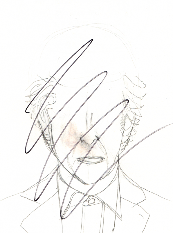
Halfway into the roughs of a drawing of the Twelfth Doctor, I had a terrible eraser accident. I'd grabbed a random pencil out of a jar and, while the graphite was good, apparently the eraser had gone bad, leaving a horrible splotch of pink-orange across my page. The pencil is labeled "Bellcore" which, based on either my own personal history of when I might have acquired it OR when Bellcore ceased to exist by that name, means it's around twenty-five years old. Apparently the erasers in #2 pencils that are really old can dry out, causing the problems that I had tonight. Oh well.
Still drawing every day, maybe just not always erasing.
A couple quick ink sketches (Pilot V5, no roughs) because I'm on vacation, damnit. Above, Day 155, a quick sketch from memory of my earlier drawing of Neil from Tenet. I wonder how well I did - probably, poorly - but I'm not going to concern myself with comparisons today, I want to crash early.
Below, Day 156, a sketch of Jeremiah from the picture of her on my convention backdrop (same drawing from the Jeremiah Willstone frontispiece and website). No roughs again, which made it tricky, but even though this drawing is sloppier than the original, I see things that I've learned from the Drawing Every Day exercise that could help me improve these kinds of drawings in the future.
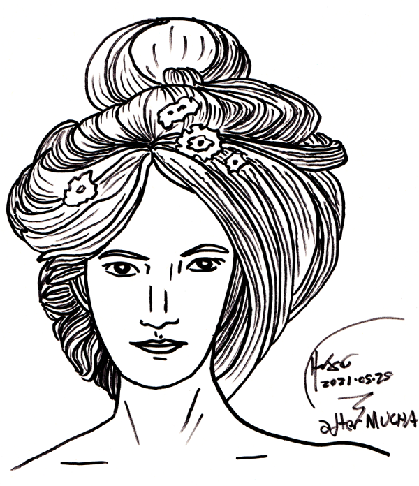
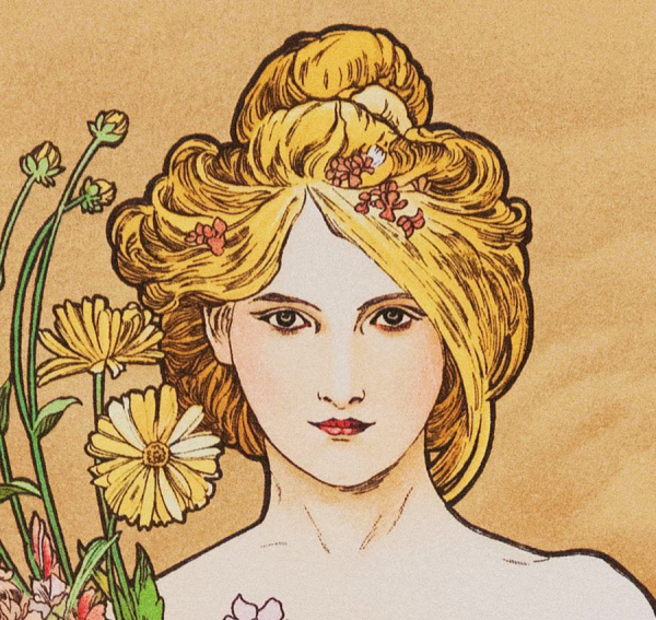
Super quick Sharpie sketch of Alphonse Mucha's Spring, no roughs at all, with my wife watching over my shoulder while I quizzed her about titles for a new Jeremiah Willstone novel (we settled on the provisional title JEREMIAH WILLSTONE AND THE FLOATING GARDENS OF VENUS).
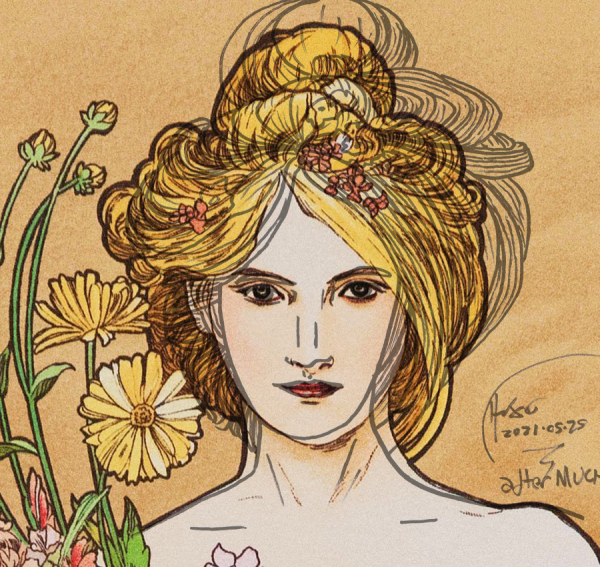
As for the drawing, the individual parts came out OK, but I gaffed the relative alignment of the falling hair and eye on the left side of the face (on the right side of the drawing) and the whole thing ended up lopsided compared to the original:
There is no way to make that hair or jaw line up right, but the face itself isn't terrible:
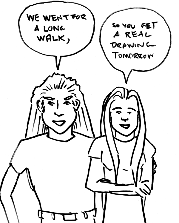
As it says on the tin: my wife and I went for a long walk, which we normally do at the very end of the day just before I hit the hay - and then I realized I hadn't done my drawing. So you get a quick sketch.
Drawing every day continues, hopefully with more rendering, tomorrow.
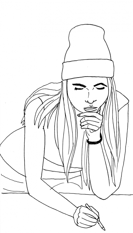
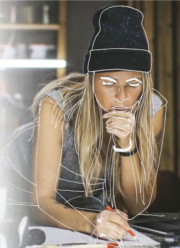
Quick sketch of a model from a sale on the Dell website (which I can no longer find). Roughs in pencil, sketched with a Pilot V5, no rendering to speak of. Let's see how I did:
Not entirely terrible, and I'm getting better at overall proportions in the face, but I am consistently tilting faces - this time roughly 3-4 degrees - and the further I get from the face the worse the proportions are. There's no way to line up the hat and the face simultaneously due to the tilt, and I completely lost the script on the arm angles, though the outlines of the arms aren't entirely terrible.
Reflecting on the past, seems like the angle of the page is less important for the squashing phenomenon than just paying attention to distances, as this was a sketchbook-in-the-lap drawing, and by consciously looking at the sizes of things (and using construction lines) I kept it together.
Welp, more work to do on the broader landscape - and that dang tilt.
And with this, my posts have caught up with my drawing every day.