
Well, not a "drawing" per se, though I went through four pages of sketches of this comic book banner logo before I cracked open Illustrator. (Here are a couple of those, not very impressive though).
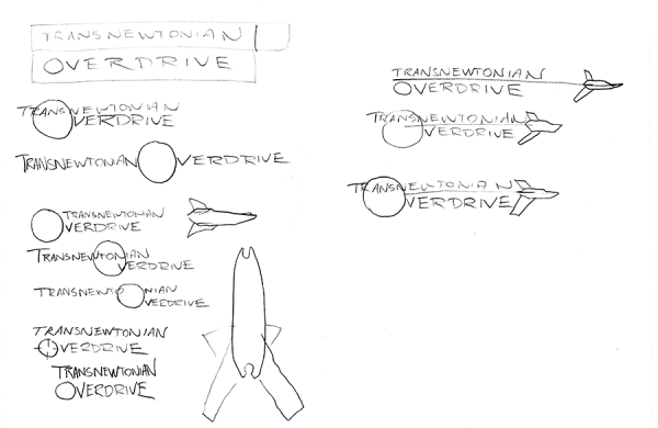
I'm still not satisfied with how this turned out ... there's some image in my mind with this logo which I haven't been able to translate into an actual drawing, much less a realized logo.
But what's up with this logo, you may ask? Well, it's from a 24 Hour Comics Day comic I did, way back in the day, but never finished - "Transnewtonian Overdrive: The Front":
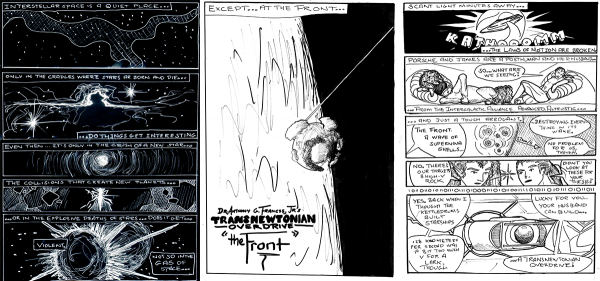
The "transnewtonian overdrive" proper is that little device in the last panel, an aftermarket component to our protagonists' Porsche Hexwing staryacht (first panel) which enables them to go places where other people can't. The idea, you see, was that in an era of faster-than-light travel, no-one would seriously be interested in the relativistic corners of our universe - but by inverting a normal hyperdrive to go just slower than the speed of light, our heroes could dive headlong into places with weird physics.
When I revisited the logo, my sketching - and looking at other logos of other comics - led me to the idea of the Hexwing cutting across the logo, with a thin line connecting it to the "O" of overdrive representing the invisible hypermass that our heroes are bungee jumping off of (and back to) to travel. I feel okay about it - the logo could be sleeker - but I can't quite articulate what the logo as drawn is missing from the image I have in my mind. If I could "see" that, perhaps I could fix it. This will require research, I think: I didn't figure out what was wrong with my Batman page (don't worry! I'm not going back to it) until I looked into
DC Comics' book on coloring and lettering and realized I hadn't properly exploited value to make different planes of the page stand out from each other. Fixing this logo will require doing some research (and, likely, coming up with my own logos for other things first, before coming back to this, so I'm not working the same piece of art over and over again).
I didn't finish "The Front" that day - it was WAY too ambitious for 24 hours, and I think I only got 7-8 pages in. You know, in a way, I think 24 Hour Comics Day hurt my creativity as much as it helped it. It pushed my boundaries in a way I never had before, but the speed at which you have to work mean that my artwork wasn't up to the standards that I'd set for myself with f@nu fiku. Five years after breaking my arm, when my art was still rusty, I bit off more than I could chew, and may have hurt myself more. Not sure I'd go back and change it, but if anything, I wished I'd taken on a drawing discipline like I have now.
Drawing every day forces you to get over yourself, the good and the bad, and to move on to the next day.
-the Centaur




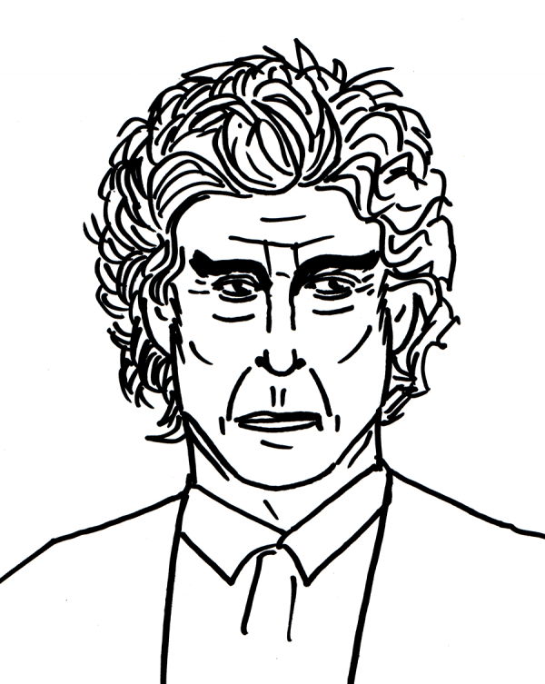
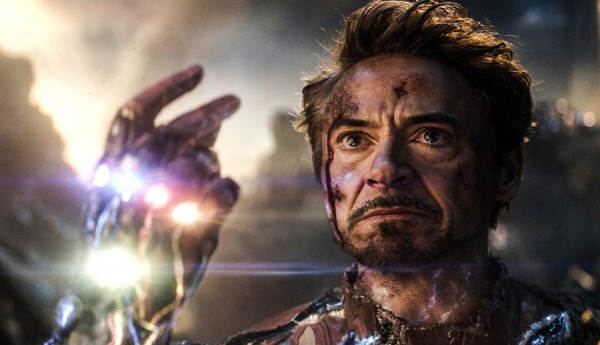
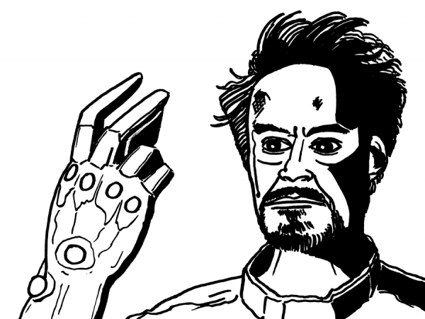 Quick sketch of Tony Stark as Iron Man. In an interesting reversal, I think the picture below looks a little squashed, and I unconsciously stretched his face back up to a more normal proportion. Actually, this one wasn't totally terrible - I had to learn a language for drawing the hair, and to pick which parts of the drawing I was going to render as pure black. Also, contra my earlier suggestions, the Sharpie wasn't totally permanent; I actually used whiteout to fix one overwritten line - can you tell where?
 Drawing every day.
-the Centaur
 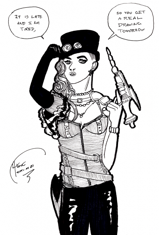 As it says on the tin: trying to get to bed earlier and did a quick sketch. From the cover of a random comic "Gearhearts" in my inspiration pile. The sketch didn't turn out ... terrible ... in fact, the arms almost came out right, and it sort of looks like the cover. But as usual, doing one or two iterations of roughs would have helped the layout of the head and face. My eyes just seem to move around, man.
Drawing every day.
-the Centaur
 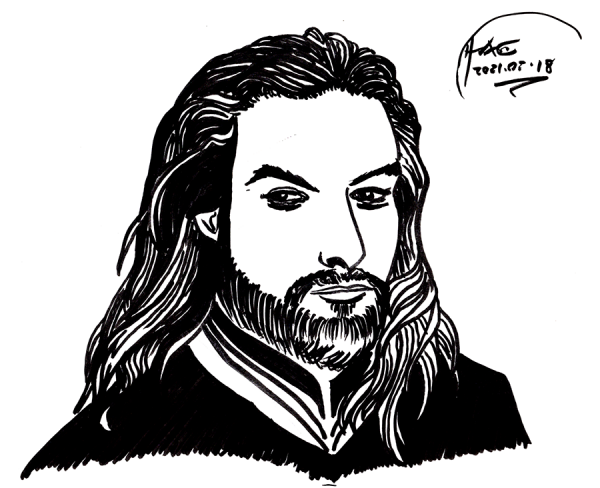 Quick sketch of
  Not ... terrible, but the proportions are still off, and my sketch gave him way too big a schnoz. Jason Momoa is a good looking guy, and unfortunately my sketch makes him look more like a rejected villain from the Princess Bride. Ah well. Perhaps I'll eventually be able to sketch good looking superheroes ...
... if I keep drawing every day.
-the Centaur
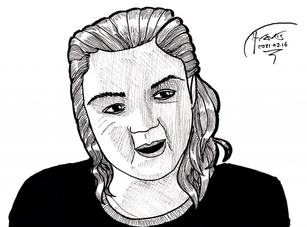
 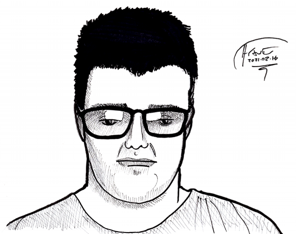 Sketched faces from tonight's
  The ultimate goal of these drawings is to rekindle my love of my art and to sharpen my abilities to the point where I can once again resume
 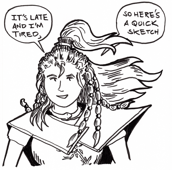 As it says on the tin: a quick sketch of Xiao from
 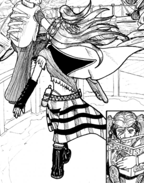 I didn't make her easy to draw, and her outfits only get more complex as the series progresses.
Ah well. Here's hoping those sketches and thumbnails once again turn to webcomic pages.
Drawing every day.
-the Centaur
 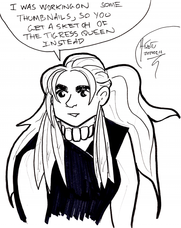 As it says on the tin: I've been trying to improve my artwork by studying how other artists plan for success with technique and thumbnails. The author of
 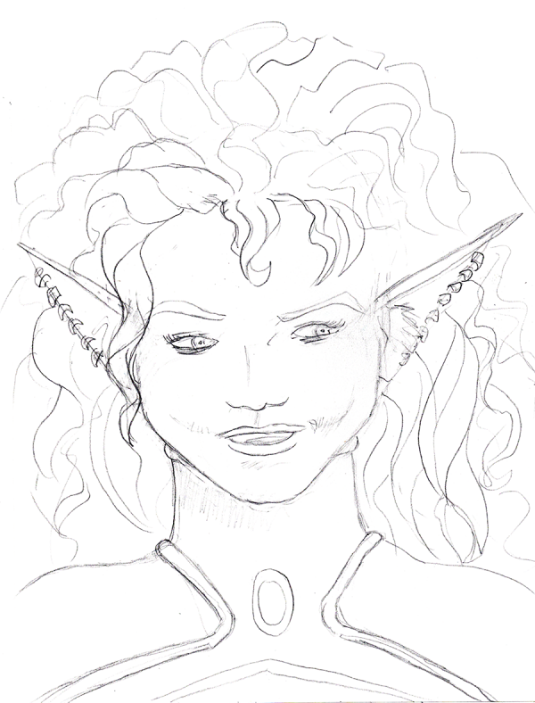 A deliberate attempt to just sketch in pencil and not ink. I decided to sit down and methodically start working through Wizard's How to Draw: Getting Started, working on roughs, when I noticed that one of the things I like about the book is that it has a mental model of artwork.
That inspired me to dial it back even further and to try to generate my own theories of art. I measured a Green Lantern figurine and a drawing dummy looking at proportions (hips are about midway in the figure), then examined old Superman comics and sketched one trying to see what I'm doing wrong.
Since I cut my chops inking my own webcomic, as fast as I could manage, wherever I draw it, I got in the habit of inking right over my own pencils, trying to get a good rendering in one go, which is a thing people do. But I've noticed many great artists use roughs to plan for success in their drawings.
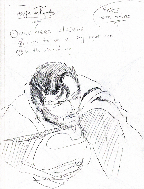 These roughs often have several levels of shading, which right there is an improvement over my "everything is an outline" style, when in reality, outlines are mostly in our minds, not in reality. So I sketched out a few figures, with shading, in greater detail than I normally would in pencil.
I can't tell you how hard it was to NOT start inking.
Still ... drawing every day.
-the Centaur
 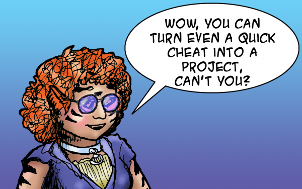 As it says on the tin. Fell down a rabbithole trying to clean up my files prior to doing my art, decided to cheat by posting a sketch I did earlier today, then fell down more rabbitholes since I apparently can't not experiment with coloring a sketch. For reference, here's the sketch from earlier, the first entry in a notebook that I hadn't written in in over 18 years:
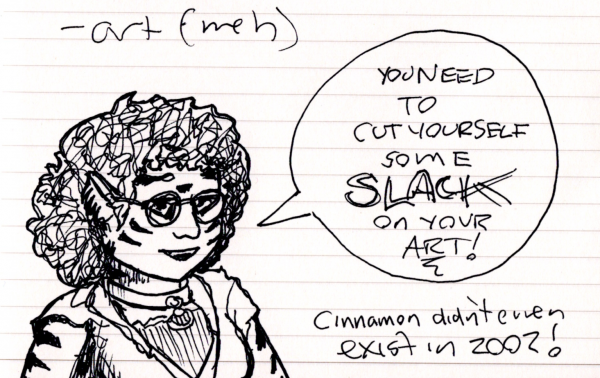 I came across this notebook just trying to find an appropriate notebook for a science idea (my sketchbook is at hand, but the science notebooks are ... buried in boxes?? Not sure) and found this one, a "commonplace book" filled with various ideas, including a life review from almost 20 years ago. I'm ... actually pretty happy with how things turned out over the last 20 years, between my wife, my novels, my comics and Google, but there's so much more to do.
Finally, for reference, here's a piece of art I found while I was re-organize my files. This is from 24 Hour Comic Day, mind you ... a bit ambitious, I think, but this pre-break art I think shows the kind of work that I'm intimidated by when I try to get back into drawing:
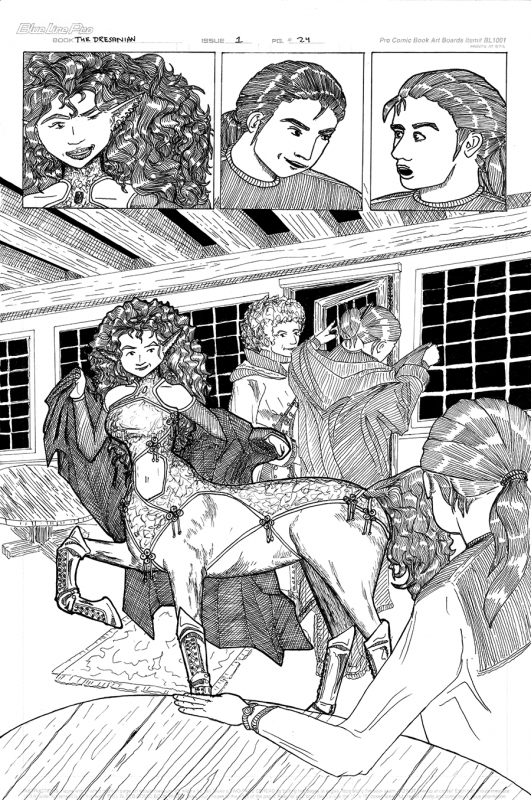 Yes, there's a lot to be improved with this art, but (a) my inking was a lot better, and (b) wow, I had forgotten how much the Porsche St. George character was supposed to be a "knockout". So much of what I've written / drawn about her since then has been the workmanlike space warrior stuff, not so much the original romance between the twentieth-century time traveller and the thirtieth-century centaur.
Ah well. Lots of work to do before I can get back to that level of quality, even though I see a lot of work I need to do to improve upon that once I get there.
Drawing every day.
-the Centaur
 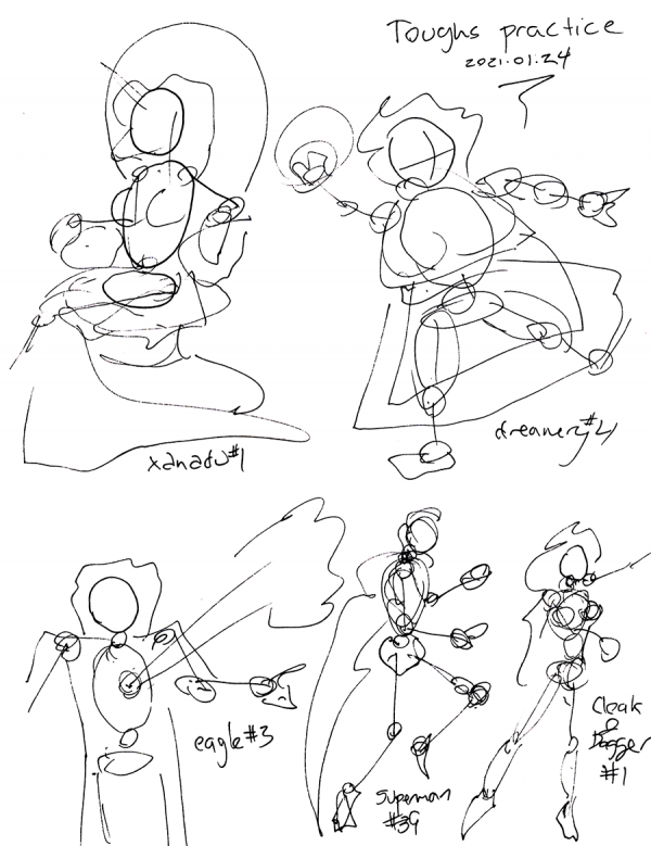 Well, this may have been quick, and it may look sketchy, but actually, this is real drawing practice. I've long had a copy of
  Well, not a "drawing" per se, though I went through four pages of sketches of this comic book banner logo before I cracked open Illustrator. (Here are a couple of those, not very impressive though).
 I'm still not satisfied with how this turned out ... there's some image in my mind with this logo which I haven't been able to translate into an actual drawing, much less a realized logo.
But what's up with this logo, you may ask? Well, it's from a 24 Hour Comics Day comic I did, way back in the day, but never finished - "Transnewtonian Overdrive: The Front":
 The "transnewtonian overdrive" proper is that little device in the last panel, an aftermarket component to our protagonists' Porsche Hexwing staryacht (first panel) which enables them to go places where other people can't. The idea, you see, was that in an era of faster-than-light travel, no-one would seriously be interested in the relativistic corners of our universe - but by inverting a normal hyperdrive to go just slower than the speed of light, our heroes could dive headlong into places with weird physics.
When I revisited the logo, my sketching - and looking at other logos of other comics - led me to the idea of the Hexwing cutting across the logo, with a thin line connecting it to the "O" of overdrive representing the invisible hypermass that our heroes are bungee jumping off of (and back to) to travel. I feel okay about it - the logo could be sleeker - but I can't quite articulate what the logo as drawn is missing from the image I have in my mind. If I could "see" that, perhaps I could fix it. This will require research, I think: I didn't figure out what was wrong with my Batman page (don't worry! I'm not going back to it) until I looked into
 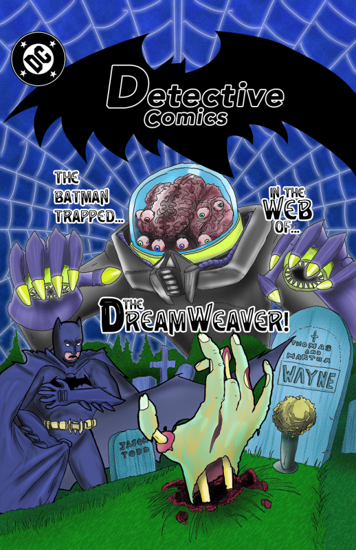 tl;dr: sometimes the solution to a bad drawing is to practice on something else
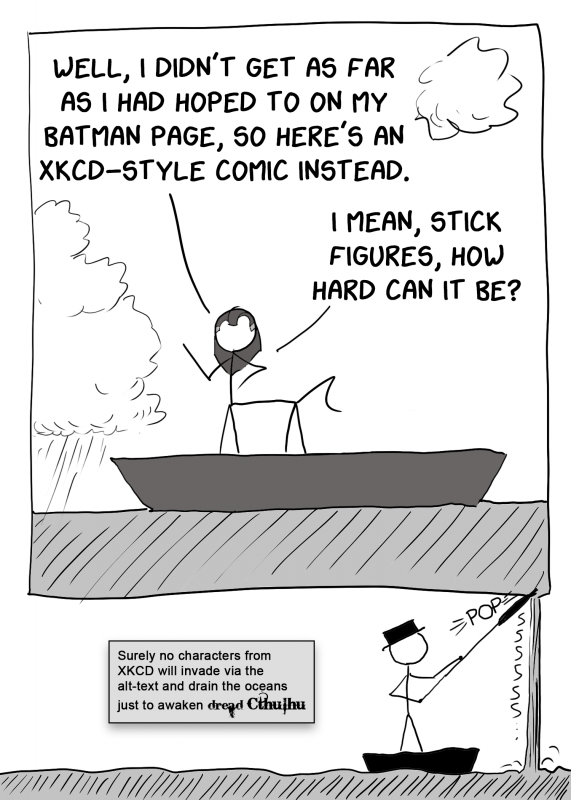
Finally, the completed page. Frankly, meh.
I could have done a lot more work on it to clean it up, add some pop, fill in some more cloud layers, etc., etc., but diving into the fiddly bits on this particular composition would not fix the deficiencies in the core drawing or in my abilities to realize it.
The solution, I think, is not to overwork a single piece of artwork trying to compensate for its deficiencies, but to instead identify those deficiencies, to practice to eliminate them on different drawings, and then to return to the original subject matter with a wholly new concept and composition.
In this case, the deficiencies - oh, I don't know where to start. My poor hand drawings, my lack of details about body anatomy, my poor inking skills, my lack of strategies to overcome my slight RSI tremor, my poor page layout, my lack of knowledge about digital coloring techniques, or my need for strategies to overcome my moderate color blindness? But identifying even a few of them starts me on the road.
Note fixing these issues requires a comprehensive approach: some involve practice, like drawing hands or working on inking. Others require research (and practice): learning more anatomy or digital coloring. Others require actual strategies: if I want to clean up my inking line, I need to focus on ways that do not irritate my RSI or trigger the slight wobbly tremor, and if I want to deal with my color blindness, I need both more knowledge of color theory and a plan to deal with it. But now I have GPS directions.
Time to get started. And at some point, when I've traveled around the country of comics and returned to the start with a better set of tools, perhaps I'll draw another Batman cover. Or a Green Lantern page.
Or ... maybe ... a comic of my own design. Not that I have one in mind or anything.
Till then, drawing every day.
-the Centaur
  It's late and I'm tired. ZZzzzz.... cthulhu ftaghn ... zzzz....
Drawing every day until the stars are right again.
-the Centaur
 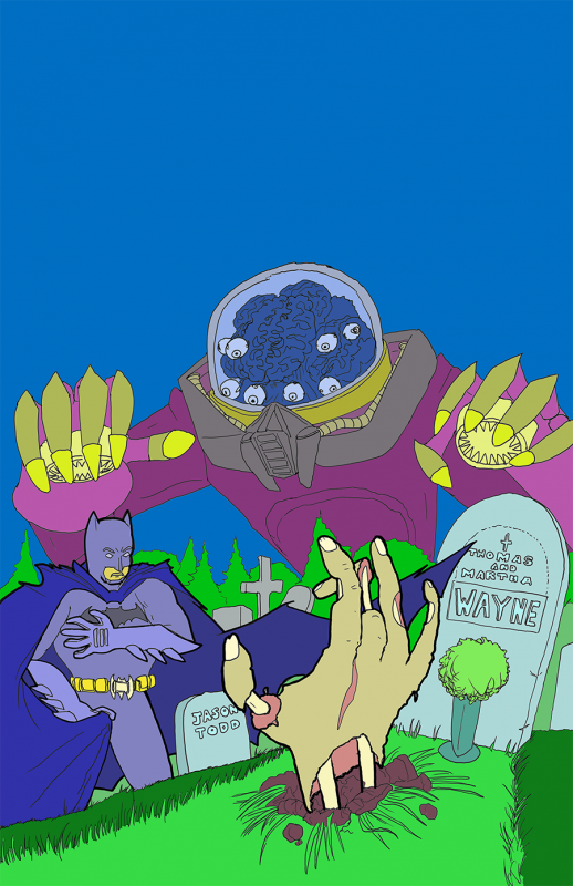 Oy, this guy again. Not a finished drawing: these are "flats", used in digital coloring to isolate different elements of the image for further processing, hence the false colors used to make sure each element can be selected by color - I'm not that colorblind! Hopefully I'll finish up the color composite tomorrow.
Drawing every day.
-the Centaur
 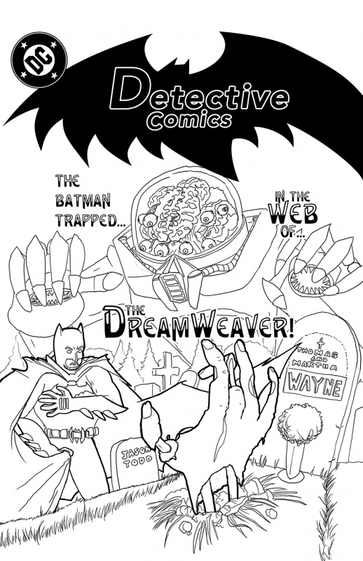 Try #4 at the drawing behind this page, using the improved layout from #3. In addition to that trick, I increased the size of the page by 50% so I was effectively drawing at 300dpi, and zoomed in to work on the details, using all three previous drawings composited in increasingly ghostly transparency like an ersatz lightbox. Darker outlines were used for Batman and Zombie Wayne.
Altogether, I like how this one came out better. Hopefully, if there are no more disasters with the water or the power or yearly planning, I can color this one tomorrow #dontjinxitfrancis so you can stop seeing this and we can move on to something else.
Drawing every day.
- the Centaur