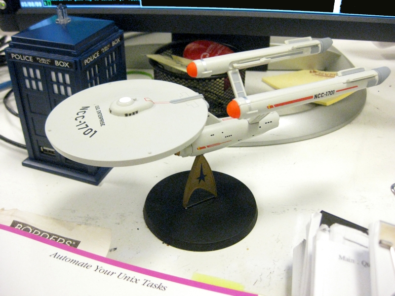
There's been some confusion recently about the "fanboy reception" of the new Star Trek movie - some people going so far as to say "fanboys will hate it because they changed everything". Well, speaking as a fanboy who recently was seriously arguing with my high school friends about whether J.J. Abrams shitted or pissed on our childhoods (and no, I'm not joking, those literal words were used), I beg to differ: my problems with the movie are with the movie as a movie, and particularly with its plot logic, not with its degree of Trekkiness.
I'll deal with the problems the movie has as a movie later (e.g., Nero is mad at Spock because ... Spock tried to save Romulus? WTF?!), since the movie is so good on an acting/directing level I don't want to give it too much bad press. (No, really, if good acting is your bag, run to the theater, baby; similarly if you like humor, excitement, action or adventure you won't be disappointed. If you care about a movie making sense ... eh.) Right now I want to show that it is indeed a good Trek movie. To see why, let's go through the Fanboy's Official Star Trek Movie Checklist and see how J.J. Abrams fares.
Oh, wait. One thing. SPOILERS AHEAD. Ok, moving on...
First off, the big three that we need in any Star Trek movie:
- Kirk makes bold command decisions. Taking a shipful of cadets toe-to-toe with a Romulan war machine that's already wiped out Klingon and Federation fleets? Check.
- Spock is conflicted about logic and emotion. Face it: this is is Spock's movie, and we get this quintessential Trekkiness in two flavors, old Spock and young Spock:
- Old Spock: "Trust me, I'm emotionally compromised." Check.
- Young Spock: Oh, where to begin, there are so many - I'll take the Vulcan Science Academy and his neat little speech where his voice says "The only emotion I wish to express is gratitude" and his face says "you stuck up racist prigs." Check.
- McCoy gets Kirk and Spock working together: Well, this one doesn't happen, but it is a prequel, and he does act as a counselor to both of them. We can see where this is going, but still ... Miss. But a near miss.
- Kirk bangs a hot alien chick. And she's green. Check.
- Spock does something brilliant. See "Stupid Transporter Tricks" below. Check.
- McCoy says "I'm a doctor not a..." Check.
- Sulu buckles some swash: Check.
- People make fun of Chekov's fake Russian accent: Check.
- Uhura contacts an alien life form: You know who I mean. Check.
- Scotty saves the day with some engineering fu: "If we eject the core..." Check!
- They pull a Stupid Transporter Trick: We get this not one, not two but THREE times:
- Chekov: Beams up someone falling. Check.
- Scotty: Beams three people on two ships to one platform. Check.
- Spock: Gets the grand prize for beaming two people onto a ship in warp, using only what looks like the transporter system on Scotty's dilapidated mobile home. Check.
- Chekov: Beams up someone falling. Check.
Now, I admit I think some of the changes J.J. Abrams made undermined himself - for example, I think the change of the phasers both made them harder to see visually as well as disconnecting them from Star Trek's heritage. But those are minor nits. Get over it - I did, and I'm probably a bigger fan than almost all of you.
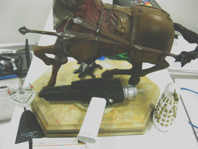
On the broad scope, Star Trek was Star Trek. No two ways about it.
-the Centaur
Pictured: the first pic is my desk at the Search Engine that Starts With a G, including a model of the original Enterprise from TOS. The second is my bookcase, including a model of an original hand phaser and a model of the U.S.S. Prometheus from Star Trek: Voyager. The blue box USB hub and the salt shaker with the plunger and ray gun are both from Doctor Who. For those who are confused by the horse without a head, it's a centaur from Narnia.


